How Can We Help?
Matplotlib is one of the famous libraries for visualizing data in python. We can use the matplotlib library to visualize 2-dimensional data and sometimes even 3-dimensional data. And matplotlib is built on Numpy arrays.
A bar plot or chart is used to visualize categorical data points with rectangular bars. A bar plot can be plotted horizontally or vertically. We will see more about this in a later section. If the plot is vertically, sometimes we call it a column chart.
A bar plot or chart is also used to visualize a numerical and categorical variable relationship. Each numerical variable is displayed as the bar’s size, while the categorical variables are shown as the bar itself.
Let’s talk about a stacked bar plot. A stacked bar plot is used to visualize how a significant categorical variable’s value is divided into small parts and what is the relationship of those small parts on the complete bar.
In this article, we will cover how to plot different types of bar plots using the matplotlib library in python.
Table of Contents:
Plot a Simple Stacked Bar Plot
- Import required libraries such as NumPy, pandas, and matplotlib.
- If you have a dataset, read the dataset and decide x-axis variable (feature) and y-axis variable (feature).
- Plot the chart using the bar() method.
- To visualize the plot, use the show() method.
Example:
import matplotlib.pyplot as plt

class_year = ["First", "Second", "Third", "Fourth", "Fifth"]
boys = [15, 20, 16, 18, 25]
girls = [10, 12, 5, 9, 15]
w = 0.6
plt.bar(class_year, girls, w)
plt.bar(class_year, boys, w, bottom = girls)
plt.show()
Output:

Explanation:
- First of all, we have imported the required libraries, and for this example, we only imported matplotlib. pyplot and given an alias ‘plt‘.
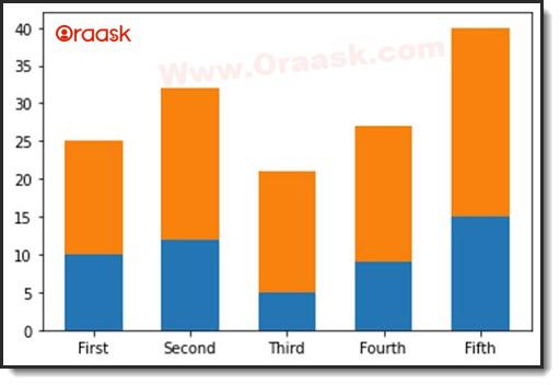
- After that, we initiated three lists with some random categorical and numerical data points. We defined one more variable, ‘w‘, which is nothing but ‘width of the bar’, and it is optional.
- Then to visualize a stacked bar plot, we use the bar() method. In the bar() method, the first two parameters will be data points and the following one parameter ‘bottom’. And we have assigned a value to the bottom, that is, bottom = Boys. And this will help to draw the bar on top of another.
- Finally, we used the show() method to display the visualization on the screen.
Stacked Bar Plot with Labels using Matplotlib Library
In the matplotlib.pyplot library, there are two methods to add labels on the x-axis and y-axis: ‘label‘ and ‘label‘. Let us see this via an example.
Example:
import matplotlib.pyplot as plt
class_year = ["First", "Second", "Third", "Fourth", "Fifth"]
boys = [15, 20, 16, 18, 25]
girls = [10, 12, 5, 9, 15]
w = 0.6
plt.bar(Class, girls, w)
plt.bar(Class, boys, w, bottom = girls)

plt.xlabel("Classes")
plt.ylabel("No.of students")
plt.show()
Output:

Explanation:
- Initially, we imported the required libraries and initiated a few lists with some values.
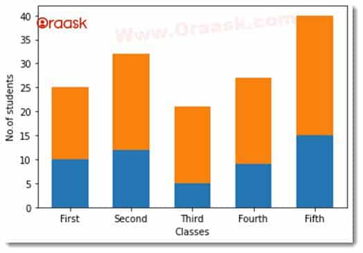
- After that, we called the bar() method to plot the bar chart, and then we added plt. xlabel and plt. ylabel to add some text on the x-axis and y-axis, respectively.
- In the above figure, we can see the labels on the x-axis are ‘Classes‘ and on the y-axis is ‘No. of students.‘
Note: We have a complete study about all types of bar charts in the matplotlib library that you can refer to them from here: Python Matplotlib Bar Chart
Stacked Bar Plot with Legend using Matplotlib Library
In the below section, we will be discussing ‘legend‘ in a stacked bar plot. In the visualization, we use ‘legend‘ to differentiate different types of size, color, etc. Let us see this with the below example.
Example:
import matplotlib.pyplot as plt

class_year = ["First", "Second", "Third", "Fourth", "Fifth"]
boys = [15, 20, 16, 18, 25]
girls = [10, 12, 5, 9, 15]
w = 0.6
plt.bar(Class, girls, w)
plt.bar(Class, boys, w, bottom = girls)

plt.xlabel("Classes")
plt.ylabel("No.of students")

plt.legend(['Female', 'Male'])

plt.show()
Output:

Explanation:
In the above example, we imported the required library and data. Then, we called the legend() method and gave the ‘Female‘ and ‘Male‘ as parameters. We can see the legend displayed in the chart’s top-right corner from the above figure. Here, ‘Female‘ is shown in ‘blue‘ color while ‘Male‘ is shown in ‘orange‘ color.
Stacked Bar Plot with DataFrame using Matplotlib Library
Let us explore more about stacked bar plots and how we can plot them with the help of a data frame. First, create a data frame, and to create a data frame easily, we can use the panda’s library. The DataFrame() method takes two important parameters data points and column names. Let us see these things with an example.
Example:
import NumPy as np
import pandas as pd
import matplotlib.pyplot as plt

df = pd.DataFrame([['A', 10, 12, 2, 20],
                                 ['B', 10, 23, 12, 18],
                                 ['C', 12, 15, 19, 6],
                                 ['D', 10, 18, 11, 19]],
       columns = ['Team', 'C++', 'Java', 'Python', 'Php'])

df.plot(x = 'Team', kind = 'bar', stacked = True, title = 'Stacked Bar Plot with Pandas DataFrame', figsize = (12,6))

plt.xticks(rotation = 'horizontal')
plt.show()
Output:

Explanation:
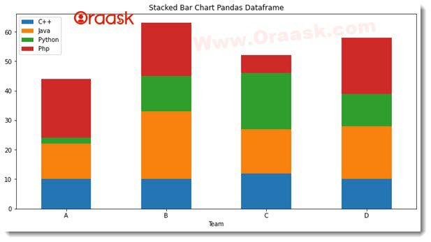
We imported the pandas, NumPy, and matplotlib library in the above example. With the help of the panda’s library, we called DataFrame() method and gave some values as a list and assigned column names. After that, we stored this data frame in a variable called ‘df‘. We can perform a complete exploratory data analysis on this variable ‘df‘, and we will see it later.
Then we plotted the data points with the help of the plot() method and rotated the ticks to horizontal on the x-axis using the xticks() method, and thus it looks much better, as we can see in the above figure.
Stacked Bar Plot using Matplotlib Library with Value inside Bar
Let’s see how to plot a bar plot with value inside the bar with an example.
Example:
import matplotlib.pyplot as plt
import pandas as pd

df = pd.DataFrame({
                                  'Male': [35, 20, 43, 12, 19],
                                  'Female': [20, 11, 18, 6, 9]
                               })

class_year = ["First", "Second", "Third", "Fourth", "Fifth"]
ax = df.plot(stacked = True, kind = 'bar')

for bar in ax.patches:
    height = bar.get_height()
    width = bar.get_width()
    x = bar.get_x()
    y = bar.get_y()
    label_text = height
    label_x = x + width / 2
    label_y = y + height / 2
    ax.text(label_x, label_y, label_text, ha = 'center', va = 'center')

ax.set_xticklabels(class_year, rotation = 'horizontal')
plt.show()
Output:

Explanation:
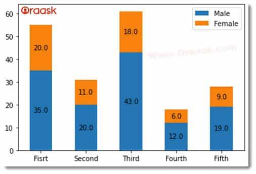
Here, we have imported only pandas and the matplotlib library. Then the data frame is created with the help of the pandas library and then defined as a list of classes in the class_year list. We then use the plot() method to plot a stacked bar plot. We used for loop, and inside this loop, we use get_height() and get_width() methods to get the actual height and width of the bar. And in the last, we set xticklabels on the x-axis. We can see in the above figure; values are displayed inside each bar.
Conclusion:
In the above article, we have seen the “Matplotlib Stacked Bar Plot in Python” with a detailed explanation and examples.


