How Can We Help?
Matplotlib is a Python 2D plotting library that produces publication-quality figures in various hardcopy formats and interactive environments across platforms. We can use Matplotlib Package in Python scripts, the Python and IPython shell (ala MATLAB or Octave), web application servers, and various graphical user interface toolkits.
Matplotlib was initially created by John D. Hunter for his Ph.D. thesis and has been under continuous development since 2005. It is currently maintained by a community of developers led by Travis Oliphant.
Table of Contents:
What is a Horizontal Bar Chart in Matplotlib?
Horizontal bar charts are a type of chart that displays the distribution of data across multiple categories. It is similar to a vertical bar chart, except that instead of stacking the bars in columns, they are stacked horizontally.
In Python, horizontal bar charts can be implemented using the matplotlib library. Matplotlib is a Python plotting library with many functions for drawing 2D and 3D graphs. This article will show you how to make a simple horizontal bar chart using only a few lines of code.
One of the most familiar charts used in data visualization is the bar chart. Bar charts show the relative proportions of different items and their sizes. There are many ways to create a bar chart in Python, but one of the easiest is using matplotlib.
In this article, you’ll learn how to create a horizontal bar chart with Python and Matplotlib.
What is a Horizontal Bar Chart in Matplotlib used for?
The bar chart we created in this tutorial can be used for various purposes. The following are some examples:
- To show how different groups of people respond to a survey question.
- To compare the amount of money spent on different types of products.
- To display how many people voted in an election by age group.
The main advantages of Matplotlib over other plotting libraries
- Flexible plotting axes; any number of plots can share a single set of x and y axes.
- Multiple plot types, such as bar charts and scatterplots.
- Native SVG output with complete control over graphical parameters.
- Encapsulation of all drawing operations within objects, allowing the programmatic generation of high-quality renditions from simple descriptions.
You can also use horizontal bar charts to show progress toward a goal. For example, if you are trying to lose weight, you could use a horizontal bar chart to show your progress over time. Bar charts help compare different values with each other, like sales revenue per month for your company’s various product lines.
They can also show how much something has changed over time. For instance, How much the average temperature has increased since 1980 (the orange line).
The following steps will guide you throughout the process of creating a Horizontal Bar Chart in Matplotlib Using Python:
Step 1: Import the Matplotlib package and check the version.
The first step of plotting a horizontal bar chart in matplotlib is to import the matplotlib package and check the version. The import statement is:
import matplotlib.pyplot as pltThe print() function outputs a string with the version number for our current Python installation. To see this output, you need to execute the following command in your Python REPL:
print(plt.__version__)Step 2: Create a data frame containing the student data containing three columns, science, math, and language, as column names and their corresponding percentage as values of those columns.
We will be using three libraries in this section. They are Python, Numpy, Matplotlib, and Pandas.
- Python: It’s a general-purpose, high-level programming language that can be used to write scripts or programs.
- Numpy: It’s a library for scientific computing with Python.
- Matplotlib: Is an open-source library for 2D plotting in Python.
- Pandas: It is one of the most popular Python data analysis libraries.
Step 3: Create a horizontal bar chart.
We’ll create a horizontal bar chart using the bar() function in this step. The following code sets up the figure with the appropriate size, axis limits, labels, legend, plot marker size, and shape. It creates a horizontal bar chart with three bars corresponding to each item in our data set (Item_ID). To see how all these pieces work together, see our example below:
import matplotlib.pyplot as plt
import numpy as np- Set up a new figure and axes for customizing their properties.
fig = plt.figure(1)
ax1 = fig.add_subplot(121)- Set the axes limits to prevent data points from clipping at the plot area’s extremes when using logarithmic scaling on y-axis ticks (or similar).
ax1.set_xlim(-20., 20.) # xmin/maxStep 4: Set the labels of the x-axis and y-axis.
The next step is to set the labels of the x-axis and y-axis. Use the following code:
xlabel = "Science"
ylabel = "Math"
Also Read: How to plot a Horizontal Line in Matplotlib Python
Plotting a Horizontal Bar Chart in Matplotlib using Python
Let’s say we have some data on the number of people who ate eggs for breakfast each day for 10 days in a row:
| Day | Number of people who ate eggs for breakfast |
|---|---|
| 1 | 25 |
| 2 | 30 |
| 3 | 28 |
| 4 | 30 |
| 5 | 31 |
| 6 | 29 |
| 7 | 32 |
| 8 | 30 |
| 9 | 31 |
Let’s explore more about the horizontal bar chart. Here is a simple code that allows you to create a horizontal bar chart using Matplotlib in Python.
Example
import matplotlib.pyplot as plt
name=['Saikat','Rahul','Animesh','Nita','Harsh']
marks = [56,67,78,23,53]
plt.barh(name,marks,color=['red','purple','green','yellow','violet'])
plt.title('Marks of the students')
plt.ylabel('Name oif the student')
plt.xlabel('marks out of 100')
plt.show()
Output
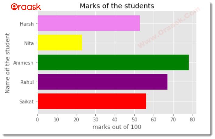
Explanation:
Notice in the above figure that the ‘marks’ are displayed on the x_axis while the ‘name’ is displayed on the y_axis. We can further modify the above plot using the ggplot() method. Let’s see how.
plt.style.use('ggplot')Finally, if we combine all the code above, it will look something like this:
Example
import matplotlib.pyplot as plt
name=['Rose','Rahul','Smith','Sam','Harsh']
Quantity = [136,167,178,123,153]
plt.style.use('ggplot')
plt.barh(name,Quantity,color=['purple','black','violet','red','green'])
plt.title('Marks of the students')
plt.ylabel('Name of the student')
plt.xlabel('marks out of 200')
plt.show()
Output
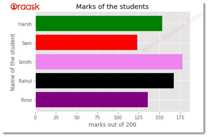
Note: We have a complete study about all types of bar charts in the matplotlib library that you can refer to them from here: Python Matplotlib Bar Chart
Let’s see how to plot the horizontal bar char using pandas data-frame in Python.
Example
import matplotlib.pyplot as plt
import pandas as pd
data = {'marks':[56,67,78,23,53]}
name=['Saikat','Rahul','Animesh','Nita','Harsh']
df = pd.DataFrame(data,columns = ['marks'], index = name)
df.plot.barh(color='violet')
plt.title('Marks of students')
plt.ylabel('Name of the student')
plt.xlabel('Marks of the student')
plt.show()
We can further use different style methods. Below are the codes:
import matplotlib.pyplot as plt
import pandas as pd
data = {'name':['Saikat','Rahul','Animesh','Nita','Harsh'],
        'marks' : [56,67,78,23,53]
       }
df = pd.DataFrame(data, columns = ['name', 'marks'], index = ['Saikat','Rahul','Animesh','Nita','Harsh'])
plt.style.use('ggplot')
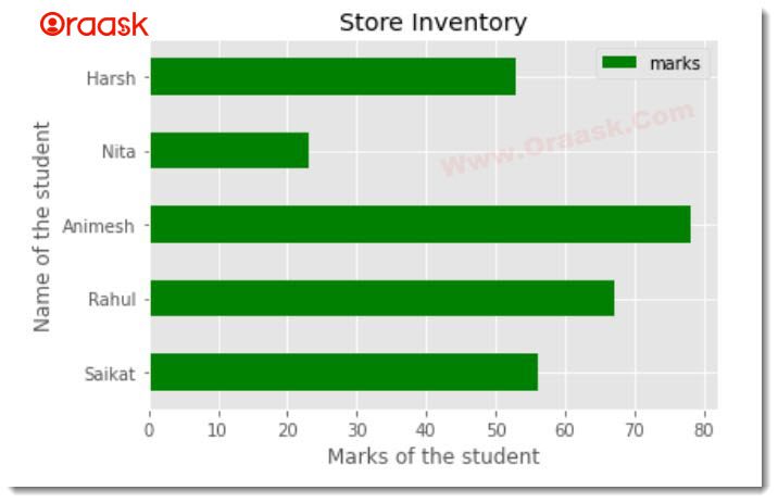
df.plot.barh(color=['green'])
plt.title('Store Inventory')
plt.ylabel('Name of the student')
plt.xlabel('Marks of the student')
plt.show()
Output
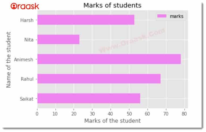
Adding legend to the graph can make the graph more readable. We can add a legend using the legend() function available in the matplotlib library. See the below code:
Example
import matplotlib.pyplot as plt
import pandas as pd
data = {'name':['Saikat','Rahul','Animesh','Nita','Harsh'],
        'marks' : [56,67,78,23,53]
       }
df = pd.DataFrame(data, columns = ['name', 'marks'], index = ['Saikat','Rahul','Animesh','Nita','Harsh'])
plt.style.use('ggplot')
df.plot.barh(color=['green'])
plt.title('Store Inventory')
plt.ylabel('Name of the student')
plt.xlabel('Marks of the student')
plt.show()
Output
Conclusion
In conclusion, we have seen that the Horizontal Bar Chart is a handy tool for visualizing data. It allows us to compare quantities and percentages of a series of categories. Each bar represents one category and is plotted along the horizontal axis, with its length representing the percentage of the total value for that category. Matplotlib is a powerful tool for creating and manipulating plots with Python. It is designed to be an open-source alternative to MATLAB, and it can be used in a wide variety of applications. The next time you need to visualize your data, don’t forget about matplotlib!
