How Can We Help?
In this article, we will look at how to plot the histogram and look at different attributes we can use for the same. but let first know
What is Histogram in Matplotlib? The histogram is a graphical visualization of continuous numerical data points. The graph looks very similar to the bar graph because it also contains rectangles as the essential visualization elements. But the difference being the bar graph represents the more discrete data, and the histogram, on the other hand, represents the continuous data points.
Plotting the Histogram
We can plot the histogram using the matplotlib library of python. Like other charts, in the matplotlib library, like bar charts and scatter charts, we can use almost the same attributes to plot the histogram. Moreover, the syntax to plot the matplotlib histogram is similar to theirs.
Hold on, Don’t forget to check the list of Matplotlib Tutorials
Essential Attributes and Parameters
For plotting the histogram, it is essential to note that we need to have a series of data points in the form of lists.
Then we need to define another list where we need to store the intervals for which we want to view the histogram. We must pass this list as the bin attribute’s value while plotting the histogram.
Note: For more information about how to change the bis size, follow this tutorial: How to Change the bin Size of Histogram in Python Matplotlib
Matplotlib Histogram Example
import matplotlib.pyplot as plt #import the modules
import numpy as np
x=np.arange([344,455,323,234,22,11,1])
y=[0,100,200,300,400,500]
plt.hist(x,bins=y)
plt.show()
Output
Explanation
We will explain the above code as follows:
- First, we have imported all the necessary modules into the code. Here we have imported the matplotlib and the numpy library and also gave them the alias names plt and np as customary.
- Next, we created a variable named x and created a user-defined list on our own. We have used the np.arrange() function to make it a numpy array.
- Now, we created another list named y and stored the interval values for which we want to see the histogram. Note that:
- It is also user-defined, and The length of x and y need not be the same.
- We then used the plot() function of matplotlib to plot x and passed y as the bin parameter value.
- We used the plt.show() method to view the graph.
Observations: What the histogram exactly tells us?
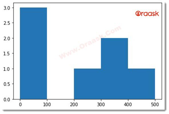
Look at the above output figure. And see the graph. The first rectangle reaches 3 seconds, 0 third 1, the fourth 2, and the fifth as 1.
If you carefully notice the elements of the list x, you can see three elements, i.e., 1,11,22, between 0 and 100. No element is between 100 and 200. There is only one element between 200 and 300 which is 234. Between 300 and 400, there are two values which are 344 and 323. And finally, between 400 and 500, there is only one value, i.e., 455.
Hence, we can say the histogram represents the frequency of the elements.
Classify Elements Among the Interval Numbers
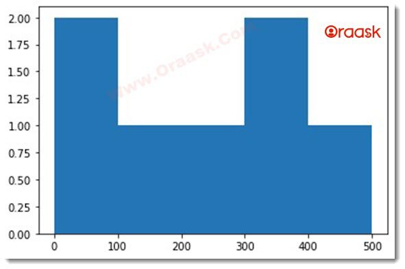
If an element is among the interval numbers like 0,100,200 etc, then it will classify the element for the class for which it is the lower limit.
Example
import matplotlib.pyplot as plt #import the modules
import numpy as np
x=np.array([344,455,323,234,22,11,100])
y=[0,100,200,300,400,500]
plt.hist(x,bins=y)
plt.show()
Output
Explanation
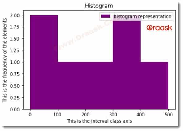
We were passing more parameters to the histogram. We have shown in the above codes an actual histogram implementation. Now let us add the title, change the color, add labels to the graph, etc., to make the plot more informative.
Example
import matplotlib.pyplot as plt #import the modules
import numpy as np
x=np.array([344,455,323,234,22,11,100])
y=[0,100,200,300,400,500]
plt.hist(x,bins=y,color="purple")
plt.xlabel("This is the interval class axis")
plt.ylabel("This is the frequency of the elements")
plt.legend(["histogram representation"])
plt.title("Histogram")
plt.show()
Output
Explanation
We will explain the above code as follows:
- As explained earlier, we have imported the necessary modules, then created the data points.
2 . While plotting the graph, we used the attribute color and set the color to purple. - Then, we set the x and y labels to the graph.
- We also set the legend element to the graph.
- Finally, we showed the graph using the show() function.
There are a lot of parameters of the histogram plt. Users can use them to be more specific about the display. They are as follows:
Histogram Density Attribute
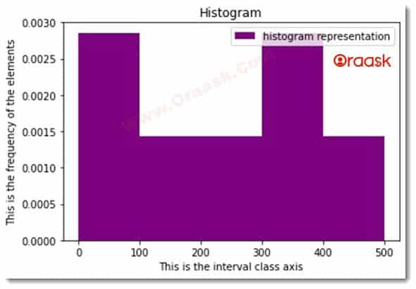
This argument takes only two parameters, either Boolean True or False, but the default value is False. If this is true, then The density Parameter will adjust the graph; as such, the histogram’s total area will equal one unit. Hence although the x-axis values will remain the same, the y-axis values will change accordingly.
Example
import matplotlib.pyplot as plt #import the modules
import numpy as np
x=[344,455,323,234,22,11,100]
y=[0,100,200,300,400,500]
plt.hist(x,bins=y,color="purple",density=True)
plt.xlabel("This is the interval class axis")
plt.ylabel("This is the frequency of the elements")
plt.legend(["histogram representation"])
plt.title("Histogram")
plt.show()
Output
Histogram Orientation Attribute:
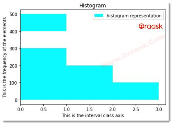
This attribute defines the orientation of the graph. By default, the orientation of the graph is vertical. The attribute can take two values one is horizontal another is vertical. If we pass the horizontal value, the graph will look like the horizontal bar graph. If we pass the vertical value, the graph will look like a horizontal bar graph.
Example:
import matplotlib.pyplot as plt #import the modules
import numpy as np
x=[67,33,456,234,55,324455,175,175]
y=[0,100,200,300,400,500]
plt.hist(x,bins=y,color="cyan",orientation='horizontal')
plt.xlabel("This is the interval class axis")
plt.ylabel("This is the frequency of the elements")
plt.legend(["histogram representation"])
plt.title("Histogram")
plt.show()
Output
Histogram rwidth Attribute:
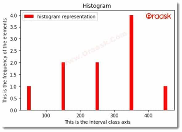
The parameter defines the width and should take the x-axis values. If we don’t pass any value, then the default value would be None, and python will automatically figure out the best possible interval for the same.
Example:
import matplotlib.pyplot as plt #import the modules
import numpy as np
x=[356,378,345,234,65,345,235,455,175,175]
y=[0,100,200,300,400,500]
plt.hist(x,bins=y,color="red",rwidth=0.1)
plt.xlabel("This is the interval class axis")
plt.ylabel("This is the frequency of the elements")
plt.legend(["histogram representation"])
plt.title("Histogram")
plt.show()
Output
Histogram Cumulative Attribute:
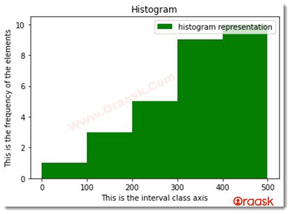
This parameter takes Boolean True or False. If we pass TRUE as a value, then matplotlib will return the histogram of its cumulative values instead of the actual graph.
Example:
import matplotlib.pyplot as plt #import the modules
import numpy as np
x=[356,378,345,234,65,345,235,455,175,175]
y=[0,100,200,300,400,500]
plt.hist(x,bins=y,color="green",histtype="stepfilled",cumulative=True)
plt.xlabel("This is the interval class axis")
plt.ylabel("This is the frequency of the elements")
plt.legend(["histogram representation"])
plt.title("Histogram")
plt.show()
Output
Histogram histotype Attribute:
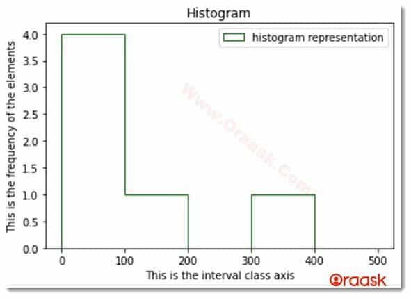
Suppose we want to display different visualization for the plot other than the default one, “bar”.
In that case, Matplotlib offers many other visualizations like barstack, step, and step filled by specifying the value to histtype attribute of the histogram.
Example:
import matplotlib.pyplot as plt #import the modules
import numpy as np
x=[3474,45,323,34,22,11,150]
y=[0,100,200,300,400,500]
plt.hist(x,bins=y,color="green",histtype="step")
plt.xlabel("This is the interval class axis")
plt.ylabel("This is the frequency of the elements")
plt.legend(["histogram representation"])
plt.title("Histogram")
plt.show()
Output
Final Thoughts
In this article, we have learned about the matplotlib histogram. We learned how to plot the graph and pass different parameters to the graph to make the graph more informative. However, we can also use some other attributes with the histogram. It would be best to look at the python matplotlib documentation to know more about its attributes. Also, try the combination of different attributes on your own, which will help you to understand the attributes better.


