How Can We Help?
Graphical representation is one of the most important aspects of any business idea, data visualization, analysis, etc. Python has many libraries to support the visual representation of data. One of the most popular data visualization libraries among them is the matplotlib. It offers not only plotting the graphs but also supports animations and other graphical content creations. In short, matplotlib is a potent tool to analyze data in the form of some visualization.
There are quite a large number of plots that we can use for plotting the graphs. One of them is the bar graph. The bar graph comprises rectangular bars in the plot, with each bar representing some value. The length of the bar determines the relative values of the bars concerning each other. So more significant the value of the bars will be the length of the bars in the graphs.
This article will demonstrate how to plot the bar graphs and use their associated attributes.
Plotting a Simple bar Graph:
We can plot the bar graph can using the matplotlib library. Just like plotting the other graphs in python like the scatter plot, histogram, etc.
Example:
import matplotlib.pyplot as plt
import numpy as np
x=np.linspace(1,10,10)
y=[33,4,2,45,23,5,6,78,9,90]
plt.bar(x,y)
plt.show()Output:
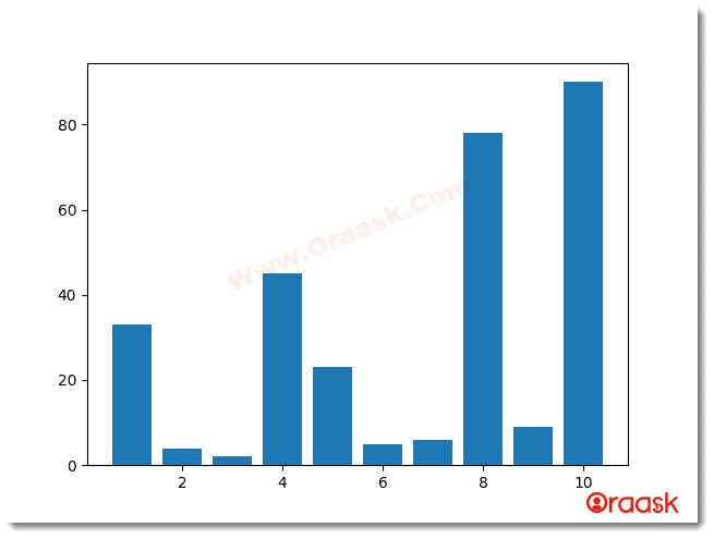
Explanation:
We can explain the above code as follows:
- First, we have imported the libraries into the code. Here we have imported matplotlib and the numpy library. We havGoode imported using alias names as plt and np for the convenience of writing our code.
- Now, we have created the variable x and 10 data points using the line space function of the numpy library.
- Now, we created another variable called y. Here we have given random values.
- Now, we used the function of Matplotlib. pyplot to plot the graph. We passed two arguments named x and y, which represent the x and the y axis of the graphs, respectively.
- We then used the plt.show() function to view the graph.
Observations: What does the bar graph exactly tell us?
The bar graphs are graphs consisting of bars in the shape of rectangles. The length of each bar represents the relative magnitude of its value concerning other bars. So if the length of one bar is twice the other, then the value of the corresponding element is twice that of the other bar.
Passing parameters to the bar graph:
Our previous graph does not display enough information about the graphs. Since there are no labels in the graph, there is any legend, etc. Let us give more details to the graph to make it more attractive.
Example
import matplotlib.pyplot as plt
students=["abhay","premla","javed","namitha","ashneer"]
marks=[33,42,45,78,90]
colors=["red","green",'blue',"yellow","brown"]
plt.bar(students,marks,color=colors)
plt.legend(["students marks distributions"])
plt.title("Marks of students")
plt.xlabel("Student")
plt.ylabel("students marks distribution")
plt.show()
Output
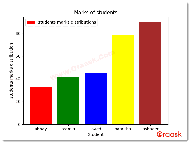
Explanation
Here is the explanation of the above code snippet:
- First, we imported all the necessary libraries in the code, like the matplotlib.pyplot with the alias name plt.
- Now, we make a list and name it students. Here we stored the name of 5 students. Note that the elements are in the form of strings.
- We created another list named colors and inserted 5 names of different colors. Next, we have plotted the bar graph in the plot. We passed the students and the marks arguments in the function to plot the bar graphs. Additionally, we have passed the color attribute too. Each element in the color attribute represents the color of the bars.
- We then provided the legend to the graph using the legend() function.
- Next, we gave the title to the graph using the title() function of matplotlib.pyplot.We provided the xlabel and the label to the graph using the xlabel() and the ylabel() function.
- Finally, we used the plt. show() function to show the graph.
Now let’s talk about other attributes that you can use with a bar graph
Matplotlib Bar Chart Types:
- Stacked Bar Chart
- Horizontal Bar Chart
- Grouped Bar Chart
- Multiple Bar Chart
- Side by Side Bar Chart
Stacked Bar Chart
The stacked bar chart in matplotlib is the chart that is used for the comparison of many categories. However, the bars should be stacked on each other. Each bar represents the total data, and each part within the bar represents the segments within that data.
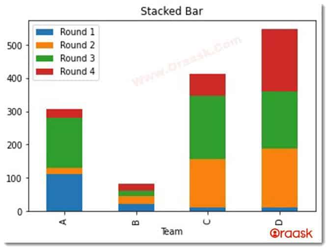
As shown in the figure, the rounds are stacked over each other, and there are 4 different classes: A, B, C, and D.
We have a complete guide about stacked bar graphs you can read here: Matplotlib Stacked Bar Chart
Horizontal Bar Chart
Horizontal bar charts are very similar to the standard bar chart, except that the bars are aligned in horizontal instead of vertical directions.
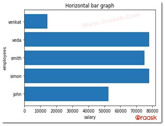
We have a complete guide about this type of bar chart you can read here: Matplotlib Horizontal Bar Chart
Grouped Bar Chart
As the name suggests, we use the grouped bar chart to compare a data group separately. Suppose within a dataset there are 5 different sub-datasets. So, to compare these sub-datasets, we use grouped bar chart.
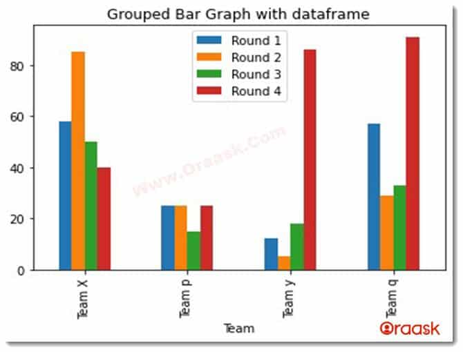
Multiple Bar Charts
We can also plot multiple bar charts within the same plot.
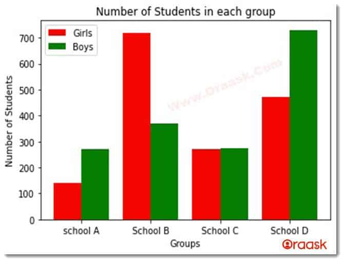
Here we have plotted the bar chart representation for schools A, B, C, and D in the figure.
Matplotlib Bar Chart Attribute List:
- Width Attribute
- Bottom Attribute
- Align Attribute
- Log Attribute
Matplotlib Bar Chart Width Attribute
This function determines the width of the bars. If no parameter is passed to the arguments by default, the default value is 0.,8.
Example
import matplotlib.pyplot as plt
students=["abhay","premla","javed","namitha","ashneer"]
marks=[38,92,85,78,50]
colors=["red","green",'blue',"yellow","brown"]
plt.bar(students,marks,color=colors,width=2)
plt.title("Marks of students")
plt.xlabel("Student")
plt.ylabel("students marks distribution")
plt.show()
Output
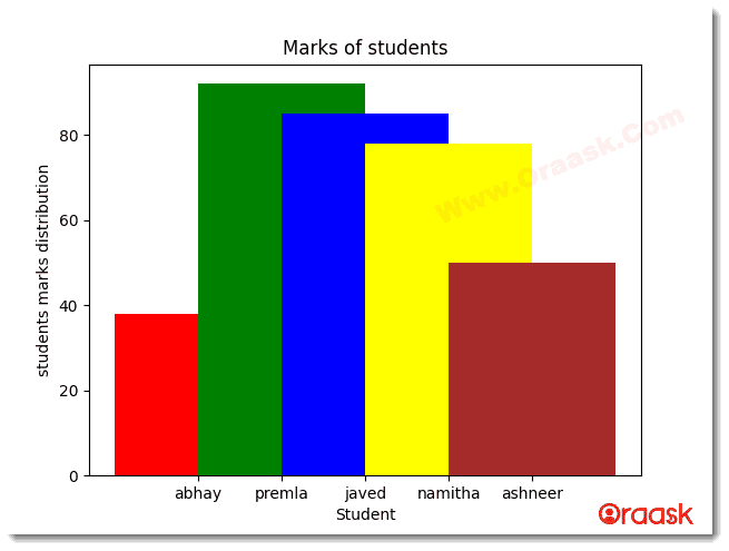
Explanation
We passed the argument named width in the above code and the value as 2. So the width of the bars got increased.
We can also set the width individually for each bar. We can achieve this by passing the widths as a list.
Example
import matplotlib.pyplot as plt
students=["abhay","premla","javed","namitha","ashneer"]
marks=[38,92,85,78,50]
colors=["orange","green",'blue',"red","cyan"]
plt.bar(students,marks,color=colors,width=[1,2,3,4,5])
plt.legend(["students marks distributions"])
plt.title("Marks of students")
plt.xlabel("Student")
plt.ylabel("students marks distribution")
plt.show()
Output
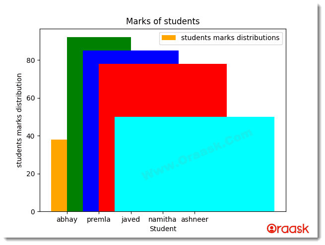
Explanation
Notice that the width of all the bars is different as we passed the parameter width where we passed 5 different elements for each of the 5 bars.
Matplotlib Bar Chart Bottom Attribute
We use the bottom attribute to set the base for the bars. Sometimes we may not want the bars to start from 0; instead, we may want to start the bars from some non-zero numbers.
This takes float or array-like objects as the parameters.
Example
import matplotlib.pyplot as plt
employees=["rishit","rohit", "rakesh","dhami","lee"]
salary=[18000,8000,75000,65000,24000]
colors=["green","cyan","red","darkgreen","purple"]
plt.bar(employees,salary,color=colors,width=[1,2,3,4,5],bottom=10000)
plt.title("salary distribution")
plt.xlabel("employees")
plt.ylabel("Salary distribution of employees")
plt.show()
Output
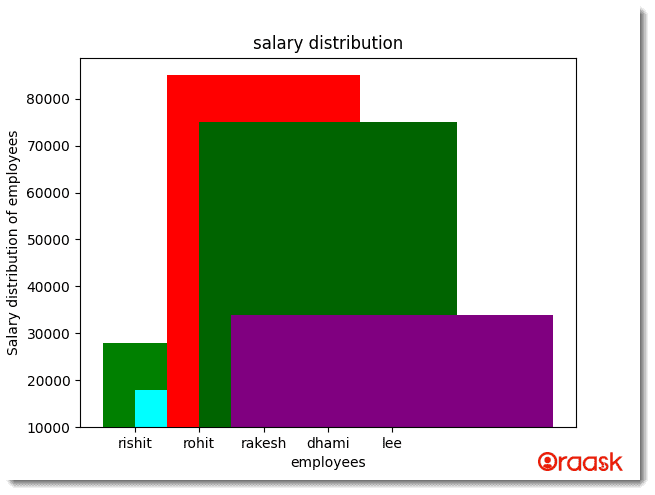
Explanation
In the above code, we have used the bottom attribute and set its value to 10000, so the baseline of the bars is 100000.
However, if we want to specify a baseline for each bar, we must pass the parameter as array-like objects.
Example
import matplotlib.pyplot as plt
employees=["rishit","rohit", "rakesh","dhami","lee"]
salary=[18000,8000,75000,65000,24000]
colors=["green","cyan","red","darkgreen","purple"]
plt.bar(employees,salary,color=colors,width=[1,2,3,4,5],bottom=[5000,10000,15000,20000,25000])
plt.title("salary distribution")
plt.xlabel("employees")
plt.ylabel("Salary distribution of employees")
plt.show()
Output
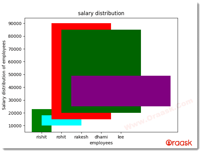
Matplotlib Bar Chart Align Attribute
We primarily use the align attribute to set the alignment of the bars. It can accept only two arguments, center and edge. The default value is center if we don’t pass any parameter.
Example
import matplotlib.pyplot as plt
employees=["rishit","rohit", "rakesh","dhami","lee"]
salary=[18000,4566,7844,4792,7645]
colors=["yellow","cyan","red","orange","purple"]
plt.bar(employees,salary,color=colors,align='edge')
plt.title("salary distribution")
plt.xlabel("employees")
plt.ylabel("Salary distribution of employees")
plt.show()
Output
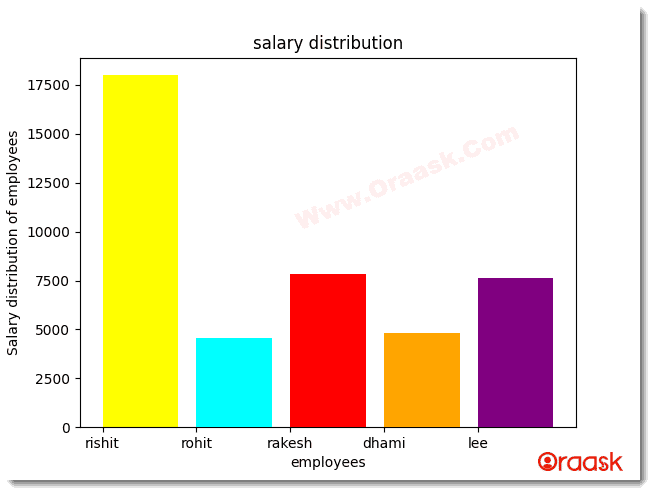
Matplotlib Bar Chart Log Attribute
We mainly use the log attribute in research work where there is a need to display substantial values.
Example
import matplotlib.pyplot as plt
employees=["rishit","rohit", "rakesh","dhami","lee"]
salary=[18000,4566,7844,4792,7645]
colors=["yellow","cyan","red","orange","purple"]
plt.bar(employees,salary,color=colors,log=True)
plt.title("salary distribution")
plt.xlabel("employees")
plt.ylabel("Salary distribution of employees")
plt.show()
Output
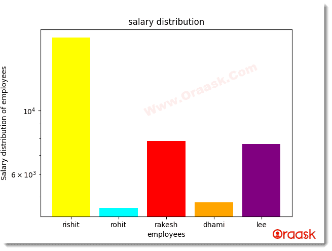
Final Thoughts:
In this article, we have learned how to plot the bar graphs and how to use different attributes along with the graph. The article discusses most of the basic stuff related to the matplotlib bar chart. Hence the reader gets fundamental knowledge of bar graphs. However, the learning is not limited to this article only. Exploring other attributes available in the python matplotlib documentation is advised to get further readings of the topics.


