How Can We Help?
Grids are defined as the cross-sectional lines that help view the graphs better. They are used when there is a requirement for some perfect design and architecture. For example, they are extensively used in the field of dome architecture, construction, etc. The grid lines provide a better description of the size and dimensions of the plot. They are also used in the camera system.
This article will teach us how to create the grid lines behind the other graphs in matplotlib.
Associated Attributes of the grid() Function:
A lot of attributes are associated with the functions. Some of the most important attributes associated with the functions are as follows:
- visible: This attribute defines whether we need to display the girds in the background of the graph or not. It takes two types of values boolean true and boolean false. If set to false the grid lines will not be visible in the graph.
- axis: This attribute defines perpendicular to which axis we need to display the girds in the graph. It takes only two types of arguments, namely x and y, in the form of string. If set to the x-axis, the grids will be perpendicular to the x-axis.
- color: This attribute takes the name of the colors as the arguments. This is optional and is used to set the color to the girds in the graph. By default, the grid color is blue.
- alpha: This attribute is used to set the contrast of the grid lines in the graph. It takes a float argument between 0 and 1. If set to zero, the grid lines will disappear; if set to 1, the grid lines will appear with maximum intensity.
- label: This attribute takes the values in the form of strings and is used to define the labels on the grid lines.
- linewidth; This attribute is used to set the width of the grid lines. This attribute takes a float as the argument.
- drawstyle: We use this attribute to set the styles for the plot in the graph.
Creating Grid Lines Behind the Scatter Graph
Creating the grid line behind the scatter plot can be done with the help of the function grid(). The function takes boolean arguments as the values. If set to True, the figure will contain grid lines. If set to false the figure will not contain any grid lines.
Example (1)
#First, import all the necessary libraries and packages in the code.
import numpy as np
import matplotlib.pyplot as plt
#defining a user-defined function
def scatter_plot(x,y):
    #creating the figure object and the axes of the plots
    fig,(ax1,ax2)=plt.subplots(1,2,figsize=(18,9))
    #plotting the first scatter graphs
    ax1.scatter(x,y)
    #defining the title for the first plot
    ax1.set_title("Scatter plot without any grid line")
    #plotting the second scatter graphs
    ax2.scatter(x,y)
    #defrining title for the second plot
    ax2.set_title("Scatter plot with grid line")
    #defining grid lines for the second scatter plot
    ax2.grid(True)
#creating the main() function
def main():
    #creating the data points for the x-axis
    x=np.arange(1,100,1)
    #creating data points for the y axis
    y=np.sin(x)
    #calling the scatter plot
    scatter_plot(x,y)
#calling the main() function
if __name__ == "__main__":
    main()
Output:
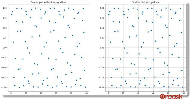
Explanation:
- First, import all the necessary libraries and packages in the code using the import statement of python. We have imported using the alias names for convenience in our code.
- Next, we created a user-defined function called scatter_plot which takes two parameters, namely x and y. Under this function, we created the figure class and the axes objects for the plots. We used the subplot() function to create those objects.
- Next we plotted the scatter plot for the first figure suing the ax1.scatter() function.We also set title to the function using the ax1.et_title() function.Next we plotted the second graph using the ax2.scatter() function.We again set title to the function using the ax2.et_title() function.
- Next, we used the following line of codes to display the grid lines in the second graph:
ax2.grid(True)
- Now we created the main() function. It’s the main driving code of the program. Under this function, we first created data points for the x-axis using the numpy array and the arange() function. Next, we created data points for the y-axis using the numpy array and taking the sine function of the x values.We called the scatter_plot() function.
- After the main() function, we finally called the main() function using the following lines of codes:
if __name__ == “__main__”:
main()
Displaying Grid Lines Only on One of the Axis
We have the option to display the grid lines in any one of the axes instead of both axes. We need to pass the value to the attribute visible and set the axis along which we need to display the grid lines. For example, if we need to display the grid lines along the y axis, we need to use the following code:
plt.grid(visible=True,axis=”x”)
Example (2)
#First, import all the necessary libraries and packages in the code.
import numpy as np
import matplotlib.pyplot as plt
#defining a user-defined function
def scatter_plot(x,y):
    #creating the figure object and the axes of the plots
    fig,(ax1,ax2)=plt.subplots(1,2,figsize=(18,9))
    #plotting the first scatter graphs
    ax1.scatter(x,y,color="red")
    #defining the title for the first plot
    ax1.set_title("Scatter plot without any grid line")
    #plotting the second scatter graphs
    ax2.scatter(x,y)
    #defrining title for the second plot
    ax2.set_title("Scatter plot with grid line")
    #defining grid lines for the second scatter plot
    ax2.grid(True,axis="x")
#creating the main() function
def main():
    #creating the data points for the x-axis
    x=np.arange(1,1000,1)
    #creating data points for the y axis
    y=np.exp(x)
    #calling the scatter plot
    scatter_plot(x,y)
#calling the main() function
if __name__ == "__main__":
    main()
Output:
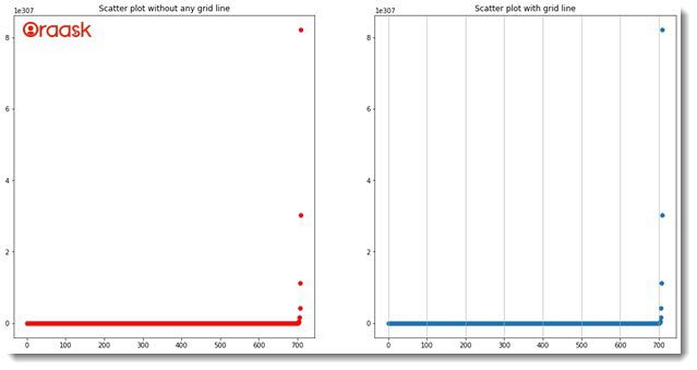
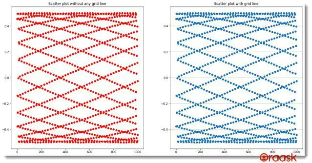
We can also plot the grid lines along the x-axis.
Example (3)
#First, import all the necessary libraries and packages in the code.
import numpy as np
import matplotlib.pyplot as plt
#defining a user-defined function
def scatter_plot(x,y):
    #creating the figure object and the axes of the plots
    fig,(ax1,ax2)=plt.subplots(1,2,figsize=(18,9))
    #plotting the first scatter graphs
    ax1.scatter(x,y,color="red")
    #defining the title for the first plot
    ax1.set_title("Scatter plot without any grid line")
    #plotting the second scatter graphs
    ax2.scatter(x,y)
    #defrining title for the second plot
    ax2.set_title("Scatter plot with grid line")
    #defining grid lines for the second scatter plot
    ax2.grid(True,axis="y")
#creating the main() function
def main():
    #creating the data points for the x-axis
    x=np.arange(1,1000,1)
    #creating data points for the y axis
    y=np.cos(x)*np.sin(x)
    #calling the scatter plot
    scatter_plot(x,y)
#calling the main() function
if __name__ == "__main__":
    main()
Output:
Creating Grid Lines for the Line Graph
Using the same syntax, we can similarly create grid lines for the line graphs. Let us try to use some other attributes with it to see more variations of this function.
Example (4)
#First, import all the necessary libraries and packages in the code.
import numpy as np
import matplotlib.pyplot as plt
#defining a user-defined function
def scatter_plot(x,y):
    #creating the figure object and the axes of the plots
    fig,(ax1,ax2)=plt.subplots(1,2,figsize=(18,9))
    #plotting the first scatter graphs
    ax1.plot(x,y)
    #defining the title for the first plot
    ax1.set_title("Line plot without any grid line")
    #plotting the second scatter graphs
    ax2.plot(x,y)
    #defrining title for the second plot
    ax2.set_title("Line plot with grid line")
    #defining grid lines for the second scatter plot
    ax2.grid(True,color='red',linewidth="5",linestyle="-")
#creating the main() function
def main():
    #creating the data points for the x-axis
    x=np.arange(1,100,1)
    #creating data points for the y axis
    y=np.sin(x)
    #calling the scatter plot
    scatter_plot(x,y)
#calling the main() function
if __name__ == "__main__":
    main()
Output:
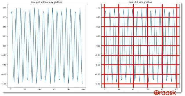
Explanation:
- First, we imported the libraries and modules in the code using the import statement of python. We have imported the numpy and the matplotlib.pyplot in the code using the technique of aliasing for convenience in writing our code further.
- Next, we created a user-defined function called scatter_plot() which takes two arguments, namely x and y. Under this function, we created the figure object and the axes of the figures using the plt.subplot() function. Next, we plotted the data in the figure using the ax.plot() function and passed x and y as the parameters to the plot.We set title for the graph using the ax1.set_title() function.Next, we plotted the second graph using the ax2.plot() function and passed x and y as the parameters to the plot.We also set title to the plot using the ax2.set_title() function.We then used the following lines of codes to display the grid lines:
ax2.grid(True,color=’red’,linewidth=”5″,linestyle=”-“)
- Note that the grid lines are not present in the graphs by default. Next, we created the main() function, which is the main driving code of the program. Under this function, we created data points for the x and the y axis using the numpy library of python. We then called the scatter_plot() function with appropriate arguments.
- Next, we called the main() function in the code using the following lines of codes:
if __name__ == “__main__”:
main()
Creating Grid Lines for the Polar Axis
Although we mainly talk about the two-dimensional rectangular coordinate system, plenty of other types of coordinate systems are available. One such popular type of coordinate system is the polar coordinate system. However, the grids are default available for this type of coordinate system. Suppose we do not want to use the grid lines; we need to use the statement plt.grid(False). However, we can also set other att4ributes to the grid lines of the polar axis.
Example (5)
#import all the necessary modules and libraries in the code
import numpy as np
import matplotlib.pyplot as plt
import math
#creating a user-defined function called polar
def polar(radius,radians):
    #defining the figure object
    fig=plt.figure(figsize=(9,9))
    #creating polar axes
    ax1=plt.axes(projection="polar")
    #iterating each angle in radians
    ax1.plot(radians, radius,color="red")
    #creating title for the graph
    ax1.set_title("Demonstrating grid lines through polar line graph")
    #creating a legend for the graph
    plt.legend(["Polar line graph"])
    #displaying the graph
    plt.show()
#creating the main() function
def main():
    radius=np.arange(0, 50, 0.001)
    #creating data points for the angles of each point
    radians =  2 * np.pi * radius
    #calling the polar function
    polar(radius,radians)
#calling the main() function
if __name__ == '__main__':
    main()
Output:
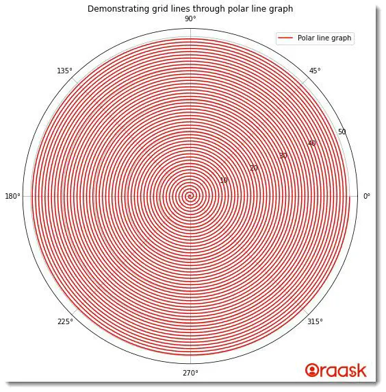
Explanation:
- First, we imported all the necessary libraries and packages in our code using the import statement of python. We have imported numpy and math library matplotlib.pyplot module.
- Next, we created a user-defined function named polar() function, which takes two parameters, radius, and radians. Under this function, we first created the figure object using the plt.figure() function. We set the size of the figure using the figsize attribute. Next, we plotted the graph using the ax1.plot() function. We passed radians and radius as the parameters of the function.Next we set title to the graph using the ax.set_title() function.We have also added legends to the graph using the plt.legend() function.
- Next, we created the main() function. Under this function, we first created values for the radius of the data points using the arange() function of numpy. We have used the start number as 0 and the last number as 50, and 0.001 as the iterating step.
- Next, we created the radians variable, which defines the angle subtended by the data points with the origin.
- Next, we called the polar() function. Finally, we called the main() function using the following lines of codes:
if __name__ == ‘__main__’:
main()
Wait: There is a full guide on Matplotlib Polar Plot if you want to know more about polar plots in python matplotlib.
Conclusion
In this article, we learned how to use the grid lines in the plot using different functions and attributes available in python matplotlib. We have used the grid() function to display the grid lines in the plot. The polar axis, however, offers the grid lines by default.
Although we have learned most of the essential functions and attributes associated with the grid lines, we highly recommend that the readers ok up for the python matplotlib library for information about the associated functions.


