How Can We Help?
Time series is one of the essential topics in the modern world. This helps to visualize data over time and make decisions accordingly. Everyone needs time series forecasting to make better decisions in the government or the corporate world. Time series plotting is plotting some quantity, a function of time. For example, take the case of the stock market price or the price of cryptocurrencies. Investors regularly check the time series plot in all fields and decide when to invest how much.
This article will teach us how to plot time series in python matplotlib.
Prerequisite:
Before we learn how to code the time series in python, we need to ensure that we have the following libraries installed on our machine.
matplotlib, pandas, random, math, datetime.
If you haven’t installed them in our python environment, then open the PowerShell of windows and run the following commands:
Pip install matplotlib
pip install pandas
pip install datetime
pip install math
If you are in Linux or macOS, you must type the above commands in the bash terminal.
Plotting a Simple Time Series in Matplotlib
We can perform time series plots in matplotlib with the help of the available functions we discussed in the previous posts. However, we need to implement our logic in the code to define what should be the time intervals between which we need the time series plot. We also need to specify the type of graphs to be used. We can use the line graph, bar graphs, etc., for the time series plot. Depending upon that, we need to use the plot (), bar () functions, etc., in the code.
Example (1)
# Import all the necessary libraries and modules in the code
import matplotlib.pyplot as plt
import matplotlib.dates
import datetime
import random
import math
# defining the main() function
def time_plot(x , y):
    # Defining the size of the plot
    plt.figure(figsize=(9, 9))
    # Plotting the values manually in the code.
    plt.plot(x, y ,  color = 'blue')
    # Defining the label along the x-axis
    plt.xlabel("time")
    # Defining the label along the y-axis
    plt.ylabel("peak")
    # defining the title of the plot
    plt.title("Displaying time series in matplotlib")
    # Displaying the plot
    plt.show()
def main():
    random.seed(42)
    # Defining the x values
    x = [datetime.datetime.now() + datetime.timedelta(microseconds=i)
         for i in range(150)]
    # defining the y values
    y = [(3+x*random.randint(-2 , 2)*math.exp(-1*random.randint(-4 , 4)))
         for x in range(0, 150)]
    time_plot(x, y)
# calling the main() function
if __name__ == "__main__":
    main()
Output:
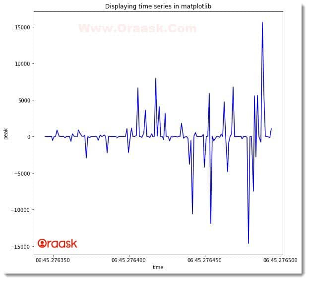
Explanation:
- First, we imported all the necessary libraries and packages in our code using the import statement of python. We used the alias names for convenience. Note that we could have imported the libraries at the end of the codes or even in between the codes too. However, we usually import the libraries at the start of the code as customary.
- Next, we created a user-defined function named time_plot() which takes two arguments, namely x and y. Under this function, we first created the figure object using the figure () function. We specified the size of the figure using the figsize attribute. Next, we plotted the graph using the plt.plot() function. We also specified the color of the plot to be blue by the color attribute.
- Next, we have defined the labels of the figure using the xlabel() and ylabel() functions of python. We then defined the plot’s title using the title () function. We used the plt.show() function to display the graph. Note that the use of this function is optional in Jupyter Notebook.
- We then created the main () function, which is the driving code of the program. Under this function, we first used the following lines of codes:
random.seed(42)
- Now you must be wondering what does this code mean? Actually, we will be using the random function next in the code, and the random function generates a random number each time you run the code. To get only a fixed random number, we use this statement. Why 42? There is no logic because we use 42. This number became popular because, in most tutorials, people have been using this number for a long time. You can pass any other value to the function.
- We then created the code’s data points for the x and y axes. We used the combination of list comprehension and the datetime () function to generate the data point for the x-axis. For the y-axis, we used the random math libraries and the list comprehension concept.
- Finally, we called the main () function.
Plotting Three-Dimensional 3D Time Series Plot
We can also perform the time series plots in three dimensions. However, three-dimensional time series plots are usually not preferred. This is because we generally prefer to plot only one quantity concerning time. We can use the plot3D() function to plot the three-dimensional time series plot in python.
Example (2)
# Importing mplot3d toolkits, numpy, and matplotlib
from mpl_toolkits import mplot3d
import numpy as np
import matplotlib.pyplot as plt
import math
import random
# Defining a user-defined function named three_dimensionall_time_series
def three_dimensional_time_series(x, y, z):
    # Creating the figure
    fig = plt.figure(figsize=(9, 9))
    # Creating a three-dimensional workspace
    ax = plt.axes(projection='3d')
    # Plotting the graph
    ax.plot3D(x, y, z, 'red')
    # Defining the x label
    ax.set_xlabel("x-axis")
    # Defining the y label
    ax.set_ylabel("y-axis")
    # Defining the z label
    ax.set_zlabel("z-axis")
    # Setting the title to the plot
    ax.set_title('Three dimensional time series plot')
    # Displaying the plot
    plt.show()
# defining the main() function
def main():
    # Creating data points for the y-axis
    y = np.arange(0, 50, 1)
    # Creating data points for the z-axis
    z = np.arange(0, 50, 1)
    # Creating data points for the x-axis
    x = [(5+random.randint(-2, 2)*math.sin(-1*random.randint(-2, 2)))
         for x in range(0, 50)]
    # calling the three_dimensional_line() function
    three_dimensional_time_series(x, y, z)
# calling the main() function
if __name__ == "__main__":
    main()
Output:
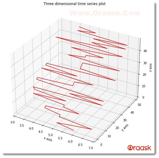
Explanation:
- First, we imported all the necessary libraries and packages in our code using the import statement of python. We have imported mpl_toolkits, numpy, math, matplotlib, and random libraries in our code.
- Next, we created the user-defined function named three_dimensional_time_series() .It takes three parameters in the code: x, y, and z. Under this function, we first created the figure object using the figure () function of python. We specified the size of the figure using the figsize attribute. Next, we created the axes object where we specified the attribute projection=” 3d” to make it three dimensions. We then plotted the graph using the plot3D() function. We passed the x, y, and z values to this function. We also specified the color of the plot to red using the color attribute. Now we set the labels along the x,y, and z axes. We also specified the graph’s title using the title() function.
- After the three_dimensional_time_series() function, we created the main() function, which is the main driving code of the program. Under this function, we created the data point for the x, y, and z-axis. We called the three_dimensional_time_series() function and passed the required parameters to the function.
- Finally, we called the main () function using the following lines of codes:
if __name__ == “__main__”:
main ()
Plotting a Time Series Plot From the Real-Life Data Set
The concept of time series has more things to do with the real-life data set than making data sets on our own. Although the previous concepts were helpful, the actual implementation of this concept is plotting real-life data. This is not possible to collect the data on our own physically. So, we need to use the data sets which are available online. A lot of online websites provide us with helpful data sets. We will use the Kaggle dataset (gold price) in this article. You are free to use any other website.
Before we understand the codes, we must know how to use the data sets.
- First, go to the Kaggle website.
https://www.kaggle.com/datasets/shavilyarajput/gold-dataset?resource=download
- Click on the download option and download the zip file.
- Next, go to the folder where you downloaded the zip file.
- Right-click on the file and click extract all.
- Now open the extracted file and copy the same.
- In the folder where you have opened the vs. code. Jupyter or any other code editor for practicing our tutorial creates a new directory named data.
- Paste the previous extracted file into this data file.
If you have done all the previous steps correctly, we are now set to introduce the codes:
Please note that we will also use the pandas library in the code.
Example (3)
# Import all the necessary libraries and packages in the code
import pandas as pd
import numpy as np
import matplotlib.pyplot as plt
# Define a user-defined function named time_Series
def time_series(x , y1 , y2 ):
    # Creating the figure object
    fig = plt.figure(figsize = (18 , 9))
    # Defining the axes object
    ax = plt.axes()
    # Plotting the figures
    ax.plot(x, y1, color = "purple")
    ax.plot(x, y2, color = "green")
    # Defining the title of the plot
    plt.title("Time series plot of gold price")
    # Defining label along the x-axis
    plt.xlabel("Dates")
    # Defining label along the y axis
    plt.ylabel("Gold price in US dollars")
    # Defining legends to the plot
    plt.legend(["US DOLLAR", "EURO"])
    # Plotting the graph
    plt.show()
# Defining the main() function
def main():
    # Importing the data set
    data = pd.read_csv('data/gold.csv')
    # Creating a data frame
    df = pd.DataFrame(data)
    print(df)
    # Taking the date column data
    x = np.array(df['Date'])
    # Taking the dollars column data
    y1 = np.array(df['USD (AM)'])
    y2 = np.array(df['EURO (AM)'])
    # Calling the function time_series()
    time_series(x, y1, y2)
# Defining the main() function as the main driving code
if __name__ == "__main__":
    main()
Output:
| # | Date | USD (AM) | USD (PM) | GBP (AM) | GBP (PM) | EURO (AM) | EURO (PM) |
|---|---|---|---|---|---|---|---|
| 0 | 2001-01-02 | 272.80 | 271.10 | 183.026 | 181.617 | 288.677 | 287.334 |
| 1 | 2001-01-03 | 269.00 | 267.15 | 178.916 | 177.390 | 281.823 | 281.655 |
| 2 | 2001-01-04 | 268.75 | 267.10 | 178.869 | 178.352 | 282.538 | 282.049 |
| 3 | 2001-01-05 | 268.00 | 267.40 | 178.488 | 178.148 | 280.775 | 280.882 |
| 4 | 2001-01-08 | 268.60 | 268.30 | 178.769 | 178.664 | 282.410 | 282.481 |
| ….. | ….. | ….. | ….. | ….. | ….. | ….. | |
| 4713 | 2019-08-27 | 1531.85 | 1532.95 | 1250.910 | 1247.510 | 1378.970 | 1380.880 |
| 4714 | 2019-08-28 | 1541.75 | 1537.15 | 1263.310 | 1258.770 | 1389.890 | 1387.430 |
| 4715 | 2019-08-29 | 1536.65 | 1540.20 | 1260.510 | 1262.960 | 1387.290 | 1392.030 |
| 4716 | 2019-08-30 | 1526.55 | 1528.40 | 1253.140 | 1251.150 | 1382.750 | 1383.510 |
| 4717 | 2019-09-02 | 1523.35 | 1525.95 | 1260.420 | 1265.010 | 1388.690 | 1391.510 |
[4718 rows x 7 columns]
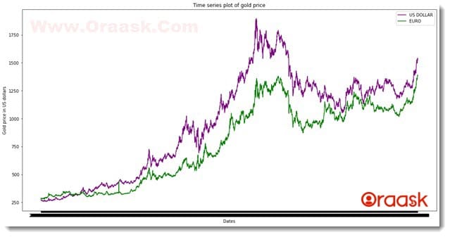
Please note that the notebook cannot fetch all the data since there are a massive amount of data.
Explanation:
- First, we imported all the required libraries and packages in our code using the import statement of python. We imported pandas, numpy library, and matplotlib.pyplot module in the code. We used alias names for convenience in our code.
- Next we created a user-defined function named time_series(). The function takes three arguments, namely x,y1, and y2. Under the function, we first created the figure object using the plt.figure() function and specified the figsize attribute to specify the size.
- Next, we created the axes object using the axes() function of matplotlib.pyplot. Having done all these, we plotted the graph using the plot() function. We used the function twice to plot two different plots in the exact figure. We specified different colors to the plot using the color attribute.
- We specified the title of the plot using the title() function. We specified the labels using the xlabel() and ylabel() functions. Since we plotted two different plots in the same figure, we used the legend() function to segregate them.
- We used the plt.show() function to display the plot. In Jupyter Notebook, this is, however, optional to use. But we strongly recommend you use this function.
- Next, we created the main() function. This is the main driving code of the program. Under this function, we first imported the dataset using the pandas library. Note that if the specified file does not reside in the folder, then python will raise errors in the interpretation step.
- Next, we created the data frame. The data frame is significant for separating the columns of the data. We printed the data frame to understand what is inside the data.
- Next, we created three variables: x,y1, and y2. The x is a numPy array storing the dates for timestamps. We stored the US dollar values in y1 as numpy array objects and the EURO values in y2.
- We called the time_sereis() functions with all the necessary arguments.
- Finally, we called the main() function using the following lines of codes:
if __name__ == “__main__”:
main()
COVID Time Series Plot
Let us now try to plot the COVID time series plot. However, this example will teach us how to plot the time series plot in bar graphs instead of line plot graphs. In the following example, we will be showing the implementation in a bar graph. However, you can also use any other type of suitable graphs too.
Before jumping onto the code, it is essential to download and locate the required data set in the correct folder.
- Go to the Kaggle website and download the data set from the following link:
https://www.kaggle.com/datasets/imdevskp/corona-virus-report
- Now go to the folder where you downloaded the zip file.
- Extract the file.
- Now copy the file day_wise.csv
- Go to the directory where you are doing all the codes.
- Create a folder named data.
- Then paste the extracted file into the folder.
Example (4)
# Import all the necessary libraries and packages in the code
import pandas as pd
import numpy as np
import matplotlib.pyplot as plt
# Define a user-defined function named time_Series
def time_series(x , y1 , y2 ,y3 ):
    # Creating the figure object
    fig = plt.figure(figsize = (18 , 9))
    # Defining the axes object
    ax = plt.axes()
    # Plotting the figures
    ax.plot(x, y1, color = "purple")
    ax.plot(x, y2, color = "green")
    ax.plot(x, y3, color = "red")
    # Defining the title of the plot
    plt.title("Time series plot of gold price")
    # Defining label along the x-axis
    plt.xlabel("Dates")
    # Defining label along the y axis
    plt.ylabel("Covid cases")
    # Definig the legend
    plt.legend(["Confirmed", "Recovered","Active"])
    # Plotting the graph
    plt.show()
# Defining the main() function
def main():
    # Importing the data set
    data = pd.read_csv('data/day_wise.csv')
    # Creating a data frame
    df = pd.DataFrame(data)
    print(df.head())
    # Taking the date column data
    x = np.array(df['Date'])
    # Taking the dollars column data
    y1 = np.array(df['Confirmed'])
    y2 = np.array(df['Recovered'])
    y3 = np.array(df['Active'])
    # Calling the function time_series()
    time_series(x[1: 1000 : 30], y1[1 : 1000 : 30], y2[1 : 1000 : 30],y3[1 : 1000 : 30])
# Defining the main() function as the main driving code
if __name__ == "__main__":
    main()
Output:
| # | Date | Confirmed | Deaths | Recovered | Active | New cases | New deaths |
|---|---|---|---|---|---|---|---|
| 0 | 2020-01-22 | 555 | 17 | 28 | 510 | 0 | 0 |
| 1 | 2020-01-23 | 654 | 18 | 30 | 606 | 99 | 1 |
| 2 | 2020-01-24 | 941 | 26 | 36 | 879 | 287 | 8 |
| 3 | 2020-01-25 | 1434 | 42 | 39 | 1353 | 493 | 16 |
| 4 | 2020-01-26 | 2118 | 56 | 52 | 2010 | 684 | 14 |
| # | New recovered | Deaths / 100 Cases | Cases Recovered / 100 Cases |
|---|---|---|---|
| 0 | 0 | 3.06 | 5.05 |
| 1 | 2 | 2.75 | 4.59 |
| 2 | 6 | 2.76 | 3.83 |
| 3 | 3 | 2.93 | 2.72 |
| 4 | 13 | 2.64 | 2.46 |
| # | Deaths / 100 Recovered | No. of countries |
|---|---|---|
| 0 | 60.71 | 6 |
| 1 | 60.00 | 8 |
| 2 | 72.22 | 9 |
| 3 | 107.69 | 11 |
| 4 | 107.69 | 13 |
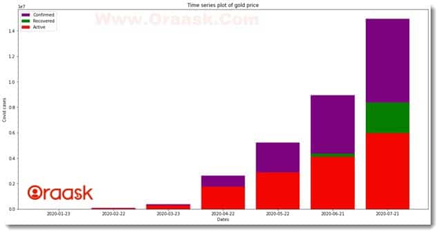
Explanation:
- As customary, we imported all the libraries required to run the code. We imported the pandas, matplotlib, and numpy into the code.
- Next, we created a user-defined function named time_series. The function takes four parameters: x, y1, y2, and y3. Under this function, we first created the figure object. We specified the size of the figure using the figsize attribute.
- Next, we created the figure axes using the axes () function. Now we plotted the bar graphs using the bar () function. We specified the colors of the plots to segregate the plots from one another.
- Using the title () function, we specified the title of the plot, and using the xlabel() and ylabel() functions; we provided labels to the plot.
- We also used the legend () function to specify the legends in the plot. Now we used the show () function to display the plot.
- After the time_series() function we created the main() function. This is the main driving code of the program. Under this function, we first imported the data set using the pd.read_csv() function. Ensure that the file resides in your specified path.
- Next, we created the data frame to select the columns and the values later in the code. This step is crucial for selecting the desired data. We printed the first 5 entries of the data set using the print () function to look into the data set first. We created a numpy array of the “Confirmed” column. We also created the numpy array for the “Recovered” and “Active” columns. After doing all the steps above, we called the time_series() function and passed the necessary arguments to plot the graph. Note that we have sliced the arrays to get more minor data set. Otherwise, it may cause inconvenience to display the labels along the x-axis.
- Finally, we called the main () function using the following lines of codes:
if __name__ == “__main__”:
main()
More Examples of Time Series Plots
Having done with the previous example, we are now in a position to practice on some more datasets and furnish our concepts well. Let us look into some famous and popular data sets and plot those graphs in matplotlib.
Stock Price Time Series Plot
Before we jump onto the code, we should download the required dataset. Follow the steps below for the same:
- Go to the Kaggle website and download the data set from the following link:
https://www.kaggle.com/datasets/rohanrao/nifty50-stock-market-data
- Now go to the folder where you downloaded the zip file.
- Right-click on the zip folder and click on the extract all /extract here option.
- Now copy the file day_wise.csv.
- Go to the directory where you do all the tutorial codes.
- Create a folder named data. You are free to choose any other name. However, you need to specify the path of the folder accordingly in the code.
- Then paste the extracted file into the folder.
Example (5)
# Import all the necessary libraries and packages in the code
import pandas as pd
import numpy as np
import matplotlib.pyplot as plt
# Define a user-defined function named time_Series
def time_series(x , y1 , y2 ,y3 ):
    # Creating the figure object
    fig = plt.figure(figsize = (18 , 9))
    # Defining the axes object
    ax = plt.axes()
    # Plotting the figures
    ax.plot(x, y1, color = "purple")
    ax.plot(x, y2, color = "green")
    ax.plot(x, y3, color = "red")
    # Defining the title of the plot
    plt.title("Time series plot of stock price")
    # Defining label along the x-axis
    plt.xlabel("Dates")
    # Defining label along the y axis
    plt.ylabel("Covid cases")
    # Definig the legend
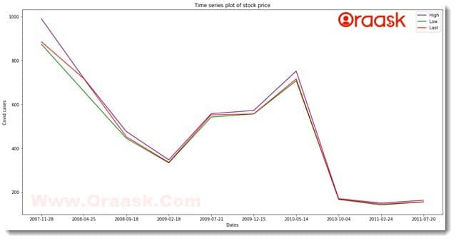
    plt.legend(["High", "Low","Last"])
    # Plotting the graph
    plt.show()
# Defining the main() function
def main():
    # Importing the data set
    data = pd.read_csv('data/ADANIPORTS.csv')
    # Creating a data frame
    df = pd.DataFrame(data)
    print(df.head())
    # Taking the date column data
    x = np.array(df['Date'])
    # Taking the dollars column data
    y1 = np.array(df['High'])
    y2 = np.array(df['Low'])
    y3 = np.array(df['Last'])
    # Calling the function time_series()
    time_series(x[1: 1000 : 100], y1[1 : 1000 : 100], y2[1 : 1000 : 100],y3[1 : 1000 : 100])
# Defining the main() function as the main driving code
if __name__ == "__main__":
    main()
Output:
| # | Date | Symbol | Series | Prev Close | Open | High | Low | Last |
|---|---|---|---|---|---|---|---|---|
| 0 | 2007-11-27 | MUNDRAPORT | EQ | 440.00 | 770.00 | 1050.00 | 770.0 | 959.0 |
| 1 | 2007-11-28 | MUNDRAPORT | EQ | 962.90 | 984.00 | 990.00 | 874.0 | 885.0 |
| 2 | 2007-11-29 | MUNDRAPORT | EQ | 893.90 | 909.00 | 914.75 | 841.0 | 887.0 |
| 3 | 2007-11-30 | MUNDRAPORT | EQ | 884.20 | 890.00 | 958.00 | 890.0 | 929.0 |
| 4 | 2007-12-03 | MUNDRAPORT | EQ | 921.55 | 939.75 | 995.00 | 922.0 | 980.0 |
| # | Close | VWAP | Volume | Turnover | Trades | Deliverable Volume |
|---|---|---|---|---|---|---|
| 0 | 962.90 | 984.72 | 27294366 | 2.687719e+15 | NaN | 9859619 |
| 1 | 893.90 | 941.38 | 4581338 | 4.312765e+14 | NaN | 1453278 |
| 2 | 884.20 | 888.09 | 5124121 | 4.550658e+14 | NaN | 1069678 |
| 3 | 921.55 | 929.17 | 4609762 | 4.283257e+14 | NaN | 1260913 |
| 4 | 969.30 | 965.65 | 2977470 | 2.875200e+14 | NaN | 816123 |
| # | %Deliverble |
|---|---|
| 0 | 0.3612 |
| 1 | 0.3172 |
| 2 | 0.2088 |
| 3 | 0.2735 |
| 4 | 0.2741 |
Conclusion
In this article, we have learned how to plot time series in python matplotlib. We also learned about many associated functions of NumPy, math, random, datetime, etc. After that, we learned how to plot the time series plots using pandas and matplotlib. The pandas are a modern library for data processing. We have downloaded the data sets from the Kaggle website and plotted the time series plots.
We covered most of the critical concepts in this article. We strongly recommend that the readers practice all these concepts with different data sets from Kaggle. Additionally, we also recommend the readers look up the python documentation to have more information regarding the associated functions and attributes.


