How Can We Help?
Matplotlib allows us to customize almost anything we can imagine in the graph. Changing the line color is one of the most fundamental aspects every programmer should know. Matplotlib not only allows us to change the color of the entire plot but also allows us to change the color of the pots dynamically.
In this article, we are going to explore different methods to change the color of the line Matplotlib lines
Prerequisite
We need some libraries and packages to code. They are namely Matplotlib and numpy. In case you haven’t installed them, then perform the following:
If you are a windows user, then open the PowerShell and run the following commands:
[adinserter block=”1″]
pip install matplotlib numpy
If you are a Linux or a macOS user, then open the bash terminal and run the following commands:
pip install matplotlib numpy
What Colors are Supported for the Line Colors in Matplotlib?
Matplotlib has over 150 named color supports, yet many more are in RGB format. The user can choose any colors to specify the colors for the lines.
Some of the colors supported are:
red, green, violet, orange, black, purple, yellow, cyan, brown, gold, salmon, tomato, aqua, indigo, orchid, blueviolet, etc.
Check This: There is a full guide on Matplotlib Colors if you want to know more about colors in matplotlib.
You do not need to remember these colors. Just search for the documentation for the available colors, and you will get them. Here is the link to the color codes for the official documentation:
https://matplotlib.org/stable/gallery/color/named_colors.html
Example (1)
[adinserter block=”2″]
# import all the necessary libraries and packages in our code
import matplotlib.pyplot as plt
import numpy as np
# Creating a user-defined function change_color
def change_color(x, y):
    # Creating the figure object
    fig = plt.figure(figsize=(9, 9))
    # Creating the axes object
    ax = plt.axes()
    # Plotting the figure
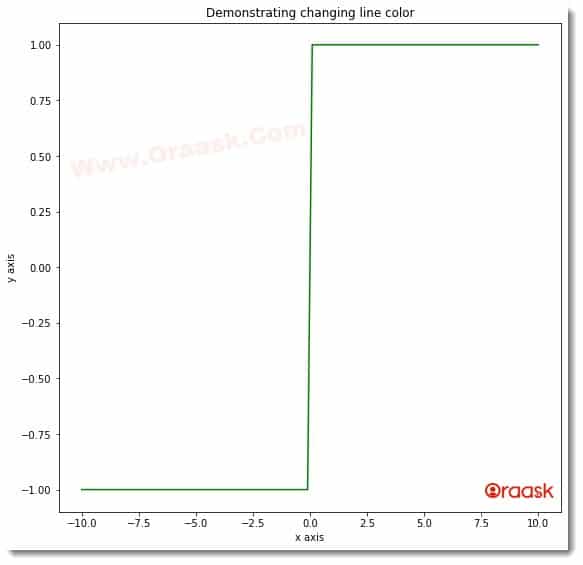
    ax.plot(x, y, color="green")
    # Setting title of the plot
    ax.set_title('Demonstrating changing line color')
    # Defining the x label
    ax.set_xlabel('x axis')
    # Defining the y label
    ax.set_ylabel('y axis')
    # Displaying the plot
    plt.show()
# Defining the main function
def main():
    # Creating the x coordinates for the data points
    x = np.linspace(-10, 10, 100)
    # Defining the y coordinates for the data points
    y = []
    for i in x:
        if i > 0:
            y.append(1)
        elif(i < 0):
            y.append(-1)
        else:
            y.append(0)
    # Calling the change_color function
    change_color(x, y)
# Calling the main function
if __name__ == "__main__":
    main()
Output:

[adinserter block=”3″]
Explanation:
- As customary, we imported the libraries and packages in our code using the import statement of python. We created a user-defined function named change_color. This is a void function, and it takes two parameters, namely x and y. Under this function, we first created the figure object using the figure function of matplotlib. We also created the axes object to plot the figures.
- Next, we plotted the figures using the plot function of the axes object. We passed the x and y to this function to plot the desired plot. We specified the plot’s color using the function’s color attribute.
- Next, we defined the title for the plot using the set_title function of matplotlib. We also created the labels along the axes using the set_xlabel and set_yalabel functions. We used the show function of matplotlib to display the plot. However, in Jupyter Notebook, this is optional to use.
- Next, we created the main function. The main function is the driving code of the entire program. Under this function, we created the data points for the plot. We used the linspace function to generate the data points. The function takes three parameters. The first parameter is the number with which the iteration should start. The second parameter is the number up to which the iteration should run, and the last parameter is the total number of elements present in the array.
- Next, we called the change_color function and plotted the graph. We called the main function using the following lines of codes:
if __name__ == “__main__”:
main()
Customizing the color of lines through cmap
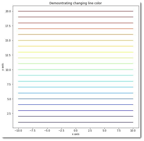
The cmap is a powerful and popular method among developers to assign dynamic colors to different plots. Matplotlib also allows us to use the cmap along with the line charts.
To use it, we need to keep the following points in mind:
- First, we need to make the colormap using the nm.jet function of the matplotlib library.
- Next, we need to decide the color of the plots per certain rules. The rules are customizable according to us.
[adinserter block=”4″]
Example (2)
# import all the necessary libraries and packages in our code
import matplotlib.pyplot as plt
import numpy as np
# Creating a user-defined function change_color
def change_color(x, y):
    # Creating the figure object
    fig = plt.figure(figsize=(9, 9))
    # Creating the axes object
    ax = plt.axes()
    # Creating the color map
    colors = plt.cm.jet(np.linspace(0,1,20))
    # Plotting the figure
    for i in range(20):
        ax.plot(x, i+y, c=colors[i])
    # Setting title of the plot
    ax.set_title('Demonstrating changing line color')
    # Defining the x label
    ax.set_xlabel('x axis')
    # Defining the y label
    ax.set_ylabel('y axis')
    # Displaying the plot
    plt.show()
# Defining the main function
def main():
    # Creating the x coordinates for the data points
    x = np.linspace(-10, 10, 100)
    # Defining the y coordinates for the data points
    y = np.ones(100)
    # Calling the change_color function
    change_color(x, np.array(y))
# Calling the main function
if __name__ == "__main__":
    main()
Output:

Explanation:
[adinserter block=”5″]
- We imported the pyplot module from matplotlib using the import statement. We also imported the numpy library.
- Next, we created the change_color function. This is a user-defined void function. Next, we created the figure, and the axes object using the figure and the axes functions, respectively. We created the colormap using the cm.jet function. We can use a few other functions like cm.rainbow instead. Now we iterated for the first 20 values of y and plotted the figure. We passed the c argument values using the colors array.
- Next, we defined the title for the figure using the set_title function. We also defined labels for the axes using the set_xlabel and set_ylabel functions. We used the show function to display the plot.
- Next, we created the main function. We defined all the data points with the help of the numpy library under this function. We used one function of the numpy library. The function takes the whole number argument. We use the function to generate an array whose elements are one. The parameter defines the number of ones required in the array. We called the change_color function with appropriate arguments to plot the figure. At last, we called the main function.
Changing the color opacity of the lines
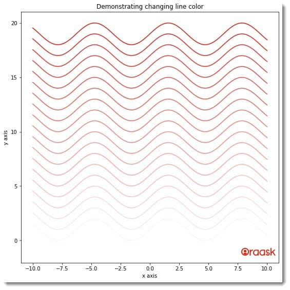
Matplotlib also allows us to customize the opacity of the colors. We can use the alpha attribute of the plot function to change the color opacity. The attribute takes values between 0 and 1. 0 means no color, and 1 means maximum intensity. The values are float data types. If we try to pass values outside this range, python will raise an error.
[adinserter block=”6″]
Example (3)
# import all the necessary libraries and packages in our code
import matplotlib.pyplot as plt
import numpy as np
# Creating a user-defined function change_color
def change_color(x, y):
    # Creating the figure object
    fig = plt.figure(figsize=(9, 9))
    # Creating the axes object
    ax = plt.axes()
    # Plotting the figure
    for i in range(20):
        ax.plot(x, i+y, color="red", alpha=i*0.05)
    # Setting title of the plot
    ax.set_title('Demonstrating changing line color')
    # Defining the x label
    ax.set_xlabel('x axis')
    # Defining the y label
    ax.set_ylabel('y axis')
    # Displaying the plot
    plt.show()
# Defining the main function
def main():
    # Creating the x coordinates for the data points
    x = np.linspace(-10, 10, 100)
    # Defining the y coordinates for the data points
    y = np.sin(x)
    # Calling the change_color function
    change_color(x, np.array(y))
# Calling the main function
if __name__ == "__main__":
    main()
Output:
[adinserter block=”7″]

We have set the logic in the program ourselves. We strongly advise the readers to try out different logic and see the difference.
Customizing the line color through queries
Programmers sometimes need to change the plots’ color per specific conditions. We call these conditions queries. Matplotlib also allows us to customize the color of the lines with the help of defined queries. However, this is tricky, and matplotlib does not have any direct function to perform the same. We can adopt the following method to achieve the same:
[adinserter block=”8″]
- First created, arrays for the values of the x and the y coordinates.
- Next, use the masked_where or any other similar function to mask specific values you wish to be masked from the array.
- Now create subplots and plot each part you made after masking the parent array.
Example (4)
# import all the necessary libraries and packages in our code
import matplotlib.pyplot as plt
import numpy as np
# Creating a user-defined function change_color
def change_color(t, upper, lower, middle):
    # Ceating the figure and the ax object
    fig, ax = plt.subplots(figsize=(9, 9))
    # Plotting the figure
    ax.plot(t, middle, t, lower, t, upper)
    # Setting title of the plot
    ax.set_title('Demonstrating changing line color')
    # Defining the x label
    ax.set_xlabel('x axis')
    # Defining the y label
    ax.set_ylabel('y axis')
    # Displaying the plot
    plt.show()
# Defining the main function
def main():
    # Creating the x coordinates for the data points
    x = np.linspace(1, 100, 1000)
    # Defining the y coordinates for the data points
    y = np.power(x, 2)
    y_max = 1500
    y_min = 500
    # Defining our queries
    supper = np.ma.masked_where(y < y_max, y)
    slower = np.ma.masked_where(y > y_min, y)
    smiddle = np.ma.masked_where((y < y_min) & (y > y_max), y)
    # Calling the change_color function
    change_color(x, supper, slower, smiddle)
# Calling the main function
if __name__ == "__main__":
    main()
[adinserter block=”9″]
Output:

Explanation:
- First, we imported the necessary libraries and packages in our code using the import statement. Note that we are free to import the libraries anywhere in the code.
- Next, we created the change_color function. The function is a void function and takes four parameters, namely t, upper, lower, and middle. Under this plot, we first created the figure and the ax object. We used the subplot function to create those objects. We also specified the size of the figure using the figsize attribute of the function.
- Next, we plotted the figure using the plot function. We passed all the necessary arguments to this function. Note that we are plotting three subplots in two dimensions; hence the total number of required arguments we passed is six.
- Next, we set the title for the plot using the set_title function. We also defined the labels along the axes using the set_xlabel and set_ylabel functions. We used the show function to display the plot.
- Now we created the main function. This is the main driving code of the program. Under this function, we created all the necessary data points for the plot. We used the linspace function to create the x coordinates values of the data points. We used the power function to create the y-axis value for the data points. Then comes the most crucial part. We used the masked_where function of the ma module of the numpy library. The masked_where is used to mask specific values from a given array. It takes two basic arguments. The first one is the query. The second one is the array on which the masking should take place. We called the change_color function to plot the figure.
- Finally, we called the main function with the help of the following lines of codes:
if __name__ == “__main__”:
main()
[adinserter block=”10″]
Final Thoughts
In this article, we have explained different methods to change the color of the line graph in python matplotlib. We have seen the color attribute, which is the fundamental way of changing the color of the lines. We also used a few advanced techniques to change the color of the lines using cmap queries etc. If you are stuck on some parts, feel free to post your questions in our forum.
Although we have explained most of the critical aspects, we strongly recommend the readers check the python matplotlib documentation to understand the topic more and explore the associated attributes and functions.


