How Can We Help?
Matplotlib is one of the most popular python libraries. This is a data visualization tool in python. This includes visualization through animations, plots, etc.
History of Matplotlib
John D. Hunter originally wrote matplotlib in 2003. This was released under the BSD-style license. Shortly after the death of John D.Hunter, Micheal Droettborn was nominated as the lead developer. In 2012 Thomas Caswell also joined the team as the lead developer. Although it was initially released as a simple data visualization tool, over the years, it became so powerful that it began to compete with other popular data visualization tools, Matlab, etc.
[adinserter block=”1″]
Versions
There are several versions of Matplotlib available. The 2.0.x version supports python 2.7 through python 3.10.x. However, python 2 is deprecated after 2020; hence, it is better not to use Matplotlib with python 2 anymore. The support for python3 for the Matplotlib version started with matplotlib 1.2. Matplotlib has signed not to support python 2 anymore in 2020.
Comparison with MATLAB
The closest competition of matplotlib is probably MATLAB. There are several differences between matplotlib and MATLAB in terms of the underlying architecture and syntax.
While MATLAB is an independent organization and is a propriety tool which means you do not have access to its source code, you can not modify or edit this code. On the other hand, the matplotlib is open source; hence, all the codes are available to the coders. Anyone can freely distribute, edit, and modify the codes, and in fact, they can contribute to the organization freely.
MATLAB considers everything as an array, whereas in the matplotlib, the variables can be any kind of object.
Operators and their usages are different on both platforms. For example, in MATLAB, the \^ is used for the power, whereas in python, it is XOR Operators.
[adinserter block=”2″]
Usages of Matplotlib
Plotting Different Graphs
Matplotlib is a highly efficient tool for creating different kinds of plots. It allows us to customize almost all the sections of the plot. Additionally, it allows us to save and check the coordinates in the plot itself. It supports a large number of coordinate systems and types of plots. Whether it is a rectangular coordinate system or a polar coordinate system, Matplotlib works exceptionally well. It is used to plot bar charts, pie charts, scatter charts, etc. They also support the three-dimensional plot, and we can use the combination of any of the charts we mentioned to get our desired result.
Line Graph using Matplotlib:
Example (1)
# Importing all the libraries and packages in our code
import matplotlib.pyplot as plt
import random
import numpy as np
# Creating a user-defined function


def sample_plot(x, y1, y2):
    # Plotting the first figure.
    plt.plot(x, y1, color="green")
    # Plotting the second figure.
    plt.plot(x, y2, color="blue")
    # Defining the title of the figure.
    plt.title("Demonstrating labels")
    # Defining the fonts of the first figure
    font1 = {'family': 'serif',
             'color':  'blue',
             'weight': 'normal',
             'size': 16,
             }
    # Defining the fonts of the second figure
    font2 = {'family': 'serif',
             'color':  'green',
             'weight': 'bold',
             'size': 16,
             }
    # Defining the label along the x-axis
    plt.xlabel("This is the x label of the plot", fontdict=font1)
    # Defining the label along the y axis
    plt.ylabel("This is the y label of the plot", fontdict=font2)
    # Displaying the plot
    plt.show()
# Defining the main function


def main():
    # Creating the values of the x coordinates of the data points
    x = np.arange(1, 10, 0.1)
    # Creating the values of the y coordinates of the data points of the first plot
    y1 = np.cos(x)
    # Creating the values of the y coordinates of the data points of the second plot
    y2 = np.sin(x)
    # Calling the sample_plot function
    sample_plot(x, y1, y2)


# Calling the main function
if __name__ == "__main__":
    main()
Output:
[adinserter block=”3″]
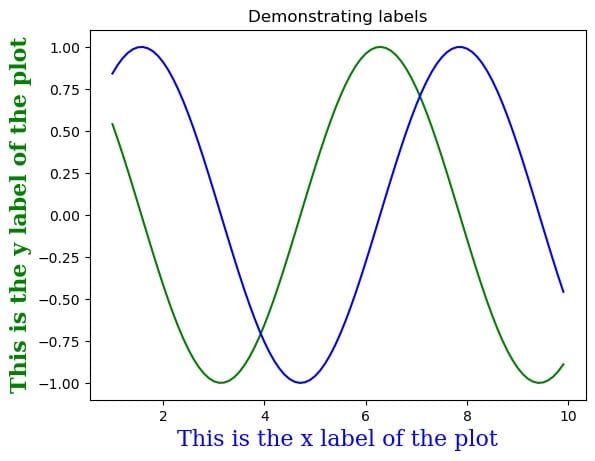
Scatter plot using matplotlib
Example (2)
# Importing all the libraries and packages in our code
import matplotlib.pyplot as plt
import random
import numpy as np
# Creating a user-defined function


def sample_plot(x, y1, y2):
    fig=plt.figure(figsize=(9,9))
    # Plotting the first figure.
    plt.scatter(x, y1, color="green")
    # Plotting the second figure.
    plt.scatter(x, y2, color="blue")
    # Defining the title of the figure.
    plt.title("Demonstrating scatter plot using matplotlib")
    # Defining the label along the x-axis
    plt.xlabel("This is the x label of the plot")
    # Defining the label along the y axis
    plt.ylabel("This is the y label of the plot")
    # Displaying the plot
    plt.show()
# Defining the main function


def main():
    # Creating the values of the x coordinates of the data points
    x = np.arange(1, 10, 1)
    # Creating the values of the y coordinates of the data points of the first plot
    y1 = np.power(x,2)
    # Creating the values of the y coordinates of the data points of the second plot
    y2 = np.power(x,3)
    # Calling the sample_plot function
    sample_plot(x, y1, y2)


# Calling the main function
if __name__ == "__main__":
    main()
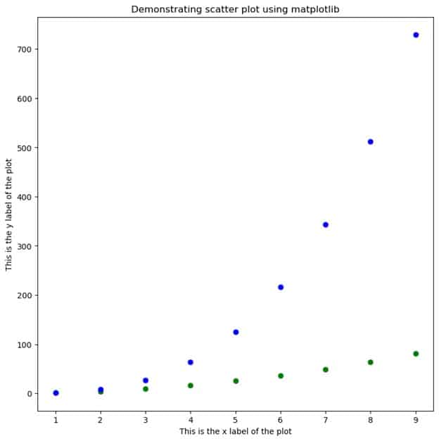
Output:
[adinserter block=”4″]
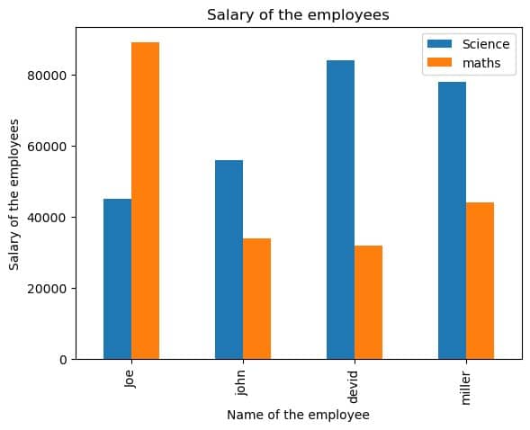
Bar Plot Through Matplotlib
Example (3)
# import the required libraries and modules in the current code.
import pandas as pd
import matplotlib.pyplot as plt
# creating the pandas_plot() function


def pandas_plot(x):
    fig = plt.figure(figsize=(9, 9))
    # creating a data frame for the plot
    df = pd.DataFrame(x)
    # plotting using pandas po=lot() function
    df.plot(x="name", kind="bar", title="Salary of the employees")
    # assigning labels along the x-axis
    plt.xlabel("Name of the employee")
    # assigning labels along the y axis
    plt.ylabel("Salary of the employees")
# creating the main() function


def main():
    # creating the value of x
    x = {"name": ["Joe", "john", "devid", "miller"], "Science": [
        45000, 56000, 84000, 78000], "maths": [89000, 34000, 32000, 44000]}
    # calling the pandas_plot function
    pandas_plot(x)


# declearing the main() function as the driving function of the code
if __name__ == "__main__":
    main()
Output:
[adinserter block=”5″]
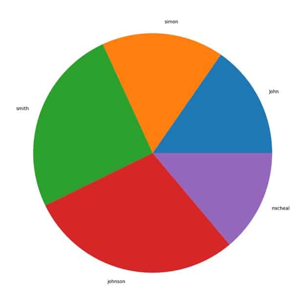
Pie Chart Through Matplotlib
Example (4)
#importing all the necessary libraries and modules in the code
import matplotlib.pyplot as plt
import numpy as np
#creating plot_pie() function
def plot_pie(x,y):
    # creating the figure object
    fig = plt.figure(figsize=(9, 9))
    #creating the axis with 4 parameters passed
    ax=fig.add_axes([0,1,1,1])
    #making the axis of the plot equal
    ax.axis("equal")
    #plotting the chart
    ax.pie(y,labels=x)
#creating the main() function
def main():
    #creating the labels for the plot
    employees=["John","simon","smith","johnson","micheal"]
    #creating data points
    salary=[52000,56000,86000,98000,47000]
    #calling the plot_pie() function
    plot_pie(employees,salary)
#declaring main() as the main driving code
if __name__ == "__main__":
    main()
Output:
Three-Dimensional 3D Plot Through Matplotlib
[adinserter block=”6″]
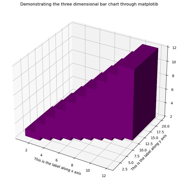
Example (5)
# import all the necessary libraries and modules
import numpy as np
import matplotlib.pyplot as plt
# create the main() function


def three_dimensional_bar(x, y, z, dx, dy, dz):
    # creating the figure class
    fig = plt.figure(figsize=(9, 9))
    # creating the three-dimensional axes
    ax = plt.axes(projection="3d")
    # plotting the chart
    ax.bar3d(x, y, z, dx, dy, dz, color="purple")
    # creating the label along the x-axis
    plt.xlabel("This is the label along the x-axis")
    # creating label along the y axis
    plt.ylabel("This is the label along the y-axis")
    # creating a title for the chart
    plt.title("Demonstrating the three-dimensional bar chart through matplotlib")
    # displaying the graph
    plt.show()


def main():
    # passing value for the x-axis
    x3 = [int(x) for x in range(1, 11)]
    # passing value for the y axis
    y3 = [int(x) for x in range(1, 11)]
    # passing value for the z-axis
    z3 = [(2) for x in range(1, 11)]
    # setting the width along the x-axis
    dx = [(2) for x in range(1, 11)]
    # setting the width along the y axis
    dy = [(10) for x in range(1, 11)]
    # setting the width along the z-axis
    dz = [1, 2, 3, 4, 5, 6, 7, 8, 9, 10]
    three_dimensional_bar(x3, y3, z3, dx, dy, dz)


# calling the main() function
if __name__ == "__main__":
    main()
Output:
[adinserter block=”7″]
Polar Plot Through Matplotlib
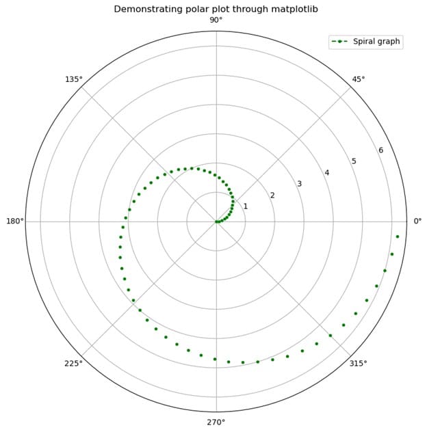
Example (6)
# import all the necessary modules and libraries in the code
import numpy as np
import matplotlib.pyplot as plt
import math
# creating a user-defined function called polar


def polar(radians):
    plt.figure(figsize=(9, 9))
    # creating a polar object
    plt.axes(projection='polar')
    # iterating each angles in radians
    for rad in radians:
        # plotting the graph
        plt.polar(rad, rad, 'r.', linestyle="dashed", color="green")
    # creating a title for the graph
    plt.title("Demonstrating polar plot through matplotlib")
    # creating a legend for the graph
    plt.legend(["Spiral graph"])
    # displaying the graph
    plt.show()
# creating the main() function


def main():
    # creating data points for the angles of each point
    radians = np.arange(0, 2 * np.pi, 0.1)
    # calling the polar function
    polar(radians)


# calling teh main() function
if __name__ == '__main__':
    main()
Output:
[adinserter block=”8″]
Using Matplotlib for Animation
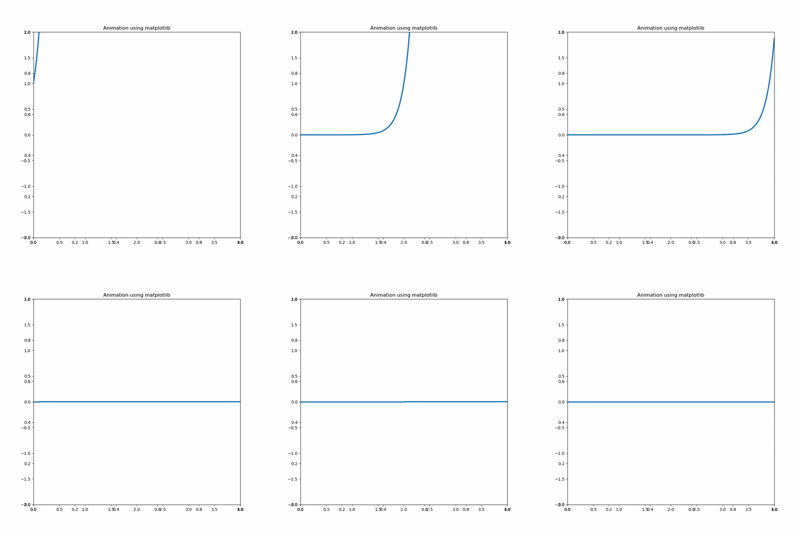
Example (7)
[adinserter block=”9″]
from matplotlib import pyplot as plt
import numpy as np
from matplotlib.animation import FuncAnimation

def main():
    fig = plt.figure(figsize=(9,9))
    plt.title("Animation using matplotlib")
    axis = plt.axes(xlim =(0, 4),ylim =(-2, 2))
    line, = axis.plot([], [], lw = 3)
    def init():
        line.set_data([], [])
        return line,
    def animate(i):
        x = np.linspace(0, 4, 1000)
        y = np.exp(2 * np.pi * (x - 0.1 * i))
        line.set_data(x, y)
        return line,
    anim = FuncAnimation(fig, animate, init_func = init,frames = 100, interval = 10, blit = False)
    anim.save('matplotlib_animation.gif',
            writer = 'ffmpeg', fps = 60)

if __name__ == "__main__":
    main()
Output:
[adinserter block=”10″]
Conclusion
This article taught us how to use matplotlib and its brief introduction. We also learned about its history, usage, and comparison with the closest competitor, MATLAB. Matplotlib is not only used for plotting different graphs, but it is also famous for creating animations. The library can work with various other libraries making it an even more powerful tool.
We strongly recommend that the readers look up the python matplotlib documentation and explore as much as possible.


