How Can We Help?
In practical situations, we mainly use rectangular coordinates. However, other coordinates are available, like polar plots, cylindrical plots, etc. The polar plot is especially very useful in the field of mathematics.
This article will explain how to plot polar histograms in matplotlib.
Prerequisites:
Before we proceed with the codes, we need to have matplotlib, numpy, and pandas libraries installed on our local machine.
If you have not installed it yet, then install the same using the following:
If you are a windows user, open the PowerShell but if you are a macOS or a Linux user, then open the bash terminal and run the following commands:
Pip install matplotlib numpy pandasPlotting Polar Histogram Plot
Plotting the polar histogram plot in matplotlib is relatively easy. If you have plotted the histogram in rectangular coordinates, then you will find that plotting the histogram plot in polar coordinates is so similar. We need to adopt the following method to plot the polar histogram plot:
First, we need to create the figure and the axes object and specify the coordinate system as polar.
Next, we can use the hist() function to plot the histogram in polar coordinates.
Example (1)
# Import the libraries and modules in the code
import numpy as np
import matplotlib.pyplot as plt
# Creating a user-defined function named polar_histogram
def polar_histogram(theta, bins, width, bottom):
    # Creating the figure object
    fig = plt.figure(figsize=(9, 9))
    # Creating the axes object
    ax = plt.subplot(111, polar=True)
    # Plotting the polar histogram
    bars = ax.hist(theta, bins=bins, width=width)
    # Displaying the polar histogram
    plt.show()
# Creating the main() function
def main():
    # Defining the parameters for the plot
    N = 100
    bottom = 0
    max_height = 4
    # Defining the angle for the bars with the origin
    theta = np.linspace(0, 10*np.pi, 10)
    # Defining the edges of the bars
    bins = [0, 5, 10, 15, 20, 25, 35]
    # Defining the width of the bars
    width = (2*np.pi) / N
    # Printing the values
    print(f" The theta array is: {theta}")
    print(f"The bins array is: {bins}")
    print(f"The width array is: {width}")
    # Calling the polar_histogram() function
    polar_histogram(theta, bins, width, bottom)
# Calling the main() function
if __name__ == "__main__":
    main()
Output:
The theta array is: [ 0. 3.4906585 6.98131701 10.47197551 13.96263402 17.45329252
20.94395102 24.43460953 27.92526803 31.41592654]
The radii array is: [0, 5, 10, 15, 20, 25, 35]
The width array is: 0.06283185307179587

Explanation:
- First, we imported all the libraries and modules required for the code using the import statement. We imported them using the aliasing technique to write the codes further in the program conveniently.
- Next, we created a user-defined function named polar_histogram. This void function takes four arguments: theta, bins, width, and bottom. Under this function, we first created the figure object. This is used to customize the plotting area. We used the attribute figsize to define the size of the plot. The attribute takes two arguments in the form of tuples. Both of them are integer number types. The first value defines the number of columns, and the second value defines the number of rows within the figure.
- Next, we created the axes object. We created this using the subplot() function. Alternatively, we can also use the axes() function for the same. We specified the attribute polar=True to define that we need to plot in polar coordinates. We can also use projection=”polar” instead of using this attribute.
- Now we created the main() function. Under this function, we created the data points for the polt. We created the theta and bins variables which are array data types. We also defined the width of the bars with the width variable
- We printed the values of theta, bins, and width to understand the plot better. We called the polar_histogram() function with appropriate parameters.
- Finally, we called the main() function using the following lines of codes: if __name__ == “main“: main()
Check This: I have wrote a full guide on Matplotlib Polar Plot if you want to know more about polar plot in python matplotlib library (What it is and how to plot a polar plot using in many different ways).
What does the histogram polar plot say?
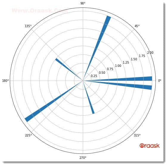
We have used the hist() function of matplotlib to plot the histogram graph in polar coordinates. Before we did it, we passed another attribute projection=” 3d”. But what does the graph tell us?
The graph looks similar to the bar plot, and there seems to be no difference. However, the bar graphs and the histograms are quite different. Let us analyze what the graph tries to convey to us. Notice the values of theta array:
The theta array is: [ 0. 3.4906585 6.98131701 10.47197551 13.96263402 17.45329252
20.94395102 24.43460953 27.92526803 31.41592654]
Now notice the value of the radii array:
The radii array is: [0, 5, 10, 15, 20, 25, 35]
Notice that between 0 and 5, there are 2 values, called 0. and 3.4906585. Notice there is a bar between o and 5 with its height equal to 2. There you go! The length of the bar tells the frequency of the values over a specific range of values. The bins parameter provides the range. However, the bins parameter is optional; if not specified, python automatically uses some values.
Adding More Attributes To The Plot
We have learned how to plot the histogram plot in the polar plot in matplotlib. However, this is not all. We can use all the other attributes and functions we used for the rectangular coordinates. Let us some other functions and attributes to the plot and make it more informative.
Example (2)
# Import the libraries and modules in the code
import numpy as np
import matplotlib.pyplot as plt
# Creating a user-defined function named polar_histogram
def polar_histogram(theta, bins1, bins2, width, bottom):
    # Creating the figure object
    fig = plt.figure(figsize=(9, 9))
    # Creating the axes object
    ax = plt.axes(polar=True)
    # Plotting the polar histogram
    bars = ax.hist(theta, bins=bins1, width=width ,bottom=bottom)
    bars = ax.hist(theta, bins=bins2, width=width)
    # Defining the title of the plot
    plt.title("Demonstrating the polar histogram plot")
    # Defining the legend to the plot
    plt.legend(["This is bins1", "This is bins2"])
    # Displaying the polar histogram
    plt.show()
# Creating the main() function
def main():
    # Defining the parameters for the plot
    N = 100
    bottom = 1
    max_height = 4
    # Defininig the angle for the bars with the origin
    theta = np.linspace(0, 10*np.pi, 10)
    # Defining the edges of the bars of the first plot
    bins1 = [0, 5, 10, 15, 20, 25, 35]
    # Defining the edges of the bars of the second plot
    bins2 = [0, 10, 20, 30, 40]
    # Defining the width of the bars
    width = (2*np.pi) / N
    # Printing the values
    print(f" The theta array is: {theta}")
    print(f"The bins1 array is: {bins1}")
    print(f"The bins2 array is: {bins2}")
    print(f"The width array is: {width}")
    # Calling the polar_histogram() function
    polar_histogram(theta, bins1, bins2, width, bottom)

# Calling the main() function
if __name__ == "__main__":
    main()
Output:
The theta array is: [ 0. 3.4906585 6.98131701 10.47197551 13.96263402 17.45329252
20.94395102 24.43460953 27.92526803 31.41592654]
The bins1 array is: [0, 5, 10, 15, 20, 25, 35]
The bins2 array is: [0, 10, 20, 30, 40]
The width array is: 0.06283185307179587

Explanation:
- We first imported the libraries and packages in the code using the import statement. We imported matplotlib.pyplot module and the numpy library in the code.
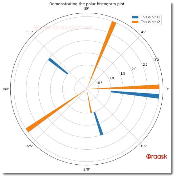
- Next defined a user-defined function named polar_histogram(). The function is a void function, and it takes 5 parameters, called theta, bins1, bins2, width, and bottom. Under this function, we first created the figure object using the figure() function of matplotlib. Next, we created the axes object using the axes() function. We plotted the figure using the ax.hist() function. We passed the value of theta and bins1 for the first plot and theta and bins2 for the second plot. We also specified the width of the bars using the width attribute.
- Using the title() function, we defined the plot’s title. We used the legend() function to define the legend for the plot. The legend is important to separate two different plots.
- After the polar_histogram() function we created the main() function. This is the driving code of the program. Under this function, we defined the data points for the histogram plot. We defined two bins for plotting two different histogram plots.
- After defining all the parameters, we printed them to understand the plot better. We called the polar_histogram() function with appropriate arguments.
- Finally, we declared the main() function as the main driving code using the following lines of codes: if __name__ == “main“: main()
Note: For more information about Histogram in the Matplotlib library, follow this tutorial: Python Matplotlib Histogram
Plotting Polar Histogram Plot By Fetching Data Sets
Until now, we have learned much about the histogram plot in matplotlib. We defined custom data points for plotting the graphs. However, in real life, we will not work with our custom data points; we need to plot the data points available in CSV or excel formats. So now we will understand how to plot the polar histogram plot by fetching the data points from a CSV file.
We need to adopt the following technique to implement the same:
- First, import the dataset using the pandas library. Pandas have the function named read_csv() for the same.
- Now create a data frame out of it using the DataFrame() function available in pandas.
- Determine the column that needs to be displayed in the polar histogram plot.
- Plot the figure.
Before we proceed with the codes, we need to have the data set in the working directory. Follow the steps below for the same.
- Go to the following link: https://www.kaggle.com/datasets/ashydv/housing-dataset
- Click on the Download option and download the zip file.
- Locate the folder where the zip file exists. Then right-click on the zip file and click on Extract here.
- Now open the extracted file and copy the file Housing.csv and paste it into the folder where you will code the following example.
Example (3)
# Import the libraries and modules in the code
import numpy as np
import pandas as pd
import matplotlib.pyplot as plt
# Creating a user-defined function named polar_histogram
def polar_histogram(theta, bins1, bins2, width, bottom):
    # Creating the figure object
    fig = plt.figure(figsize=(9, 9))
    # Creating the axes object
    ax = plt.axes( polar=True)
    # Plotting the polar histogram
    bars = ax.hist(theta, bins=bins1, width=width ,bottom=bottom)
    bars = ax.hist(theta, bins=bins2, width=width ,bottom=bottom)
    # Defining the title of the plot
    plt.title("Demonstrating the polar histogram plot")
    # Defining the legend to the plot
    plt.legend(["This is bins1", "This is bins2"])
    # Displaying the polar histogram
    plt.show()
# Creating the main() function
def main():
    # Defining the parameters for the plot
    N = 100
    bottom = 1
    data = pd.read_csv('Housing.csv')
    # Creating the data frame
    df=pd.DataFrame(data)
    # Defininig the angle for the bars with the origin
    theta = df["total_bedrooms"][20:30]
    # Defining the edges of the bars of the first plot
    bins1 = [int(x) for x in range(0,500,50)]
    # Defining the edges of the bars of the second plot
    bins2 =  [int(x) for x in range(0,500,100)]
    # Defining the width of the bars
    width = (2*np.pi) / N
    # Printing the values
    print(f" The theta array is: {theta}")
    print(f"The bins1 array is: {bins1}")
    print(f"The bins2 array is: {bins2}")
    print(f"The width array is: {width}")
    # Calling the polar_histogram() function
    polar_histogram(theta, bins1, bins2, width, bottom)
# Calling the main() function
if __name__ == "__main__":
    main()
Output:
The theta array is: 20 184.0
21 367.0
22 541.0
23 337.0
24 437.0
25 123.0
26 244.0
27 421.0
28 492.0
29 160.0
Name: total_bedrooms, dtype: float64
The bins1 array is: [0, 50, 100, 150, 200, 250, 300, 350, 400, 450]
The bins2 array is: [0, 100, 200, 300, 400]
The width array is: 0.06283185307179587

Explanation:
- First, we imported the libraries in our code. Note that we can import the libraries anywhere in our code.
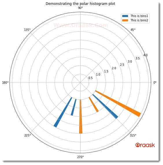
- Next, we created another user-defined function named polar_histogram. Under this function, we first created the figure object. We specified the size of the figure using the figsize attribute. We created the axes object using the axes() function of matplotlib. We plotted the graph using the hist() function. We passed the theta and bins1 parameters for the first plot and similarly theta and bins2 for the second plot. For both plots, we specified the width and bottom attributes. The width determines the width of the bars, and the bottom determines the lower limit from which the bars should be placed.
- Now we specified the title of the plot using the title function and legends using the legend() function.
- Next, we created the main() function. This is the main driving code of the program. Under this function, we first imported the dataset using the pandas library. We used the read_csv() function to read the CSV file. Next, we created a data frame from the data using the DataFrame() function of pandas. Note that this is very important to select desired columns.
- We selected the “total_bedrooms” column and only 10 entries which we sliced using the slicing technique.
- We created bins for both plots and called the polar_histogram() function. Finally, we called the main() function using the following lines of codes: if __name__ == “main“: main()
Conclusion
This article taught us how to plot polar histogram plots in matplotlib. We used the hist() function of matplotlib to plot the same. Before that, we used the attribute projection =” polar” to define that we need a polar plot. Besides that, we learned about the associated functions and attributes. We also learned about other functions of numpy.
We strongly recommend that readers look up python matplotlib documentation to know more about the associated attributes and functions.


