How Can We Help?
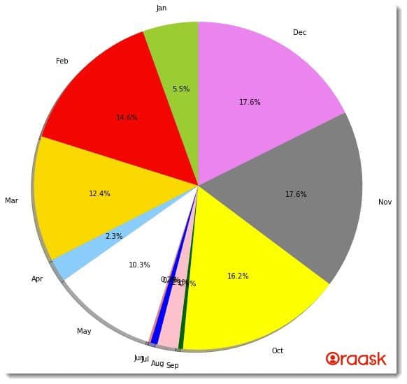
The pie chart is essential in python. It has wide usage in the field of business, economics, etc. It essentially represents a circle or ellipse or a similar-looking graph, and the percentage of the sectors represents the percentage share of different portions. At the same time, plotting the graph, we need to display the text representing what a particular portion of the sector represents. In this process, the texts often overlap with each other, making it difficult to understand the texts clearly.

In this article, we will understand different techniques to tackle such situations (Matplotlib Pie Chart Labels Overlap).
[adinserter block=”1″]
Example (1)
# Import all the necessary packages and libraries in the code
import matplotlib.pyplot as plt
import numpy as np
# Creating a user-defined function called explode

def explode(values, months, colors):
    # Defining the size of the figure
    plt.figure(figsize=(9, 9))
    # Plotting the pie chart
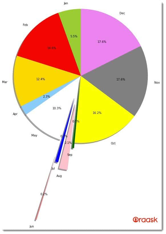
    plt.pie(values, labels=months, autopct='%1.1f%%', shadow=True,
            colors=colors, startangle=90, radius=1.2, explode=(0, 0, 0, 0, 0, 1.5, 0.4, 0.5, 0.1, 0, 0, 0))
    # Displaying the pie chart
    plt.show()
# Creating the main function

def main():
    # Creating a dataset for the chart
    values = np.array([24, 64, 54, 10, 45, 1, 3, 9, 2, 71, 77, 77])
    # Defining the label
    months = ['Jan', 'Feb', 'Mar', 'Apr', 'May', 'Jun',
              'Jul', 'Aug', 'Sep', 'Oct', 'Nov', 'Dec']
    # Defining the color of the pie chart sectors
    colors = ['yellowgreen', 'red', 'gold', 'lightskyblue',
              'white', 'lightcoral', 'blue', 'pink', 'darkgreen',
              'yellow', 'grey', 'violet', 'magenta', 'cyan']
    # Calling the function to plot the graph
    explode(values, months, colors)

# Calling the main function
if __name__ == '__main__':
    main()
Output:

Explanation:
- First, we have imported the libraries and packages to use in the code. We imported the pyplot module and the numpy library in the code.
- Next, we created the explode function. This is a user-defined function that takes three parameters: values, months, and colors. Under the function, we first defined the size of the figure using the figsize attribute of the figure function.
- Next, we used the pie function to plot the graph. We used several parameters here. We used the attribute explode to define the values of the explode. The explode attribute takes tuples as the arguments.
- Next, we used the show function to display the function.
- After the explode function, we used the main function. This is the driving code of the program. We used the array function of the numpy library to convert the list into an array.
- Next, we created another variable named months, where we stored the list elements, which we used as labels later. Next, we also defined the colors of the slices to be used later.
- We called the explode function to plot the graph by passing the appropriate parameters.
- Finally, we called the main function using the following lines of codes:
if __name__ == ‘main‘: main()
[adinserter block=”2″]
Check This: I have wrote a full guide on Matplotlib Pie Chart if you want to know more about pie charts in python matplotlib library (What it is and how to plot a pie plot using different functions and techniques).
Creating Legends
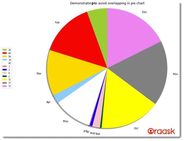
The best way to tackle the problem of overlapping labels in the pie chart is to use the labels separately in the plot. We can keep all the labels in a separate rectangular space which makes the figure cleaner. We can use the legend function of the pyplot library for the same.
Example (2)
# Import all the necessary packages and libraries in the code
import matplotlib.pyplot as plt
# Creating a user-defined function called explode

def explode(values, months, colors):
    # Defining the size of the figure
    plt.figure(figsize=(9, 9))
    # Plotting the pie chart
    plt.pie(values, labels=months, shadow=True,
            colors=colors, startangle=90, radius=1.2)
    plt.legend(values, loc='center left', bbox_to_anchor=(-0.35, .5), fontsize=8)
    plt.title("Demonstrating to avoid overlapping in pie chart")
    # Displaying the pie chart
    plt.show()
# Creating the main function

def main():
    # Creating a dataset for the chart
    values = [24, 64, 54, 10, 45, 1, 3, 9, 2, 71, 77, 77]
    # Defining the label
    months = ['Jan', 'Feb', 'Mar', 'Apr', 'May', 'Jun',
              'Jul', 'Aug', 'Sep', 'Oct', 'Nov', 'Dec']
    # Defining the color of the pie chart sectors
    colors = ['yellowgreen', 'red', 'gold', 'lightskyblue',
              'white', 'lightcoral', 'blue', 'pink', 'darkgreen',
              'yellow', 'grey', 'violet', 'magenta', 'cyan']
    # Calling the function to plot the graph
    explode(values, months, colors)

# Calling the main function
if __name__ == '__main__':
    main()
[adinserter block=”3″]
Output:

Explanation:
- First, we imported all the necessary libraries and packages in our code using the import statement of python. We imported the pyplot module of the matplotlib library.
- Next, we have created a user-defined function called explode. This is a void function, and it takes only three parameters, called values, months, and colors. Under this function, we first defined the size of the figure using the figsize attribute of the figure function of pyplot. Next, we plotted the graph using the pie function of the pyplot. We passed the values arguments to this function as the data points we need to plot. We also provided the labels by using the labels attribute. We provided the parameter shadow=True to enable shadow.
- We used the title function to define the title of the pie chart. After the explode function, we created the main function. The main function is the driving code of the program. Under this function, we first created the data points. We used a hard-coded list as the value. We stored the list value in variable named values. We created another list, called months, which we later used as the pie chart label. Next, we created another list called colors. This list contains the name of the colors we have used in the pie chart slices.
- Next, we called the explode function to plot the graph.
[adinserter block=”4″]
Conclusion
In this article, we understood how to avoid overlapping the labels in python matplotlib. We first understood that using the explode attribute could solve this problem. However, it is not much convenient to use. This is because we have to explode the cliche that we need to explode manually. So this is a somewhat expensive task to perform. We also saw the usage of legend instead, which is more convenient to use.
We strongly recommend that readers look up the python matplotlib documentation to understand the topic more.


