How Can We Help?
Introduction
The polar plot is circular-looking. We use this graph to represent values with both real and imaginary parts. These plots find their usage in engineering, economics, etc. Sometimes we may need to set labels to the axis of this plot to mark essential parts of the graph. This article will explain how to set labels for the matplotlib plot.
Using the text Function
The most popular method to set labels along the matplotlib axes is using the text function. This is an in-built function of matplotlib, and we use this to place labels, texts, annotations, etc., in the plot.
Example (1)
[adinserter block=”1″]
# Importing all the necessary libraries and packages in the code
import numpy as np
import matplotlib.pyplot as plt
# Defining a user-defined function named polar_plot


def polar_plot(r, theta):
    # Creating a figure object
    plt.figure(figsize=(9, 9))
    # Dedining the subplots and axes object
    ax = plt.subplot(111, projection='polar')
    # Plotting the graph
    ax.plot(theta, r)
    # Defining the maximum value of the radius
    ax.set_rmax(5)
    ax.margins(y=0)
    ax.set_rticks([0.4, 1, 1.5])
    ax.set_rlabel_position(120)
    # Enbling grid in the plot
    ax.grid(True)
    tick = [ax.get_rmax(), ax.get_rmax()*0.97]
    for t in np.deg2rad(np.arange(0, 360, 5)):
        ax.plot([t, t], tick, lw=0.72, color="orange")
    ax.text(2.5, 1, 'My label',
            rotation=45, ha='center', va='center')
    # Defining the title of the plot
    ax.set_title("A line plot on a polar axis", va='bottom')
    # Displaying the plot
    plt.show()
# Defining the main function


def main():
    # Creating the data points for the polar plot
    r = np.arange(0, 5, 0.1)
    theta = 2 * np.pi * r
    polar_plot(r, theta)


# Calling the main function
if __name__ == "__main__":
    main()
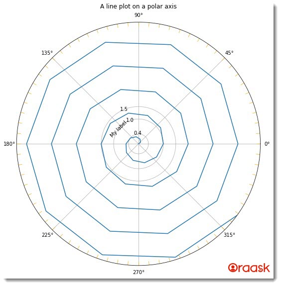
Output:

Explanation:
- First, we imported all the necessary libraries and packages in our code using the python import statement. We have used the alias names for convenience in writing the codes in our program.
- Next, we have created a user-defined function named polar_plot. This function takes two arguments, namely r and theta. This is a void function.
- Under this function, we have first defined the size of the figure using the figure function and the figsize attribute. Next, we used the subplot function to create an axes object for the plot. We used the attribute projection-=”polar” to make a polar plot.
- Next, we used the plot function to plot the graph. We used several other functions for the plot. For example, we used the set_rmax, which defines the maximum value of the radius we need to display in our plot. We also used the margins and the set_rtricks attributes to create margins and major tricks in the plot.
- Next, we plotted the tricks in the plot using the following lines of codes: for t in np.deg2rad(np.arange(0, 360, 5)): ax.plot([t, t], tick, lw=0.72, color=”orange”)
- Now we have used the text function to display the text/label in the plot. We passed two numerical values to the text function, which defines the position where we need to place the text.
- We also defined the title of the plot using the set_title function.
- After the polar_plot function, we created the main function. The main function is the driving code of the program. Under this function, we have created all the data points and called the polar_plot function to plot the graph.
- We finally called the main function using the following lines of codes: if __name__ == “main“: main()
[adinserter block=”2″]
Check This: There is a full guide on Matplotlib Polar Plot if you want to know more about Polar plot like (What it is and a lot more examples of it).
Defining The Labels Along The Axis
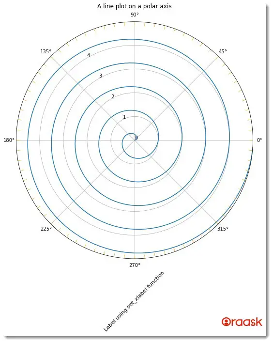
We can also define the labels along the axes using the set_xlabel and the set_ylabel function. The functions take the label’s text as the essential argument and several other nonessential arguments. For example, it takes the rotation argument to define the rotation of the text concerning the horizontal axis.
Example (2)
# Importing all the necessary libraries and packages in the code
import numpy as np
import matplotlib.pyplot as plt
# Defining a user-defined function named polar_plot


def polar_plot(r, theta):
    # Creating a figure object
    plt.figure(figsize=(9, 9))
    # Dedining the subplots and axes object
    ax = plt.subplot(111, projection='polar')
    # Plotting the graph
    ax.plot(theta, r)
    # Defining the maximum value of the radius
    ax.set_rmax(5)
    ax.margins(y=0)
    ax.set_rticks([float(x) for x in range(0,5)])
    ax.set_rlabel_position(120)
    # Enbling grid in the plot
    ax.grid(True)
    tick = [ax.get_rmax(), ax.get_rmax()*0.97]
    for t in np.deg2rad(np.arange(0, 360, 5)):
        ax.plot([t, t], tick, lw=0.72, color="orange")
    ax.set_xlabel('Label using set_xlabel function', rotation=45, size=11)
    # Defining the title of the plot
    ax.set_title("A line plot on a polar axis", va='bottom')
    # Displaying the plot
    plt.show()
# Defining the main function


def main():
    # Creating the data points for the polar plot
    r = np.arange(0, 5, 0.01)
    theta = 2 * np.pi * r
    polar_plot(r, theta)


# Calling the main function
if __name__ == "__main__":
    main()
Output:

Explanation:
[adinserter block=”3″]
- First, we have imported the numpy library and the pyplot module in the code using the import statement of python.
- Next, we have created a user-defined function named scatter. The function takes four arguments: distance, theta, colors, and area. Under this function, we have written the codes to plot the scatter polar plot. We have first defined the figure object using the figure function. We used its figsize attribute to define its size. Next, we used the add_subplot function to create the axes object, namely the ax. We used the attribute projection=”polar” to mention that we wanted to plot a polar plot.
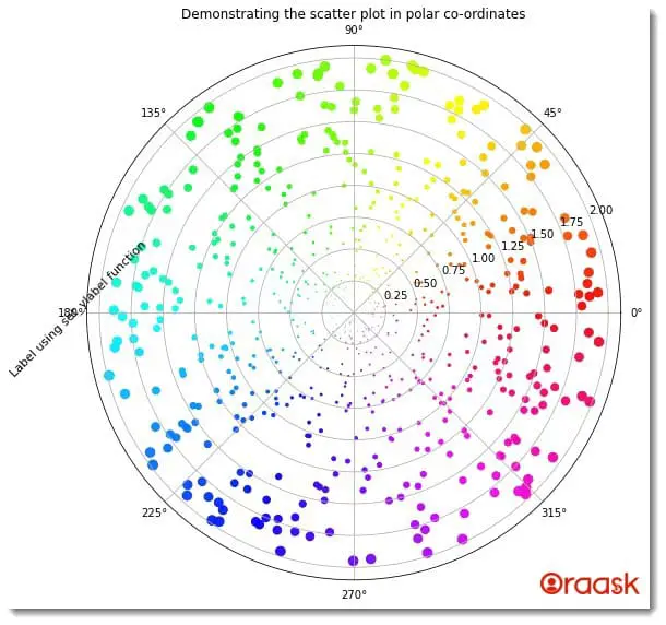
- Now we have plotted the graph using the scatter function. We passed all the required parameters in the function, like the theta, distance, etc. We specified the color map and plot area using the “c” and the “s” attributes.
- Next, we used the set_ylabel function to add a label along the y-axis. We used several other attributes with this function. For example, we have used the rotation attribute to define the rotation of the text concerning the horizontal direction. We used the title function to define the title of the plot.
- After the scatter function, we created the main function. The main function is the driving code of the program. Under this function, we have created all the data points we need for the program. We called the scatter function to plot the graph.
- Finally, we called the main function using the following lines of codes: if __name__ == ‘main‘: main()
We can also create labels along the y-axis using the ylable function. The below code shows the implementation.
Example (3)
# import all the necessary libraries and packages in the code
import numpy as np
import matplotlib.pyplot as plt
# creating a user-defined function named scatter


def scatter(distance, theta, colors, area):
    # creating the figure object
    fig = plt.figure(figsize=(9, 9))
    # creating the axis object and setting the projection to be polar
    ax = fig.add_subplot(projection='polar')
    # plotting the graph
    c = ax.scatter(theta, distance, c=colors, s=area, cmap='hsv', alpha=0.95)
    ax.set_ylabel('Label using set_ylabel function', rotation=45, size=11)
    plt.title("Demonstrating the scatter plot in polar co-ordinates")
# creating the main() function


def main():
    # defining random seed to that the numbers are not changed each time we refresh the code
    np.random.seed(42)
    # using a random function to set the distance
    distance = 2 * np.random.rand(700)
    # creating 600 data points for the angle subtended by the points
    theta = 2 * np.pi * np.random.rand(700)
    # defining the area of the points to be displayed
    area = 10 * distance**3
    # defining color values to be used for cmap
    colors = theta
    # calling the scatter() function
    scatter(distance, theta, colors, area)


# calling the main() function
if __name__ == '__main__':
    main()
Output:
[adinserter block=”4″]

Final Words
This article taught us how to set labels along the matplotlib polar axes. We first saw how to use the text function of matplotlib to achieve the same. Later we saw how to use the xlabel land the ylabel functions to set labels along the x and the y axes.
We strongly recommend that the readers look up all the functions we used in this article in the python matplotlib documentation to understand the associated functions better.


