How Can We Help?
Introduction
The box plot is famous for visualizing the measures of central tendencies, like the median, quartile, etc., from the first until the third quartile. A straight line is also aligned vertically through the box plot. This line passes through the median of the data.
The x-axis of such a plot represents the data we need to plot, and the y-axis denotes the frequency distribution of the data.
A box plot is a type of chart used to display the distribution of data based on the five-number summary (minimum, first quartile, median, third quartile, and maximum). It shows outliers and skewness of the data. Matplotlib is a popular Python library used to create visualizations, including box plots.
Using The Boxplot Function
There is an inbuilt function available in python matplotlib. The function which we can use is the boxplot function. This function takes a list or array-like object as the parameter /value and plots the box plot accordingly in the figure. We can also pass multiple arrays to the boxplot function.
This will create multiple box plots in the exact figure.
Example (1)
# Importing all the necessary libraries and packages in the code
import numpy as np
import random
import matplotlib.pyplot as plt


def box_plot(uniform):
    # creating figure
    fig = plt.figure(figsize=(9, 9))
    # Creating the axes
    ax = plt.axes()
    # plotting violin plot for uniform distribution
    ax.set_title('Uniform Distribution in box plot')
    # plotting the uniform distribution
    ax.boxplot(uniform)
    # Defining the label along the x-axis
    plt.xlabel("X axis")
    # Defining the label along the y axis
    plt.ylabel("Y axis")
    # Function to show the plot
    plt.show()


def main():
    # Creating the data point
    uniform = [int(x+random.randint(1, 10)) for x in range(1, 10, 1)]
    # Printing the data point
    print(uniform)
    # Calling the viloin_plot function to plot the violin plot
    box_plot(uniform)


# Calling the main function
if __name__ == "__main__":
    main()
Output:
[3, 4, 5, 6, 11, 8, 12, 10, 19]
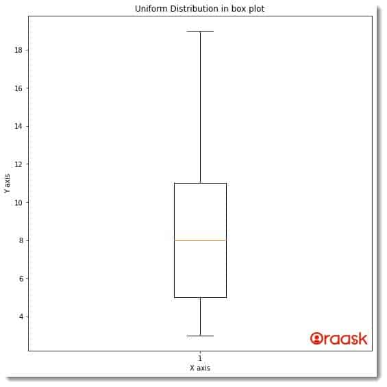
Explanation:
- Using the python import statement, we first imported the numpy and the random library in our code. Next, we have created a user-defined function named box_plot. This function takes only one parameter, namely uniform. Under this function, first, we have defined the size of the figure using the figsize attribute of the figure function.
- Next, we used the axes function to create the axes object. We set the title of the plot using the set_title function of the pyplot module. We plotted the graph using the boxplot function.
- Using the xlabel and the ylabel function, we have created the labels along the axes. We used the show function to display the plot. Note that using the show function in the Jupyer Notebook is optional.
- After the box_plot function, we created the main function. The main function is the driving code of the program. Under this function, we have created the data points needed for the plot. We used the method of list comprehension to create the list named uniform. This list contains the data points required to plot the graph.
- Next, we have called the box_plot function to plot the graph.
- Finally, we called the main function using the following lines of codes: if __name__ == “main“: main()
Attributes associated with the boxplot function
Matplotlib boxplot has quite a lot of associated attributes. Some of the most widely used attributes among them are as follows:
- data: The list or some array-like objects representing the dataset.
- notch: This is an optional parameter, and it accepts a boolean value.
- vert: This is an optional parameter. This accepts boolean True and boolean False values. If set to True, this will place the ox plot vertically or horizontally.
- positions: This parameter accepts a list or array-like objects as the value. This is used to set the position of the box plot in the figure.
- order: This is an optional argument. This defines the order in which the box plot needs to be placed in the figure.
Plotting Multiple Box Plot
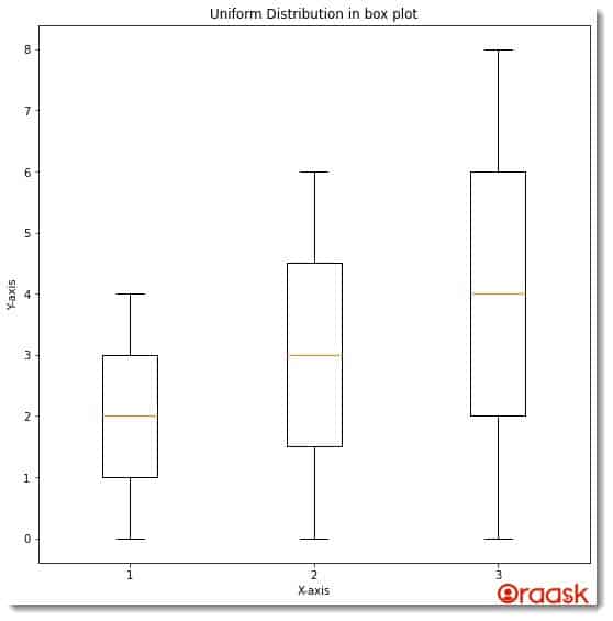
Sometimes we may need to compare two or more datasets in the exact figure for better comparison. We do not need to create any separate plots or subplots for the same. We can plot them in a single figure. This helps to compare different data sets within the same plot. We only need to create a collection out of the dataset and pass it as a parameter to the boxplot function.
Example (2)
# Importing all the necessary libraries and packages in the code
import numpy as np
import matplotlib.pyplot as plt
import numpy as np
import matplotlib.pyplot as plt
from random import randint


def box_plot(l1, l2, l3):
    # creating figure
    fig = plt.figure(figsize=(9, 9))
    # Creating the axes
    ax = plt.axes()
    # plotting violin plot for uniform distribution
    ax.set_title('Uniform Distribution in box plot')
    # Creating a random collection
    random_collection = [l1, l2, l3]
    # plotting the uniform distribution
    violinplot = ax.boxplot(random_collection)
    # Defining the label along the x-axis
    plt.xlabel("X-axis")
    # Defining the label along the y axis
    plt.ylabel("Y-axis")
    # Function to show the plot
    plt.show()


def main():
    # Creating 3 empty lists
    l1 = [int(x) for x in range(random.randint(1,10))]
    l2 = [int(x) for x in range(random.randint(1,10))]
    l3 = [int(x) for x in range(random.randint(1,10))]
    print(f"First random list created is: {l1}")
    print(f"Second random list created is: {l2}")
    print(f"Third random list created is: {l3}")

    # Calling the viloin_plot function to plot the violin plot
    box_plot(l1, l2, l3)


# Calling the main function
if __name__ == "__main__":
    main()
Output:
First random list created is: [0, 1, 2]
Second random list created is: [0, 1, 2, 3, 4]
Third random list created is: [0, 1, 2, 3, 4, 5, 6, 7]
Plotting Horizontal Box Plot
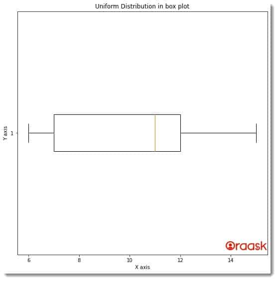
Matplotlib also allows us to plot the box plot horizontally. Hence the plot shall lean along the x-axes. We only need to pass a single attribute to achieve the same. The attribute is vert=False to the boxplot function. The rest of the code shall remain the same.
Example (3)
# Importing all the necessary libraries and packages in the code
import numpy as np
import matplotlib.pyplot as plt
def box_plot(uniform):
    # creating figure
    fig=plt.figure(figsize=(9,9))
    # Creating the axes
    ax=plt.axes()
    # plotting violin plot for uniform distribution
    ax.set_title('Uniform Distribution in box plot')
    # plotting the uniform distribution
    ax.boxplot(uniform,vert=False)
    # Defining the label along the x-axis
    plt.xlabel("X axis")
    # Defining the label along the y axis
    plt.ylabel("Y axis")
    # Function to show the plot
    plt.show()
def main():
    uniform = [int(x+random.randint(1, 10)) for x in range(1, 10, 1)]
    # Calling the viloin_plot function to plot the violin plot
    box_plot(uniform)
# Calling the main function
if __name__ == "__main__":
    main()
Output:
Specifying the median and outliers in The Violin Plot
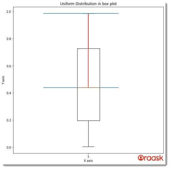
In the violin plot, we can also specify the median, outliers, etc. For this, we can adopt the following steps:
- First, define the quartile, median, and mean of the data from the data sets. You can either use the NumPy array functions or other techniques that you can use to calculate them.
- Next, you need to use the boxplot function to plot the figure. In the figure itself, we need to use the vlines and hlines functions of the matplotlib to mark the median, outliers, etc., in the plot.
Example (4)
import matplotlib.pyplot as plt
def box_plot(data,quartile1, median, quartile3):
    # creating figure
    fig = plt.figure(figsize=(9, 9))
    # Creating the axes
    ax = plt.axes()
    # Creating the plot
    plt.boxplot(data)
    # Defining a vertical line
    plt.vlines(1, quartile1,quartile3,color='r',linestyle='-')
    # Defining horizontal lines
    plt.hlines(quartile1,.7,1.2)
    plt.hlines(quartile3,.7,1.2)
    # plotting violin plot for uniform distribution
    ax.set_title('Uniform Distribution in box plot')
    # Defining the label along the x-axis
    plt.xlabel("X axis")
    # Defining the label along the y axis
    plt.ylabel("Y axis")
    # Function to show the plot
    plt.show()
def main():
    np.random.seed(42)
    data = np.random.random(111)
    quartile1, median, quartile3 = np.percentile(data,[ 50, 75,100],axis=0)
    # Calling the viloin_plot function to plot the violin plot
    box_plot(data,quartile1, median, quartile3)
# Calling the main function
if __name__ == "__main__":
    main()
Output:
Using The Box Plot With CSV Files
Until now, we have learned how to plot the box plot with custom-defined datasets. However, in real life, it is highly unlikely that we will be working with custom datasets. We will instead be working with some real-life datasets available to us. These data are usually available to us in excel or CSV file formats. So in this section, we will learn how to plot box plots using the data from the CSV file. We first need to use data processing libraries like the pandas to read the CSV file and create columns out of it.
Before proceeding with the code, first, follow the below steps:
- Download the data set in the same directory where you will keep your.py file.
- Click on the below link https://www.kaggle.com/datasets/ashydv/housing-datasetk
- Next, click on the Download option to download the zip file.
- Next, go to the directory where you downloaded the zip file and extract it to the same directory where you have kept the .py file.
Example (5)
# Importing all the necessary libraries and packages in the code
import numpy as np
import matplotlib.pyplot as plt
import pandas as pd
def box_plot(x,y):
    # creating figure
    fig = plt.figure(figsize=(9, 9))
    # Creating the axes
    ax = plt.axes()
    # Create a plot
    ax.boxplot([x,y])
    # Add title
    ax.set_title('Uniform Distribution in box plot')
    # Defining the label along the x-axis
    plt.xlabel("X axis")
    # Defining the label along the y axis
    plt.ylabel("Y axis")
    # Function to show the plot
    plt.show()
def main():
    # Reading the CSV file
    data = pd.read_csv("Housing.csv")
    # Creating a data frame
    df=pd.DataFrame(data)
    # Selecting the bedrooms column
    bedrooms = df['bedrooms']
    # Selecting the bathrooms column
    bathrooms = df['bathrooms']
    # Calling the viloin_plot function to plot the violin plot
    box_plot(bedrooms,bathrooms)
# Calling the main function
if __name__ == "__main__":
    main()
Output:
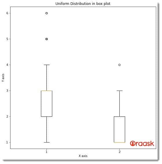
Explanation:
- First, we have imported all the necessary libraries and packages in our code using the import statement. Note that we can import the libraries and packages anywhere in our code. But for convenience, it is recommended to import them at the top.
- Next, we have created a user-defined function, namely box_plot. This function takes two parameters, namely x, and y. This is also a void function.
- Under this function, we first created the figure object using the figure function of the pyplot module. Next, we created the axes object using the axes function of pyplot.
- Next, we used the boxplot function to plot the graph. We also used the set_title function to define the title of the plot. Next, we used the xlabel and the ylabel functions to define labels along the x and y axes.
- After the box_plot function, we created the main function. This is the driving code of the program. Under this function, we first used the read_csv file to read the CSV file. Next, we used the DataFrame function to create a data frame out of the dataset available. We then selected two columns from the datasets, namely the bedrooms and the bathrooms.
- We called the box_plot function to plot the graph. Finally, we called the main function with the help of the following lines of codes: if __name__ == “main“: main()
Example (6)
# Importing all the necessary libraries and packages in the code
import numpy as np
import matplotlib.pyplot as plt
import pandas as pd
def box_plot(price):
    # creating figure
    fig = plt.figure(figsize=(9, 9))
    # Creating the axes
    ax = plt.axes()
    # Create a plot
    ax.boxplot([price])
    # Add title
    ax.set_title('Uniform Distribution in box plot')
    # Defining the label along the x-axis
    plt.xlabel("X axis")
    # Defining the label along the y axis
    plt.ylabel("Y axis")
    # Function to show the plot
    plt.show()
def main():
    # Reading the CSV file
    data = pd.read_csv("Housing.csv")
    # Creating a data frame
    df=pd.DataFrame(data)
    # Selecting the price column
    price = df['price']
    # Calling the viloin_plot function to plot the violin plot
    box_plot(price)
# Calling the main function
if __name__ == "__main__":
    main()
Output:
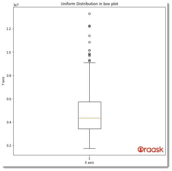
Conclusion:
In this article, we have learned how to plot the box plot in matplotlib using the boxplot function of multiple. We learned about the associated attributes and functions.
We strongly recommend that readers look up the python documentation to understand the topic more. Additionally, we encourage the readers to post their queries in our Oraask forum.


