How Can We Help?
The heatmap is a data visualization tool in matplotlib python. It is used to display the magnitude of any particular phenomenon in the form of color differences. However, this is only applicable to two-dimensional plots.
What is a Heatmap in Python Matplotlib? A heatmap is a plot used to represent the relative values of the data sets/points on a graph using color contrasts. This type of graph is used mainly in business, stock markets, etc.
In this article, we will discuss how to plot the matplotlib heatmaps and their associated attributes with them.
Simple Heatmap
Creating a simple heatmap is a straightforward task. All you have to do is to import the matplotlib.pyplot() module then uses the imshow() function and passes the necessary parameters to the function.
Let us create a basic heatmap in matplotlib:
Example
#import all the necessary libraries and modules
import numpy as np
import matplotlib.pyplot as plt
#create a user defined function to plot the heatmap
def heatmap(x,y):
    #creating the data points using the parameters
    data_points=np.random.random((x,y))
    #plotting the heatmap
    plt.imshow(data_points)
def main ():
    x=10
    y=10
    heatmap(x,y)
#calling the main() function
if __name__ == "__main__":
    main ()
Output
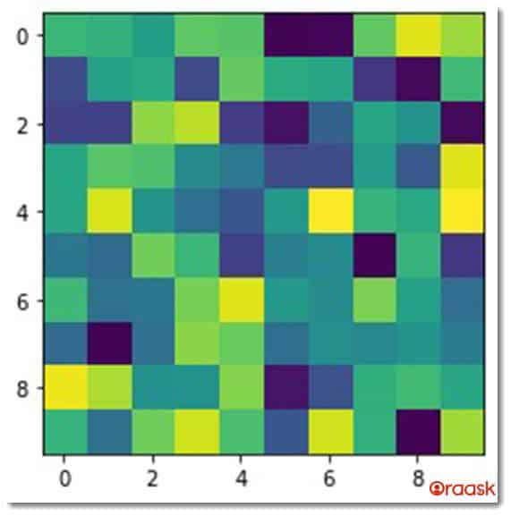
Explanation
- First, we imported all the necessary libraries and modules into the code. Here we imported the numpy and matplotlib.pyplot. We have used the technique of aliasing for convenience.
- Now we created a user-defined function called heatmap (). It takes two parameters, i.e., x and y. Now we created a variable named data_points and created a numpy array using the parameters x and y as the arguments. Finally, we used the plt.imshow() function to plot the heatmap in the figure.
- Next, we created the main () function. We passed the value to the variables x and y. Then we called the heatmap () function and passed x and y arguments to the function.
- Finally, we called the main () function using the following codes:
if __name__ == "__main__":
    main ()
Attributes Associated with the imshow() Function
- norm: This attribute is used for scaling the data in the range of 0 to 1 before plotting the data. However, if the RGB color is specified, this attribute is ignored.
- aspect: This will either take auto or float as the value. It will determine whether the cells shall be square or in the form of a rectangle by specifying the aspect ratios.
- If we pass “equal” as the value to this parameter, the cells will be square. On the other hand, if we pass “auto”, then it will mostly be a rectangular shape.
- alpha: This will take a float value between 0 to 1. It determines the opacity of the cells.0 means transparent cell, and 1 means opaque cell. We must consider that alpha must have the same dimension as the value of x.
- resample: This attribute takes Boolean True and Boolean False as arguments. If set to True, then matplotlib will resample the image if the output image size is larger than the input image.
Labeled Heatmap
Depending upon our requirements, we can add any desired number of other attributes and labels to the heatmaps. Just like any other matplotlib.pyplot() plots we can use the functions like the xlabel(), ylabel(),title() functions in the heatmap function. These will make the heatmap more informative.
Example
#import all the necessary libraries and modules
import numpy as np
import matplotlib.pyplot as plt
#create a user defined function to plot the heatmap
def heatmap(x,y):
    #creating the data points using the parameters
    data_points=np.random.random((x,y))
    #Passing labels to the plot
    plt.xlabel("X values")
    plt.ylabel("Y values")
    #Passing title to the plot.
    plt.title("Demonstration of heatmap plot")
    #plotting the heatmap
    plt.imshow(data_points)
def main ():
    x=5
    y=5
    heatmap(x,y)
#calling the main() function
if __name__ == "__main__":
    main ()
Output
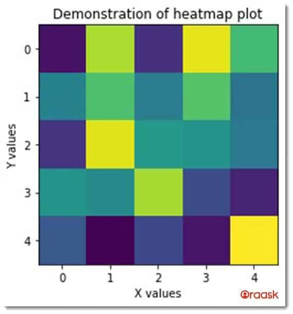
Using the pcolormesh () Function
Matplotlib. pyplot itself offers another exciting method to plot heatmap in the graphs. The syntax of the code is similar to the previous function.
Example
#import all the necessary libraries and modules
import numpy as np
import matplotlib.pyplot as plt
#create a user defined function to plot the heatmap
def heatmap(x,y):
    #creating the data points using the parameters
    data_points=np.random.random((x,y))
    #plotting the heatmap
    plt.pcolormesh(data_points)
    #Passing labels to the plot
    plt.xlabel("X values")
    plt.ylabel("Y values")
    #Passing title to the plot.
    plt.title("Demonstration of heatmap plot")
    plt.show()
def main():
    x=5
    y=22
    heatmap(x,y)
#calling the main() function
if __name__ == "__main__":
    main()
Output
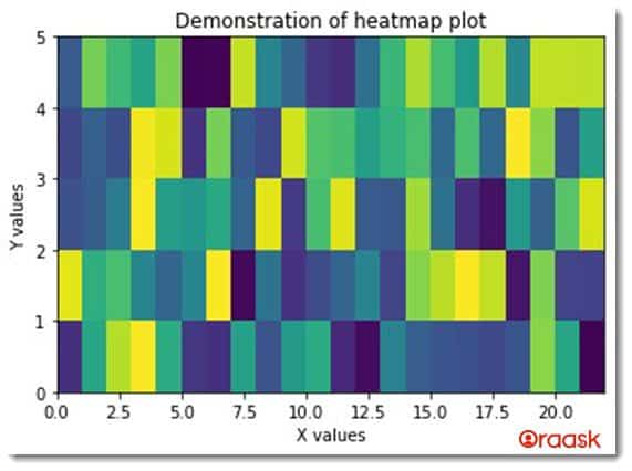
Explanation
- We imported matplotlib.pyplot and numpy libraries using the import statement.
- We then created a user-defined function called the heatmap (). It takes two parameters, i.e., x and y. Under the function, we created a variable named data_points using the numpy library. We passed x and y as the parameters to the np.random.random() function.
- We plotted the heatmap using the pcolormesh () function. We passed the data_points as the arguments to this function.
- We gave labels to the graphs using the xlabel() and ylabel() functions.
- We then gave the title to the graph using the plt.title () function.
- We then created the main () function. We created the values of x and y. We called the heatmap () function and passed x and y as the arguments.
- We finally called the main() function using the following code:
if __name__ == "__main__":
    main()
Heatmap with Color Bar
Usually, the seaborn library is preferred for plotting the heatmap along with color bars because, by default, it provides the color bar.
Using the Seaborn Python Library
We can also use many other libraries to plot the heatmaps other than the matplotlib. For this, we need to import the seaborn library.
If you have not installed the seaborn library, then type the following command in the PowerShell:
pip install seabornExample
#import all the necessary libraries and modules
import numpy as np
import matplotlib.pyplot as plt
import seaborn as sns
#create a user defined function to plot the heatmap
def heatmap(x,y):
    #creating the data points using the parameters
    data_points=np.random.random((x,y))
    #plotting the heatmap
    ax=sns.heatmap(data_points)
def main():
    x=10
    y=10
    heatmap(x,y)
#calling the main() function
if __name__ == "__main__":
    main()
Output
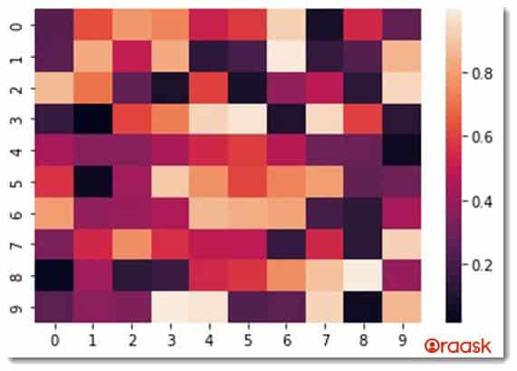
Explanation
- We imported three libraries using user-defined alias names. We imported numpy, matplotlib. pyplot and seaborn.
- Next, we created a user-defined function heatmap (). The function takes two parameters i.e., x and y. Under the function, we created variable data_points and stored an array-like object using the numpy library. We used the values of x and y to be used as their parameters.
- Next, we used seaborn’s heatmap () function to plot the heatmap in the graph.
- Next, we created the main () function. We created the variables x and y. We called the heatmap() function and passed the values of x and y as the arguments.
- Finally, we called the main () function using the following code:
if __name__ == "__main__":
    main ()
We can also add many other attributes to the heatmap() function to make the plot more informative. you can refer to the matplotlib reference here for more attributes
Example
#import all the necessary libraries and modules
import numpy as np
import matplotlib.pyplot as plt
import seaborn as sns
#create a user defined function to plot the heatmap
def heatmap(x,y):
    #creating the data points using the parameters
    data_points=np.random.random((x,y))
    #plotting the heatmap
    ax=sns.heatmap(data_points)
    #Passing labels to the plot
    plt.xlabel("X values")
    plt.ylabel("Y values")
    #Passing title to the plot.
    plt.title("Demonstration of heatmap plot")
    plt.show()
def main():
    x=5
    y=22
    heatmap(x,y)
#calling the main() function
if __name__ == "__main__":
    main()
Output

Parameters Associated with Seaborn Heatmap
- data: If we specify this parameter, the index or the column from the pandas library will be used as the labels for the columns.
- vmin and vmax: This parameter accepts float as the value. And we use them to anchor the colormap (the one found to the right side).
- center: This also takes a float value. While dealing with divergent data, this will center align the colormap.
- robust: Boolean True or False. If we specify True to this attribute, the colormap will be computed with robust quantities instead of extreme values. Mean, median, standard deviations, etc., which are measures of central tendency, are all examples of robust quantities.
- annot: This takes Boolean True and False as the value. If we pass true to the attribute, then values will also be shown along with the bars in the heatmap.
- Linewidths: This will take float as the argument. This attribute specifies the width of the lines that separate the cells.
- linecolor: This will take a string as the argument with a valid name of the color.
- Square: Boolean True or False. If set to true, the cell of the graph will be square instead of a rectangle.
But what does the heatmap represents?
Although we understood the above explanation about the code and the syntax, precisely what the heatmap represents is not yet clear. It’s definitely not a conventional plot that we mostly encounter in mathematics.
So let us understand the actual mechanism of the code and what the heatmap is displaying in the graph.
Look at the following code:
#import all the necessary libraries and modules
import numpy as np
import matplotlib.pyplot as plt
import seaborn as sns
#create a user defined function to plot the heatmap
def heatmap(x,y):
    #creating the data points using the parameters
    data_points=np.random.random((x,y))
    #plotting the heatmap
    ax=sns.heatmap(data_points)
    #Passing labels to the plot
    plt.xlabel("X values")
    plt.ylabel("Y values")
    #Passing title to the plot.
    plt.title("Demonstration of heatmap plot")
    plt.show()
def show_values(x,y):
    data_points=np.random.random((x,y))
    print(data_points)
def main():
    x=2
    y=10
    show_values(x,y)
    heatmap(x,y)
#calling the main() function
if __name__ == "__main__":
    main()
Output
[[0.5044486 0.56854355 0.52739035 0.76294225 0.73023861 0.199933
0.44874862 0.02034535 0.11336132 0.93549538]
[0.95521931 0.3072625 0.12705713 0.29626776 0.75058221 0.12620712 0.62934023 0.44997971 0.81179765 0.73340075]]
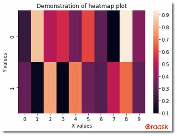
Now, look at the output and the graph. Notice there are two values, the y axis to the left and a scale from 0.1 to 0.9 to the right. Observe again that there are 20 small bars in the graph. Now notice the output where you find a two-dimensional array with 2 rows and 10 columns.
So, it is clear that the bars represent the data points. Now, look at the right of the graph, where you find values corresponding to different color contrasts. This is what the heatmap exactly represents. The color contrast of each bar represents the relative values of each of the bars against other bars.
For example, take the case of the top left corner bar, whose value is 0.5044486. It lies between 0.5 and 0.6 (see the right side). And hence its color is deep. Look at the right side of the previous bar, whose value is 0.95521931. Its value is more than 0.9, and hence its color is lighter (see the scale on the right side of the graph).
Conclusion
In this article, we have learned how to plot heatmap in python using different libraries and functions. We have learned to use the matplotlib and the seaborn library to plot the heatmap. Under the matplotlib.pyplot we used imshow() function and pcolormesh() function to plot the matplotlib heatmap. Under the seaborn, we used the heatmap () function to plot the heatmap.
However, the reader is encouraged to look up the python documentation to learn more about different attributes associated with the functions.


