How Can We Help?
Legends are important parts of the figure. They help one to distinguish different parts of the figure. Python allows us to customize the legend section of the figure in many ways, including changing the color, font size, font family, etc. This article will explain how to remove the legend border from the plot.
Using The frameon Argument
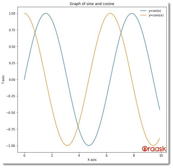
One of the most popular methods programmers often use to remove the legend border from the plot is to use the frameon argument. The frameon argument can only take two values: boolean True and False. If set to True, the legend will consist of borders; on the other hand, if the value is set to False, the legend will not consist of borders anymore.
Example (1)
[adinserter block=”1″]
# Import all the necessary libraries and packages in the code
import matplotlib.pyplot as plt
import numpy as np
# Create a user-defined function to plot the graph


def legend_outside(x,y1,y2):
    # Create the figure object
    fig = plt.figure(figsize=(9, 9))
    # Create the axes object
    ax = plt.subplot(111)
    # Plot the first graph
    ax.plot(x,y1)
    # Plot the second graph
    ax.plot(x,y2)
    # Using the legend function to define the legend
    ax.legend(["y=sin(x)","y=cons(x)"],frameon=False)
    # Define the title of the plot
    ax.set_title("Graph of sine and cosine")
    # Define the label along the x-axis
    ax.set_xlabel("X-axis")
    # Define the label along the y axis
    ax.set_ylabel("Y-axis")
    # show the figure object in the plot
    plt.show()
# Create the main function


def main():
    # Define the data points for the plot
    x = np.arange(0,10,0.1)
    y1=np.sin(x)
    y2=np.cos(x)
    # Call the legend_outside function to plot the graph
    legend_outside(x,y1,y2)


# Call the main function
if __name__ == "__main__":
    main()
Output:

Explanation:
- First, we have imported the pyplot module and the numpy library in our code using the python import statement. We have used their alias names for better convenience of the code.
- Next, we have created a user-defined function named legend_outside. The void function takes two arguments: x,y1, and y2. Under this function, we have first defined the figure object using the figure function of pyplot. We also defined the figure’s size using the function’s figsize attribute. Next, we have defined the axes object using the subplot function of pyplot. We have used the plot function to plot the two graphs. Next, we used the legend function to define the legend in the figure. We have used the frameon argument to False to hide the border.
- Next, we have defined the plot’s title using the set_title function. We also defined the labels along the x and the y axes using the set_xlabel and the set_ylabel functions.
- We used the show function at the end of the legend_outside function to display the plot. Note that in Jupyter Notebook, this is optional to use.
- After the legend_outside function, we created the main function. This is the main part of the program. Under this function, we have defined the data points for the plot. We used the arange function to create a numpy array. The arange function takes three parameters: start, stop, and step. The start defines the number with which the iteration should start, the number with which the iteration should stop, and the step defines the iterating step to create the array.
- We called the legend_outside function to plot the figure. Finally, we called the main function to execute our code.
Check This: There is a full guide on How to use Legend in Matplotlib if you want to know more about Legend.
Making The Legend Border Transparent
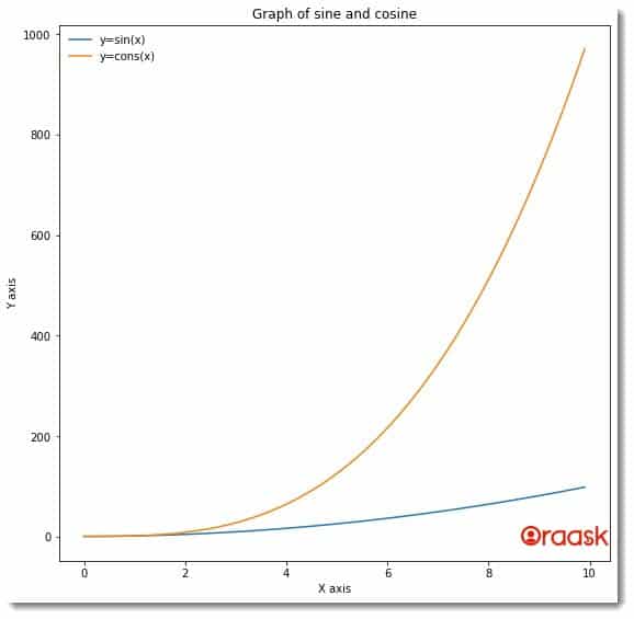
Another indirect way to achieve the same is to use the alpha argument and make the border transparent using the alpha value of 0. First, we need to grab the border component using the get_frame argument. The alpha argument takes float values between 0 and 1.0 representing no opacity, and 1 represents full opacity.
Example (2)
[adinserter block=”2″]
# Import all the necessary libraries and packages in the code
import matplotlib.pyplot as plt
import numpy as np
# Create a user-defined function to plot the graph


def legend_outside(x,y1,y2):
    # Create the figure object
    fig = plt.figure(figsize=(9, 9))
    # Create the axes object
    ax = plt.subplot(111)
    # Plot the first graph
    ax.plot(x,y1)
    # Plot the second graph
    ax.plot(x,y2)
    # Using the legend function to define the legend
    leg=ax.legend(["y=sin(x)","y=cons(x)"])
    # Making the legend border transparent
    leg.get_frame().set_alpha(0)
    # Define the title of the plot
    ax.set_title("Graph of sine and cosine")
    # Define the label along the x-axis
    ax.set_xlabel("X-axis")
    # Define the label along the y axis
    ax.set_ylabel("Y-axis")
    # show the figure object in the plot
    plt.show()
# Create the main function


def main():
    # Define the data points for the plot
    x = np.arange(0,10,0.1)
    y1=np.power(x,2)
    y2=np.power(x,3)
    # Call the legend_outside function to plot the graph
    legend_outside(x,y1,y2)


# Call the main function
if __name__ == "__main__":
    main()
Output:

Explanation:
- We have imported the pyplot module and the numpy library into the program. Note that we can import them anywhere in the code, but importing them at the file’s header is convenient.
- Next, we created the legend_outside function. This is a void function. We use this function to create the plot. Under this function, we first defined the figure object using the figure function. We also defined the size of the figure using the figsize attribute.
- Next, we used the subplot function to create the ax object. After that, we used the plot function to plot the graph.
- We have defined the legend using the legend function. We have used the set_alpa function to set the opacity of the legend border to 0.
- Next, we used the set_title function to define the plot’s title and the set_xlabel and the set_ylabel functions to define the labels along the x and y axes, respectively.
- We also used the show function to show the plot.
- After the legend_outside function, we have defined the main function. The main function is the driving code of the program. Under this function, we have defined all the data points we need to plot the figure.
- Next, we have called the legend_outside function to plot the figure.
- Finally, we used the following lines of codes to call the main function: if __name__ == “main“: main()
Using set_linewidth Argument
[adinserter block=”3″]
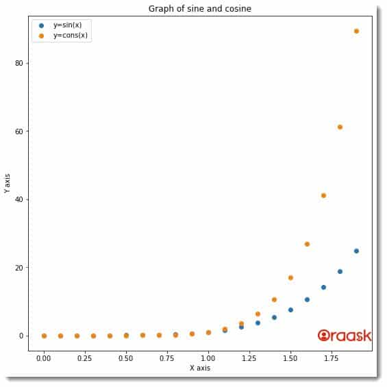
We can adopt several indirect methods to hide the border from the legends. One such method is to set the linewidth of the legend border to 0 instead of 1. This will indirectly hide the legend border since the legend’s border virtually doesn’t exist.
Example (3)
# Import all the necessary libraries and packages in the code
import matplotlib.pyplot as plt
import numpy as np
# Create a user-defined function to plot the graph


def legend_outside(x,y1,y2):
    # Create the figure object
    fig = plt.figure(figsize=(9, 9))
    # Create the axes object
    ax = plt.subplot(111)
    # Plot the first graph
    ax.scatter(x,y1)
    # Plot the second graph
    ax.scatter(x,y2)
    # Using the legend function to define the legend
    leg=ax.legend(["y=sin(x)","y=cons(x)"])
    # Making the legend border transparent
    leg.get_frame().set_linewidth(0.0)
    # Define the title of the plot
    ax.set_title("Graph of sine and cosine")
    # Define the label along the x-axis
    ax.set_xlabel("X-axis")
    # Define the label along the y axis
    ax.set_ylabel("Y-axis")
    # show the figure object in the plot
    plt.show()
# Create the main function


def main():
    # Define the data points for the plot
    x = np.arange(0,2,0.1)
    y1=np.power(x,5)
    y2=np.power(x,7)
    # Call the legend_outside function to plot the graph
    legend_outside(x,y1,y2)


# Call the main function
if __name__ == "__main__":
    main()
Output:

[adinserter block=”4″]
Conclusion
In this article, we have understood how to remove the legend border from the legend component in matplotlib. We saw one direct and one indirect method to achieve the same. Both methods are helpful. However, we can also use the latter method to change the legend border’s opacity, making it more usable.
We also recommend that the readers go through the python matplotlib documentation to explore more about these functions.


