How Can We Help?
Introduction
You may make a variety of plots with Matplotlib, a well-liked Python data visualization library, including histograms. Histograms are frequently used to show how a dataset is distributed. They aid in our comprehension of the data’s range, regularity, and pattern. In this post, we’ll look at how to use Matplotlib to plot two histograms on a graph.
Plot Two Histogram In a Single Chart
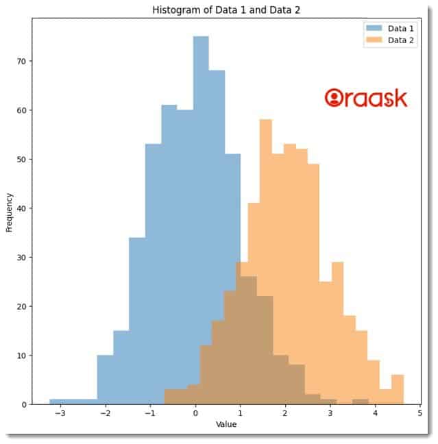
We do not need any additional function to plot two histograms in a chart in matplotlib. We need to call the hist() function with appropriate parameters twice to perform the same. Matplotlib will automatically draw both in a single child. Note that if two data exactly overlap each other, then only the histogram will be visible, which we called for the last time.
Example
import numpy as np
import matplotlib.pyplot as plt
# Generate random data for Histogram 1
np.random.seed(42)
data1 = np.random.normal(loc=0, scale=1, size=500)

# Generate random data for Histogram 2
data2 = np.random.normal(loc=2, scale=1, size=500)

plt.figure(figsize=(9,9))

# Plot Histogram 1
plt.hist(data1, bins=20, alpha=0.5, label='Data 1')

# Plot Histogram 2
plt.hist(data2, bins=20, alpha=0.5, label='Data 2')

# Add Legend
plt.legend(loc='upper right')

# Add Title and Axis Labels
plt.title('Histogram of Data 1 and Data 2')
plt.xlabel('Value')
plt.ylabel('Frequency')

# Show Plot
plt.show()
Output:

Explanation:
- First, using the Python import statement, we imported the numpy and the matplotlib library in the function.
- Next, we used random.seed() function generates random numbers. Here argument 42 has no practical significance. It has only become popular among the community to use it.
- Next, we used the normal function and passed the parameter size=500, which means we want to generate 500 random numbers.
- We stored the value in the variable named data1 and data2. Note that the loc parameter is a parameter that specifies the mean of the normal distribution. For example, loc=5 means the random numbers generated will have values centered around value 5.
- Next, we used the figure function and the filesize parameter to define the size of the figure. We used the hist function to plot the histogram charts of the data. We also used the legend function to define the legend of the chart. Next, we used the title function to define the title. It takes string data type. We also defined the labels along the axes using the xlabel and ylabel.
Note: For more information about Histogram in the Matplotlib library, follow this tutorial: Python Matplotlib Histogram
Conclusion
In this article, we have learned how to plot two histograms on a single chart using Matplotlib. We generated two sets of random data, plotted the histograms using the plt.hist() function, added a legend, and customized the chart with a title and axis labels. Histograms are a valuable tool for visualizing data and understanding its distribution. Matplotlib makes it easy to create professional-looking charts and graphs in Python.


