How Can We Help?
Matplotlib is a powerful data visualization library in Python that provides a variety of customizable charts and plots. One of the most common types of charts used in data visualization is the pie chart. Pie charts are a helpful way to represent data as a proportion of a whole. They are instrumental when you want to show the distribution of a categorical variable.
When creating a pie chart in Matplotlib, we can customize the matplotlib pie chart colors of each slice of the chart. In this blog post, we will explore how to customize the colors of a pie chart in Matplotlib.
Basic Pie Chart
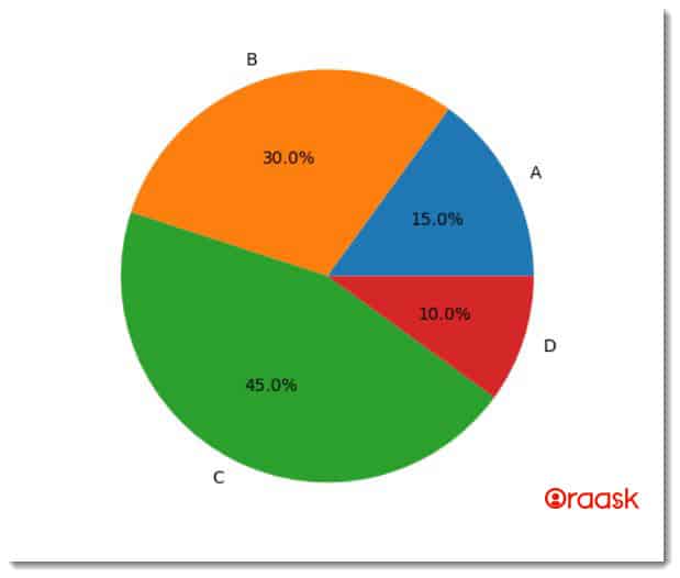
Before we dive into customizing the colors of a pie chart, let’s create a basic pie chart in Matplotlib. The following code creates a simple pie chart with four slices. By default, it utilizes colors from Matplotlib’s present property cycle.
Example (1):
# Importing all the necessary libraries and packages in the code
import matplotlib.pyplot as plt

# Defining a user-defined function named basic_pie
def basic_pie():

    #creating the labels for the plot
    labels = ['A', 'B', 'C', 'D']
    #creating the data points
    sizes = [15, 30, 45, 10]

    ax1 = plt.subplots()
    ax1.pie(sizes, labels=labels, autopct='%1.1f%%')
    ax1.axis('equal')

    # Displaying the plot
    plt.show()

def main():
    #calling the basic_pie() function
    basic_pie()

# Calling the main function
if __name__ == "__main__":
    main()
Output:

Explanation:
The labels list contains the labels for each slice of the pie chart. The sizes list contains the values for each slice of the pie chart. The autopct argument specifies how the values should be displayed on each chart slice. In this case, we display the values as percentages with one decimal point.
Check This: There is a full guide on Matplotlib Pie Charts if you want to know more about Polar plot like (What it is and a lot more examples of it).
Customizing Pie Chart Colors
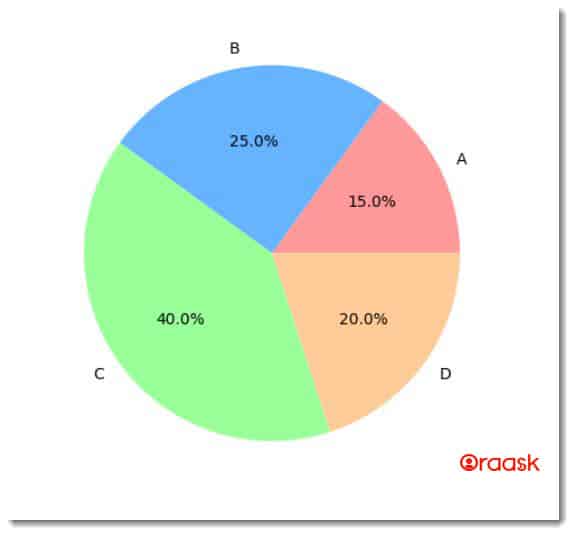
To customize the colors of a pie chart in Matplotlib, we need to provide a list of colors to the colors argument of the pie function. The following code creates a pie chart with custom colors:
Example (2):
import matplotlib.pyplot as plt

#creating the labels for the plot
labels = ['A', 'B', 'C', 'D']
#creating the data points
sizes = [15, 25, 40, 20]
#creating the color of each slice of the chart
colors = ['#ff9999','#66b3ff','#99ff99','#ffcc99']

fig1, ax1 = plt.subplots()
ax1.pie(sizes, colors=colors, labels=labels, autopct='%1.1f%%')
ax1.axis('equal')

# Displaying the plot
plt.show()
Output:

Explanation:
In this code, we added a colors list to specify the colors for each pie chart slice. The colors list contains four representing represent colors for each chart slice.
Check This: There is a full guide on Matplotlib Colors if you want to know more about colors in matplotlib.
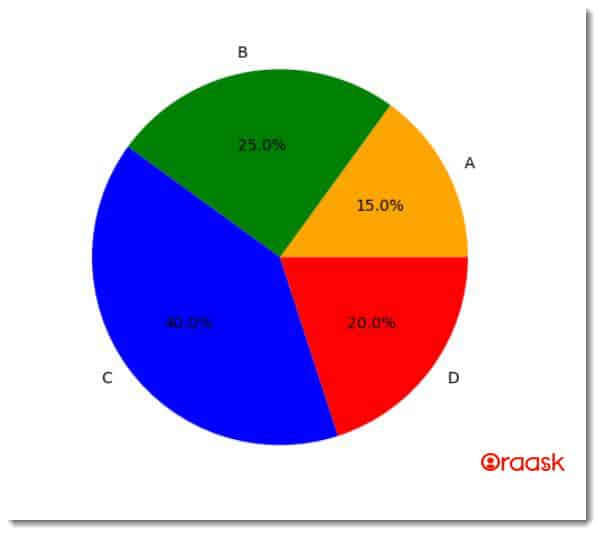
We can also use named colors instead of hex codes to specify the colors of the pie chart. The following code creates a pie chart with named colors:
Example (3):
import matplotlib.pyplot as plt

#creating the labels for the plot
labels = ['A', 'B', 'C', 'D']
#creating the data points
sizes = [15, 25, 40, 20]
#creating the color of each slice of the chart
colors = ['orange', 'green', 'blue', 'red']

fig1, ax1 = plt.subplots()
ax1.pie(sizes, colors=colors, labels=labels, autopct='%1.1f%%')
ax1.axis('equal')

# Displaying the plot
plt.show()
Output:

Explanation:
In this code, we have replaced the hex codes with named colors. The colors list contains four named colors representing the colors for each chart slice.
Conclusion
In this blog post, we have explored how to customize the matplotlib pie chart colors. By specifying a list of colors to the colors argument of the pie function, we can create pie charts with custom colors that best represent our data. With these customization options allow us to create visually appealing and informative pie charts to showcase our data.


