How Can We Help?
In the field of mathematics, economics, engineering, and business, we use quite a lot of graphs. Some of them are not in the rectangular coordinate system. Instead, they are in cylindrical, polar coordinates, etc. The polar plot is handy in the field of mathematics and engineering. This article will explain how to plot the polar bar plot in matplotlib.
Prerequisite:
We will use a few code libraries called numpy, pandas, and matplotlib.
- If you are a windows user, open the PowerShell and run the following commands: Pip install matplotlib numpy pandas
- If you are a Linux or macOS user, then open the bash terminal and type the following codes: Pip install matplotlib numpy pandas
[adinserter block=”1″]
How to Plot Bar Plot in Polar Coordinate
Plotting bar plots in polar coordinates is simple, and we can do it in the following way:
- First, we need to specify the coordinate system of the plot as a polar plot instead of a rectangular coordinate system.
- Next, we need to use the bar() function to plot the figure.
- We need to define the value of theta and radii. The theta determines the angle at which the particular bar should reside, and the value of radii determines the total length of the bar we need to use.
Example (1)
# import all the necessary libraries and packages in the code
import numpy as np
import matplotlib.pyplot as plt
# Defining a user-defined function
def bar(angle, r, w, colors):
    # Defining figure object to the plot
    fig = plt.figure(figsize=(9, 9))
    # Creating the axes object
    ax = plt.axes(projection='polar')
    # Plotting the polar bar plot
    ax.bar(angle, r, width=w, color=colors, alpha=0.60)
    # Defining the title of the plot
    plt.title("Demonstrating polar bar plot")
    # Displaying the plot in the figure
    plt.show()
# defining the main() function
def main():
    # definng the angles of the data points with the center
    angle = np.linspace(0., 2 * np.pi, 10)
    # Defining the radius
    # r = 10 * np.random.rand(9)
    r = np.arange(0, 10, 1)
    # Defining the w of the axis
    w = np.ones(10)
    # Printing the angle array
    print(angle)
    # Printing the radii array
    print(r)
    # Printing the width array
    print(w)
    # Defining the colors of the plots
    colors = ["red", "green", 'blue', "orange", "purple",
              "yellow", "red", "darkred", "yellow", "red"]
    # calling the bar() function
    bar(angle, r, w, colors)
# calling the main() function
if __name__ == '__main__':
    main()
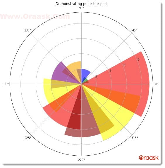
Output:
[adinserter block=”2″]
[0. 0.6981317 1.3962634 2.0943951 2.7925268 3.4906585
4.1887902 4.88692191 5.58505361 6.28318531]
[0 1 2 3 4 5 6 7 8 9]
[1. 1. 1. 1. 1. 1. 1. 1. 1. 1.]

Explanation:
- First, we imported all the necessary libraries and packages in our code using the import statement of python. This is customary. We could also choose to import the libraries at last, but adding them at the top of the code is a general practice.
- Next, we created a user-defined function named bar(). The function takes four arguments, called angle, r, w, and colors. Under this function, we first created the figure object in the code. We specified the size of the figure using the figsize attribute of the function. Next, we created the figure object. We specified the projection of the plot to be a polar plot using the attribute projection=” polar”. Next, we plotted the bar graph with the help of the bar() function. We passed the values of the arguments to the function. We passed the angle, width, and radii parameters. Using the color attribute, we specified the colors of each bar, and using the alpha attribute; we specified the color contrast.
- Next, we defined the graph’s title using python’s title() function and using the plt.show() function to display the graph.
- We Now created another function called main(). This is the driving code of the program. Under this function, we first defined the angle of the data points. To distribute them equally throughout the plot, we used the linspace() function of numpy. The function takes three arguments: start, stop, and several elements.
- We defined the radius of the bars with the arrange() function. The arrange() function takes three arguments: start, stop and step. The start defines the number with which the iteration should start. The stop defines the number up to which the iteration should run. The step defines the iterating step.
- We have printed the arrays to visualize the plot better using the print() function. We also specified the color of the bar. However, choosing a color on our own for each bar is not crucial in python matplotlib. If we do not pass the color argument, matplotlib will automatically set a different color for each bar.
- We called the bar() function and passed the arguments.
- Using the following code, we called the main() function: if __name__ == ‘main‘: main()
[adinserter block=”3″]
Check This: There is a full guide on Matplotlib Polar Plot if you want to know more about polar plots in Matplotlib library.
More Tweaks On Matplotlib Polar Plot
We can use all the attributes we used with the rectangular and polar coordinates. We can try different combinations of different attributes like color, width, bottom, etc.
Example (2)
# import all the necessary libraries and packages in the code
import numpy as np
import matplotlib.pyplot as plt
# Defining a user-defined function
def bar(angle, r,  w, colors):
    # Defining figure object to the plot
    fig = plt.figure(figsize=(9, 9))
    # Creating the axes object
    ax = plt.axes(projection='polar')
    # Plotting the polar bar plot
    ax.bar(angle, r, width=w, bottom=5.0, color=colors, alpha=0.8)
    # Defining the title of the plot
    plt.title("Demonstrating polar bar plot")
    # Displaying the plot in the figure
    plt.show()
# defining the main() function
def main():
    # defining the angles of the data points with the center
    angle = np.linspace(np.pi, 2 * np.pi, 10)
    # Defining the radius
    # r = 10 * np.random.rand(9)
    r = np.cos(angle)
    # Defining the w of the axis
    w = np.ones(10)*0.3
    # Printing the angle array
    print(angle)
    # Printing the radii array
    print(r)
    # Printing the width array
    print(w)
    # Defining the colors of the plots
    colors = ["red", "green", 'blue', "orange", "purple",
              "yellow", "red", "darkred", "yellow", "red"]
    # calling the bar() function
    bar(angle, r, w, colors)
# calling the main() function
if __name__ == '__main__':
    main()
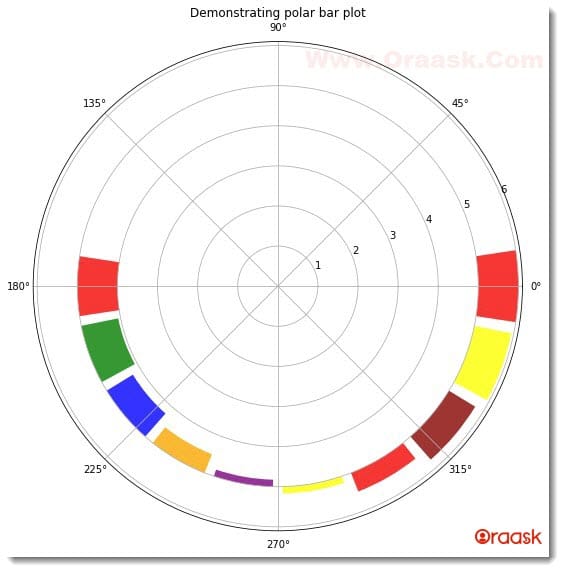
Output:
[3.14159265 3.4906585 3.83972435 4.1887902 4.53785606 4.88692191
5.23598776 5.58505361 5.93411946 6.28318531]
[-1. -0.93969262 -0.76604444 -0.5 -0.17364818 0.17364818
0.5 0.76604444 0.93969262 1. ]
[0.3 0.3 0.3 0.3 0.3 0.3 0.3 0.3 0.3 0.3]
[adinserter block=”4″]

Explanation:
- We imported the matplotlib and the numpy library in the code using the import function of python. We used the technique of aliasing for convenience in writing our codes.
- Next, we created a user-defined function named bar. The function takes four arguments called angle, r, w, colors, and legends. Under the function, we first created the figure object using the figure function of python matplotlib. Next, we created the axes object using the axes() function. We specified the projection of the plot to be polar to get the polar plot. Next, using the bar() function, we plotted the graph. We passed the parameters, called angle, r, and width, for the dimensional parameters of the bars. Notice that we have specified another parameter only bottom. This defines the distance from which the bars should be plotted from the origin. Besides them, we also specified the colors and the intensity of the colors used using the colors and the alpha attribute, respectively. We used the title function to specify the title of the figure. We used an optional function namely plt.show(). However, this is optional only in Jupyter Notebook.
- After the bar function, we created the main() function, which is the main driving code of the program. Under this function, we first created the data points for the bars’ angle concerning the origin. We started to plot the bars from angle pi instead of zero. We used the linspace function to get the data points. We also defined the data points for the lengths of the bars using the variable r and numpy library. We used the np.ones() function for the width attribute. The function takes integer numbers as the arguments. This will create an array consisting of only one element.
- Using the print() function, we have printed the values of angle, r, and w. We strongly recommend that users carefully look into it to understand the plot better. We called the bar() function to plot the graph.
- Finally, we declared the main function as the main driving code of the program using the following lines of codes: if __name__ == ‘main‘: main()
[adinserter block=”5″]
Plotting Polar Plots From CSV Files
Till now, we have understood how to plot the custom-defined data in the polar plot. However, in real life, it is apparent that we will deal with real-world data sets; therefore, we should know how to plot the data when available in CSV or excel format.
In this section, we will learn how to plot the polar plots after fetching the data sets from CSV files.
We need to adopt the following to achieve the same:
- Access the data sets using some library, for example, the pandas library.
- Now created data frame out of it
- Determine the column that needs to be plotted as the bar plot in polar coordinates. Access the column by using the available function of pandas.
- Plot the figure.
We need to have a data set downloaded from the internet for the following example code.
- Go to the following link: https://drive.google.com/drive/my-drive
- Click on the Download option and download the zip file.
- Locate the folder where the zip file exists. Then right-click on the zip file and click on Extract here.
- Now open the extracted file and copy the file Housing.csv and paste it into the folder where you will code the following example.
After you have done all the steps mentioned correctly, you can use the following codes:
[adinserter block=”6″]
Example (3)
# import all the necessary libraries and packages in the code
import numpy as np
import matplotlib.pyplot as plt
import pandas as pd
# Defining a user-defined function
def bar(angle, r, w, colors):
    # Defining figure object to the plot
    fig = plt.figure(figsize=(9, 9))
    # Creating the axes object
    ax = plt.axes(projection='polar')
    # Plotting the polar bar plot
    ax.bar(angle, r, width=w, bottom=5.0, color=colors, alpha=0.8)
    # Defining the title of the plot
    plt.title("Demonstrating polar bar plot")
    # Displaying the plot in the figure
    plt.show()
# defining the main() function
def main():
    # Accessing the CSV file
    data=pd.read_csv("Housing.csv")
    # Creating the data frame
    df=pd.DataFrame(data)
    # Taking the first 10 data points
    r=df["households"][:15]
    # definng the angles of the data points with the center
    angle = np.linspace(np.pi, 2 * np.pi, 15)
    # Defining the w of the axis
    w = np.ones(15)*0.3
    # Printing the angle array
    print(angle)
    # Printing the radii array
    print(r)
    # Printing the width array
    print(w)
    # defining the colors of the plots
    colors = ["red", "green", 'blue', "orange", "purple",
              "yellow", "red", "darkred", "yellow", "red","red", "green", 'blue', "orange", "purple"]
    # calling the bar() function
    bar(angle, r, w, colors)
# calling the main() function
if __name__ == '__main__':
    main()
[adinserter block=”7″]
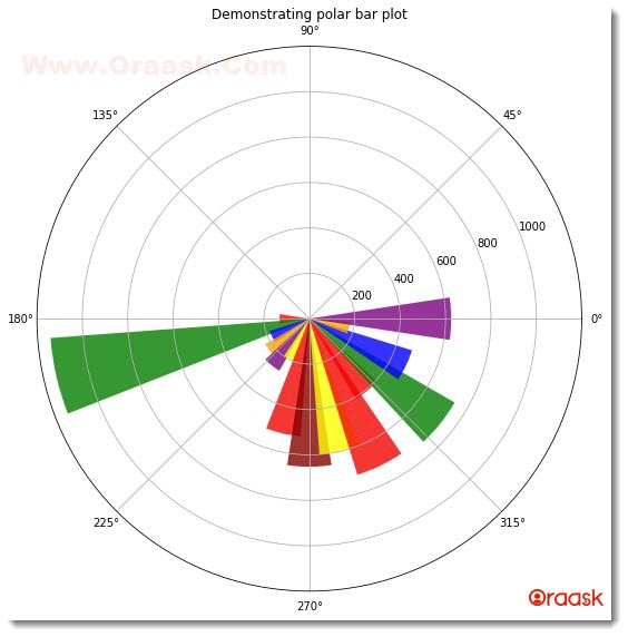
Output:
[3.14159265 3.36599213 3.5903916 3.81479108 4.03919055 4.26359003
4.48798951 4.71238898 4.93678846 5.16118793 5.38558741 5.60998688
5.83438636 6.05878583 6.28318531]
0 126.0
1 1138.0
2 177.0
3 219.0
4 259.0
5 193.0
6 514.0
7 647.0
8 595.0
9 714.0
10 402.0
11 734.0
12 468.0
13 174.0
14 620.0
Name: households, dtype: float64
[0.3 0.3 0.3 0.3 0.3 0.3 0.3 0.3 0.3 0.3 0.3 0.3 0.3 0.3 0.3]

Explanation:
[adinserter block=”8″]
- We first imported the two libraries, called numpy and pandas, and module matplotlib.pyplot.
- Next, we created the user-defined function name bar. The function is a void function and takes four arguments: angle, r, w, and colors. Under this function, we first created the figure object. Using the bar() function, we plotted the figure. We passed all the required arguments in the code.
- Using the title() function, we specified the title of the figure, and we displayed the plot using the show() function.
- Next, we created the main() function. This is the driving code of the program. Under this function, we first imported the CSV file using pandas’ read_csv() function. Next, we created a data frame using the DataFrame() function. After creating the data frame, we are free to choose any column to be plotted in the figure. We are taking the households column. You are free to choose any other column. Also, we used the slicing technique to slice the column and took only the first 10 entries.
- We specified the angle manually because it had nothing much to do with the actual data except plotting it at a particular angle.
- We also defined the width of the bars and printed the angle, r, and w arguments using the print function.
- After defining the colors for the bars, we called the bar() function and passed the appropriate arguments.
- Finally, we called the main() function.
Conclusion
In this article, we understood how to plot bar plots in a polar plot. We have used the bar() function to plot the bar plot in matplotlib. Before that, we specified the projection of the coordinates to ‘polar”.
We have discussed the fundamentals of plotting the bar graph in polar coordinates. However, we strongly recommend that the readers look up the python matplotlib documentation to understand the topic more.
[adinserter block=”9″]


