How Can We Help?
Introduction
Programmers may often need to change the line style in matplotlib. We default to get a straight line connected with dots as the line style in the matplotlib. However, matplotlib allows us to customize the same. This article will explain how to change the line style in matplotlib.
Allowed Line Style in Matplotlib
Before proceeding with the codes, it is important to know the valid line styles allowed in matplotlib. Matplotlib allows the following line styles:
‘-‘, ‘–‘, ‘-.’, ‘:’, ‘None’, ‘ ‘, ”, ‘solid’, ‘dashed’, ‘dashdot’, ‘dotted’
[adinserter block=”1″]
Prerequisite
Before we proceed with the codes, we presume that the reader has sound knowledge of contour plots. We also need some libraries and packages to code. They are namely matplotlib and numpy. In case you haven’t installed them, then perform the following:
If you are a windows user, then open the PowerShell and run the following commands:
pip install matplotlib numpyIf you are a Linux or a macOS user, then open the bash terminal and run the following commands:
pip install matplotlib numpyHow To Change Line Style in Matplotlib
Matplotlib allows us to use many different methods to change the line style. We can use the attribute method, functional methods as well as the rcParams settings to change the line style in matplotlib
Using the Line Style Attribute
The simplest way to change the line style in python matplotlib is to use the line style attribute of the plot function. The attribute takes a string as the value. The valid values are the line style we mentioned earlier.
[adinserter block=”2″]
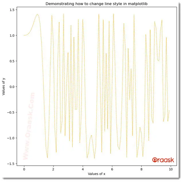
Example (1)
# Import all the required libraries and modules in the code
import matplotlib.pyplot as plt
import numpy as np
# Creating a user-defined  function named lim_change


def style_change(x, y):
    # Creating the figure object
    fig = plt.figure(figsize=(9, 9))
    # Plotting the figure
    plt.plot(x, y, color='orange', linestyle="dotted")
    # Defining the title for the plot
    plt.title("Demonstrating how to change line style in matplotlib")
    # Defining the label along the x-axis
    plt.xlabel("Values of x")
    # Defining the label along the y-axis
    plt.ylabel("Values of y")
    # Displaying the plot
    plt.show()
# Creating the main() function


def main():
    # Creating the x coordinates of the data points
    x = np.arange(0, 10, 0.1)
    # Creating the y coordinates of the data points
    y = np.sin(x**3)+np.cos(x**3)
    # Calling the lim_change function
    style_change(x, y)


# calling the main function
if __name__ == '__main__':
    main()
Output:

Explanation:
[adinserter block=”3″]
- First, we imported the matplotlib.pyplot module and the numpy library using the import statement of python. We used the alias names for convenience in writing the codes.
- Next, we created a user-defined function named style_change. The function is a void function that takes two parameters, called x and y. Under this function, we first defined the size of the figure using the figsize attribute, and we created the figure object using the figure function of matplotlib. Next, we plotted the figure using the plot function of matplotlib. We set the color of the plot to orange using the color attribute and line style using the lifestyle attribute. We used the dotted style. Next, we set the title to the plot using the title function.
- We used the xlabel function to define the label along the x-axis and the ylabel function to define the label along the y-axis.
- We used the show function to display the figure. However, in Jupyter Notebook, this is optional to use this function.
- After the style_change function, we created the main function. The main function is the driving code of our program. Under this function, we created the values for the coordinates of the data points. We called the style_change function with appropriate values to plot the figure.
- Finally, we called the main function with the help of the following lines of codes: if __name__ == ‘main‘: main()
Check This: Article on How to Change Line Color in Matplotlib if you want to know how to change the line color of the plot with practical examples.
Changing The Line Style of Three Dimensional 3D Plot
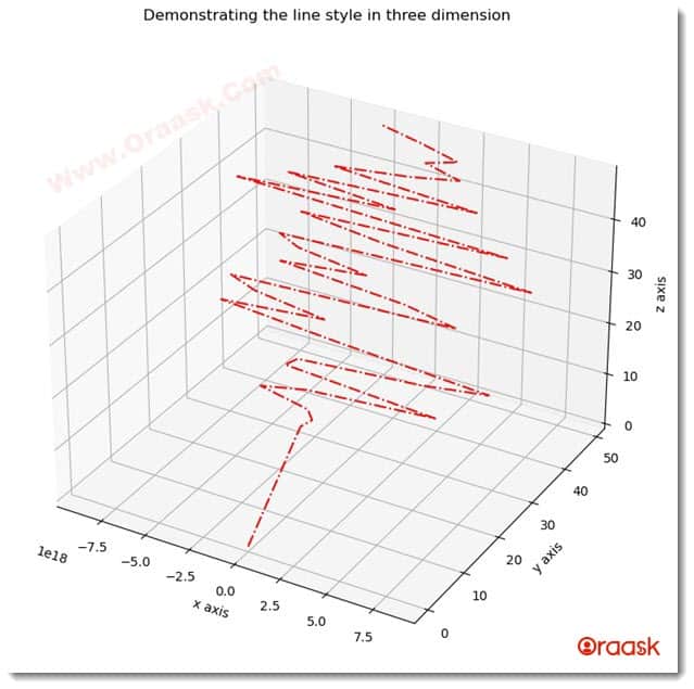
Matplotlib also allows us to change the line style of the three-dimensional plot. To achieve the same, we only need to use the lifestyle attribute of the plot3D function.
Example (2)
# importing numpy and matplotlib
import numpy as np
import matplotlib.pyplot as plt

# defining a user defined dunction named three_dimensionall_time_series


def line_style_change(x, y, z):
    # creating the figure
    fig = plt.figure(figsize=(9, 9))
    # creating a three-dimensional workspace
    ax = plt.axes(projection='3d')
    # plotting the graph
    ax.plot3D(x, y, z, 'red', linestyle="dashdot")
    # Defining the x label
    ax.set_xlabel("x-axis")
    # Defining the y label
    ax.set_ylabel("y-axis")
    # Defining the z label
    ax.set_zlabel("z axis")
    # setting the title to the plot
    ax.set_title('Demonstrating the line style in three dimension')
    # displaying the plot
    plt.show()

# defining the main() function


def main():
    # creating data points for the y-axis
    y = np.arange(0, 50, 1)
    # creating data points for the z-axis
    z = np.arange(0, 50, 1)
    # creating data points for the x-axis
    x = np.power(y, z)
    # calling the three_dimensional_line() function
    line_style_change(x, y, z)


# calling the main() function
if __name__ == "__main__":
    main()
Output:
[adinserter block=”4″]

Explanation
- As customary, we first imported the libraries and the modules in the code. Note that we are free to import the libraries and modules anywhere in the code.
- Next, we created the function named line_style_change. This is a void function, and it takes three arguments called x,y, and z. Under this function, we first created the figure object. We defined the size of the figure using the figsize attribute. Next, we created the axes object using the axes function of matplotlib. We specified the projection of the plot to be ‘3d’ to specify the plot to be three-dimensional. Next, we used the plot3D function to plot the three-dimensional figure. We passed the color argument to this function and specified its color as ‘red’. We specified the line style to be dashdot. Next, we used the set_xlabel, set_ylabel, and set_zlabel to define the labels along the axes.
- We used the set_title function to define the plot’s title and the show function to display the plot.
- Next, we created the main function. Under this function, we created the values of the coordinates of the data points for the plot. We called the line_style_change function to plot the figure.
- Finally, we declared the main function as the driving code with the help of the following lines of codes: if __name__ == “main“: main()
Check This: There is a full guide on Matplotlib Colors if you want to know more about colors in matplotlib.
Using the rcParams Settings
Another way to change the line style is to use the rcParams settings. This is a popular choice for programmers to tweak different parameters.
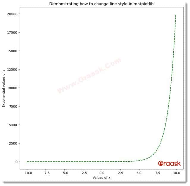
We need to use the following syntax to change the lifestyle using this setting:
rcParams[‘lines.linestyle’]=\
[adinserter block=”5″]
Example (3)
# Import all the required libraries and modules in the code
import matplotlib.pyplot as plt
import numpy as np
import matplotlib as mpl
# Creating a user-defined  function named lim_change


def style_change(x, y):
    # Creating the figure object
    fig = plt.figure(figsize=(9, 9))
    # Plotting the figure
    plt.plot(x, y, color='green')
    # Chaing the line style
    mpl.rcParams['lines.linestyle'] = '--'
    # Defining the title for the plot
    plt.title("Demonstrating how to change line style in matplotlib")
    # Defining the label along the x-axis
    plt.xlabel("Values of x")
    # Defining the label along the y-axis
    plt.ylabel("Exponential values of z")
    # Displaying the plot
    plt.show()
# Creating the main() function


def main():
    # Creating the x coordinates of the data points
    x = np.arange(-10, 10, 0.1)
    # Creating the y coordinates of the data points
    y = np.exp(x)
    # Calling the lim_change function
    style_change(x, y)


# calling the main function
if __name__ == '__main__':
    main()
Output:

In the above code, we imported the matplotlib library as mpl. Within the style_change function, we used the following line to change the line style in matplotlib:
mpl.rcParams[‘lines.linestyle’] = ‘–‘
Specifying the Line Style Through Numeric Values
Although python allows us to choose from many line styles, programmers may still need more customization and control over the line styles. Python also allows us to control the line style through numeric values.
The typical sequence is :
[adinserter block=”6″]
(offset,(on and off sequence through pt)
For example, (1,(3,4)) means the line has no offset and consists of 3 pt dots, then 4 pt space followed by 3 pt dots, 4 pt space, and so on.
Example (4)
# Import all the required libraries and modules in the code
import matplotlib.pyplot as plt
import numpy as np
# Creating a user-defined  function named lim_change


def style_change(x, y):
    # Creating the figure object
    fig = plt.figure(figsize=(9, 9))
    # Plotting the figure
    plt.plot(x, y, color='purple', linestyle=(0, (3, 1, 10, 5)))
    # Defining the title for the plot
    plt.title(" y=x graph")
    # Defining the label along the x-axis
    plt.xlabel("Values of x")
    # Defining the label along the y-axis
    plt.ylabel("Values of y")
    # Displaying the plot
    plt.show()
# Creating the main() function


def main():
    # Creating the x coordinates of the data points
    x = np.arange(0, 10, 0.1)
    # Creating the y coordinates of the data points
    y = x
    # Calling the lim_change function
    style_change(x, y)


# calling the main function
if __name__ == '__main__':
    main()
Output:
[adinserter block=”7″]

Explanation:
- We first imported the pyplot module and the numpy library in the code using the import statement of python.
- Next, we created a user-defined function named style_change, which is a void function. The function takes two arguments, called x and y. Under this function, we first created the figure object using the figure function of matplotlib. We defined the size of the figure using the figsize attribute of python matplotlib.
- Next, we plotted the graph using the plot function of matplotlib.pyplot. We also changed the color of the plot using the color attribute. Next, we changed the line style using the line style attribute. We passed the value of the lifestyle attribute using the numeric values.
- Now we defined the title for the plot and also defined the labels along the axes using the xlabel and the ylabel functions. We used the show function to display the plot.
- Next, we created our driving code which is the main function. Under this function, we created the values of the coordinates of the data points for the plot. We used the arange function to generate the data points. The arange function takes three arguments, called start, stop and step. The start defines the number with which the iteration should start; the stop defines the number up to which the iteration should run, and the step defines the iterating step.
- We called the style_change function, and finally, we called the main function using the following lines of codes:
if __name__ == ‘main‘: main()
[adinserter block=”8″]
Changing the Line Style of the Polar Plot
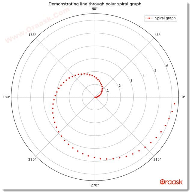
All the methods we discussed till now are not only applicable to the rectangular coordinate system but are equally applicable to the polar coordinates. We can use the line style attribute with the polar function. Similarly, we can use the rcParamas settings.
Example (5)
# import all the necessary modules and libraries in the code
import numpy as np
import matplotlib.pyplot as plt
import math
# creating a user-defined function called polar


def polar(radians):
    plt.figure(figsize=(9, 9))
    # creating a polar object
    plt.axes(projection='polar')
    # iterating each angle in radians
    for rad in radians:
        # plotting the graph
        plt.polar(rad, rad, 'r.', linestyle="dotted")
    # creating a title for the graph
    plt.title("Demonstrating line through polar spiral graph")
    # creating a legend for the graph
    plt.legend(["Spiral graph"])
    # displaying the graph
    plt.show()
# creating the main() function


def main():
    # creating data points for the angles of each point
    radians = np.arange(0, 2 * np.pi, 0.1)
    # calling the polar function
    polar(radians)


# calling teh main() function
if __name__ == '__main__':
    main()
Output:
[adinserter block=”9″]

Check This: There is a full guide on Matplotlib Polar Plot if you want to know more about Polar Plot (What it is and what is the use of it plus several practical examples to nail the concept very well).
Conclusion
In this article, we have learned how to change the line style in python matplotlib. We saw the use of the line style attribute of the python plot function. We also used the rcParams settings to change the line style of the plot. The line style can be changed for both the two-dimensional and the three-dimensional plot. Finally, we saw to change the line style with numeric values. matplotlib also allows us to customize our line style using numeric methods.
We have discussed the most critical aspects of changing the line style in python matplotlib. We strongly encourage the readers to use the python matplotlib documentation to understand the topic more.


