How Can We Help?
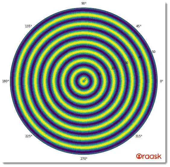
Matplotlib allows us to customize almost anything we desire in the plot. It also offers us to plot in other coordinates like polar plots, etc. This article will explain how to plot polar heatmaps in Matplotlib. The polar heatmap plot determines the density of the values in a plot.
[adinserter block=”1″]
How To Draw Polar Heatmaps
Example (1)
# Import all the necessary packages and libraries in the code
import matplotlib.pyplot as plt
from mpl_toolkits.mplot3d import Axes3D
import numpy as np
# Create a user-defined function named polar_heatmap
def polar_heatmap(radius,angle):
    # Create a figure object and specify the dimensions of the plot
    fig = plt.figure(figsize=(9,9))
    # Creating the axes object
    ax = Axes3D(fig)
    # Creating a meshgrid for the plot
    R, th = np.meshgrid(radius, angle)
    z = np.sin(R)
    # Specifying the projection as polar
    plt.subplot(projection="polar")
    # Defining the colormesh to define the color as per the values
    plt.pcolormesh(th, R, z)
    # PLotting the figure
    plt.plot(angle, R, color='k', ls='none')
    # Displaying the plot
    plt.show()
# Creating the main function
def main():
    # Defining the distance of the points from the center of the plot
    radius = np.linspace(0, 50, 100)
    # Defining the azimuthal angle
    angle = np.linspace(0, 2 * np.pi, 100)
    # Calling the polar_heatmap function to plot the heatmap
    polar_heatmap(radius, angle)
# Calling the main function
if __name__ == "__main__":
    main()
Output:

[adinserter block=”2″]
Explanation:
- We first imported all the necessary libraries and packages in our code using the import statement of python. Note that we can import the libraries and packages anywhere in the code.
- Next, we defined a user-defined function named polar_heatmap. The function is a void function and takes two parameters: the radius and the angle. Under this function, we first created the figure object using the figure function. We defined the size of the figure using the figsize attribute.
- Next, we defined the axes of the figure using the Axes3D function. After that, we created a mesh of the radius and angles of the two variables. We defined the value of z as the sine of the angle of R. Next, and we defined the projection of the plot to be “polar” to get our plot in polar coordinates.
- We used the function pcolormesh to get the colors as per the values of th, R, and z. We used the plot function to plot the figure and specified a few other arguments, like color, to make the plot more informative.
- Next, we created the main function, which is the driving code of our program. Under this function, we have defined all the data points. We called the polar_heatmap function with appropriate arguments to plot the graph.
- Finally, we called the main function with the help of the following lines of codes: if __name__ == “main“: main()
[adinserter block=”3″]
Check This: There is a full guide on Matplotlib Polar Plot if you want to know more about Polar plot like (What it is and a lot more examples of it).
Conclusion:
In this article, we have learned how to draw polar heat maps. The polar heatmaps are used to plot the relative density of the data points.
Although we have discussed most of the crucial aspects of the topic, we strongly recommend the readers look up the python documentation to understand the topic more.


