How Can We Help?
Introduction
Matplotlib is one of the most potent libraries of Python used for data visualization in Python. The plots contain different components like Titles, legends, labels, etc. This information is known as the texts of the plot. Some introductory text commands are the text, annotate, xlabel, ylabel, title, figtext, subtitle, etc. In this article, we shall understand how to deal with the texts in matplotlib in Python.
Define the Title Of The Plot
The title of a plot is a text label that briefly describes the plot’s content. It is typically displayed at the top of the plot and is used to convey important information about the data being displayed. Titles are important components because they let the readers know what the plot is all about.
Example (1)
# Import the matplotlib and the numpy library in the code
import matplotlib.pyplot as plt
import numpy as np
# Define the x coordinate of the data points
x = np.linspace(-10, 10, 100)
# define the y coordinate of the data points
y = -x ** 2
# Plot the data points
plt.plot(x, y)
# Define the title of the data
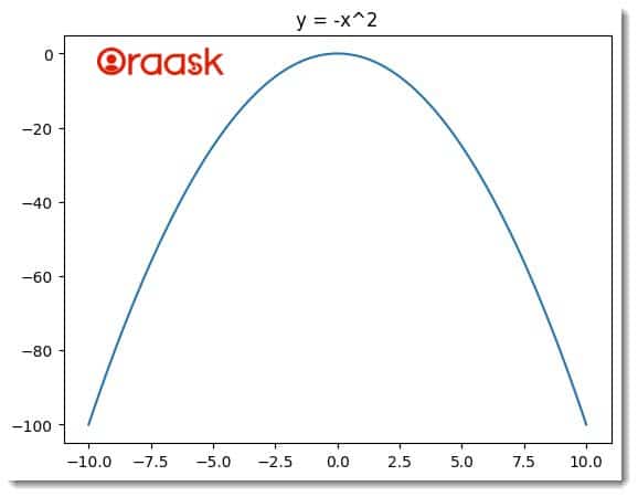
plt.title('y = -x^2')
# Show the plot
plt.show()
Output:
Explanation
- In this code, first, we have imported the matplotlib and the Numpy library in Python using the import statement. Next, we have defined the data points using the linspace function of Numpy.
- The linspace function takes three arguments: start, stop, and the number of points. The start defines the number with which the list of numbers generated should start, the stop defines the number up to which the iteration should run, and the last argument defines the total number of data points.
- We used the plot function to plot the data and the title function to define the plot’s title.
- Next, we used the show function to display the plot.
Labels Along The Axis
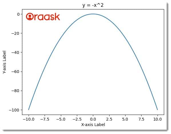
Labels are one of the most critical aspects of the plot. Labels define what is present in the x and the y axis. Without the labels, it becomes meaningless to try to understand the data. In Matplotlib, we can use the xlabel and the ylabel functions to define the labels along the x and y-axis.
Example (2)
# Import the Matplotlib and NumPy libraries
import matplotlib.pyplot as plt
import numpy as np

# Define the x-coordinate of the data points
x = np.linspace(-10, 10, 100)

# Define the y-coordinate of the data points
y = -x ** 2

# Plot the data points
plt.plot(x, y)

# Add a title to the plot
plt.title('y = -x^2')

# Add label along the x axis
plt.xlabel('X-axis Label')

# Add a label along the y axis
plt.ylabel('Y-axis Label')

# Display the plot
plt.show()
Output:
Ticks And Tick Labels
In a Matplotlib plot, ticks are the small marks or lines on the axes that indicate specific points on the plot scale. They often label data points or intervals on the axes, providing a visual reference for plotted values. Ticks can be positioned automatically by Matplotlib or manually set to custom values.
On the other hand, tick labels are the textual labels associated with each tick mark. They provide additional information about each tick’s specific data point or interval. By default, Matplotlib uses numeric labels for ticks, but it is also possible to use custom text labels to communicate the meaning of the tick values better.
Both ticks and tick labels can be customized using Matplotlib. For example, you can set the positions and labels of ticks to specific values, modify the appearance of tick marks or labels, or remove ticks and tick labels altogether. Customizing ticks and tick labels can help create straightforward, informative plots that effectively communicate data to an audience.
Example (3)
import matplotlib.pyplot as plt
import numpy as np
x = np.linspace(-10, 10, 100)
y = np.sin(x)
plt.plot(x, y)
# Define the x-tick locations and labels
xticks = [-10, -5, 0, 5, 10]
xticklabels = ['Min', 'Small', 'Medium', 'Large', 'Max']
plt.xticks(xticks, xticklabels)
# Define the y-tick locations and labels
yticks = [-1, 0, 1]
yticklabels = ['Low', 'Mid', 'High']
plt.yticks(yticks, yticklabels)
plt.xlabel('X-axis Label')
plt.ylabel('Y-axis Label')
plt.title('Graph Title')
plt.show()
Output:
Explanation:
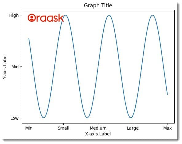
- In this code, we first imported the matplotlib library using the import statement of Python. Next, we created data points using the linspace function of the mumpy. We used the sine function of the data points for the y-axis values.
- Next, we defined the ticks along the x-axis and named them xticks. We defined the ticks along the y-axis as xticklabels. We plotted the ticks using the xticks and the yticks function.
- We also defined the labels along the axis using the xlabel and the ylabel functions. We also defined the title of the function using the title function and displayed using the show function.
Use Legends With The Plot
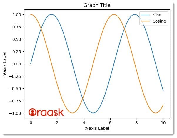
Legends are a feature in Matplotlib that allow you to label the different elements in a plot, such as lines or markers, to help the viewer understand the meaning of the data being displayed. Legends are typically used in line, scatter, and other plots displaying multiple data sets.
When you create a plot in Matplotlib, you can assign a label to each element that you want to appear in the legend. Then, you can call the legend() function to add the legend to the plot. The legend() function takes several optional parameters, such as the location of the legend on the plot, the legend’s font size, and the legend’s background color.
Example (4)
import matplotlib.pyplot as plt
import numpy as np

# create data
x = np.linspace(0, 10, 100)
y1 = np.sin(x)
y2 = np.cos(x)

# create plot
plt.plot(x, y1, label='Sine')
plt.plot(x, y2, label='Cosine')

# add legend
plt.legend(loc='upper right')

# add axis labels and title
plt.xlabel('X-axis Label')
plt.ylabel('Y-axis Label')
plt.title('Graph Title')

# display plot
plt.show()
Output:
Use Annotation
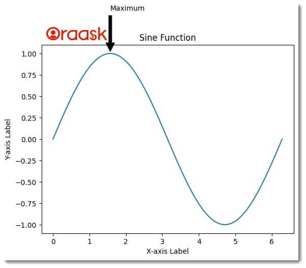
Annotation is a feature in Matplotlib that allows you to add text or symbols to a plot to highlight specific data points, features, or areas. Annotations help provide additional information to a reader or viewer of a plot.
There are several types of annotations that you can add to a plot in Matplotlib. Some examples include:
- Text: You can add a text annotation to a plot using the annotate() function. This allows you to place a text at a specific location on the plot.
- Arrows: You can add an arrow annotation to a plot using the annotate() function with the arrowprops parameter. This allows you to point from one location on the plot to another with an arrow.
- Shapes: You can add shapes like rectangles or circles to a plot using the Rectangle or Circle classes from the matplotlib.patches module.
- Images: You can add images to a plot using the imshow() function. This is useful for displaying heatmaps or other types of image data.
Annotations are a powerful tool for communicating information in a plot and can help to make your plots more informative and easier to understand.
Example (5)
import matplotlib.pyplot as plt
import numpy as np

# create data
x = np.linspace(0, 2*np.pi, 100)
y = np.sin(x)

# create plot
plt.plot(x, y)

# add annotation
xpos = np.pi/2
ypos = 1
plt.annotate('Maximum', xy=(xpos, ypos), xytext=(xpos, ypos+0.5),
             arrowprops=dict(facecolor='black', shrink=0.05))

# add axis labels and title
plt.xlabel('X-axis Label')
plt.ylabel('Y-axis Label')
plt.title('Sine Function')

# display plot
plt.show()
Output:
Conclusion
In this article, we have learned how to deal with the matplotlib texts in Python. We have learned about the title, xlabel, ylabel, etc., in matplotlib to make the plot more informative. We strongly advise readers to try using the combination of the concepts we learned to have more understanding of the topic.


