How Can We Help?
Matplotlib is one of the most popular packages of python. This is a data visualization package that not only helps in data visualization but also helps in the creation of animations, graphics, etc. While programming, we often need the two-dimensional plotting of the data. However, sometimes, especially in economics, business, etc., one may need to plot the graphs in three-dimensional space to visualize the plots better.
What is the Use of a 3D Bar Chart in Matplotlib?
The three-dimensional bar chart is widely used whenever the number of parameters in the data points is more than 2. Because in such a situation, we may want to plot multiple dimensions to visualize the plots better. For example, in the field of electromagnetism, it is important to specify all three dimensions to understand the motion of any particle in three-dimensional space because they both go along a straight line and a helical path.
This article will explain how to plot a three-dimensional bar chart in matplotlib.
How to Create Three-Dimensional Space for 3D Plots?
By default, the matplotlib will plot all the data points in the two-dimensional space. So, to plot the figures in three-dimensional space, we need to use some extra functions, techniques, and attributes.
This can be done as follows:
- First, import the matplotlib library.
- Next, create a figure class in the code.
- Next, set the projection of the figure into three dimensions instead of two dimensions.
Example (1)
#import all the necessary libraries and modules
import numpy as np
import matplotlib.pyplot as plt
#create the main() function
def main():
    #creating the figure class
    fig=plt.figure()
    #creating the three-dimensional axes
    ax=plt.axes(projection="3d")
#calling the main() function
if __name__ == "__main__":
    main ()
Output:
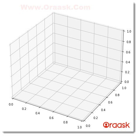
Explanation:
- First, we imported all the necessary libraries and packages in the code using the import statement of python. We also used the aliasing name for the convenience of the codes.
- Next, we created the main () function in the program. Under the main () function, we created a figure class using python’s plt.figure() function.
- Next, we created axes using the plt.axes() function. We passed projection=”3d” as the required attribute to this function to make the interpreter understand that the plot should be three-dimensional.
- Finally, we declared the main () function as the driving part of the code using the following lines of codes:
if __name__ == “__main__”:
main ()
Notice that the scale would be 0.2 units for each cell by default.
Plotting Three-Dimensional Bar Chart:
Having created a three-dimensional chart, we can plot any kind of graph on the workspace, like bar charts, pie charts, line charts, etc.
For plotting the three-dimensional bar chart, we need to keep the following points in mind:
- We need to create the figure and the axis using the fig and axes () class of matplotlib. Next, we need to set the values along the x,y, and z-axis as the data points. This should be done in the form of array-like objects or lists etc.
- We must pass another three arguments to the plot, namely dx,dy, and dz. They represent the width or depth along the x, y, and z-axis. If we Pass, only the values of x, y, and z will show an error in the program.
Example (2)
# import all the necessary libraries and modules
import numpy as np
import matplotlib.pyplot as plt
# create the main() function

def three_dimensional_bar(x,y,z,dx,dy,dz):
    # creating the figure class
    fig = plt.figure()
    #plotting the three-dimensional plot
    # creating the three-dimensional axes
    ax = plt.axes(projection="3d")
    ax.bar3d(x, y, z, dx, dy, dz)

def main():
    #passing value for the x-axis
    x3 = [int(x) for x in range(1,11)]
    #passing value for the y axis
    y3 = [51, 63, 17, 58, 29, 75, 86, 73, 78, 92]
    #passing value for the z-axis
    z3 = [(2) for x in range(1,11)]
    #setting the width along the x-axis
    dx = [(2) for x in range(1,11)]
    #setting the width along the y axis
    dy = [(10) for x in range(1,11)]
    #setting the width along the z-axis
    dz = [1, 2, 3, 4, 5, 6, 7, 8, 9, 10]
    three_dimensional_bar(x3,y3,z3,dx,dy,dz)

# calling the main() function
if __name__ == "__main__":
    main ()
Output:
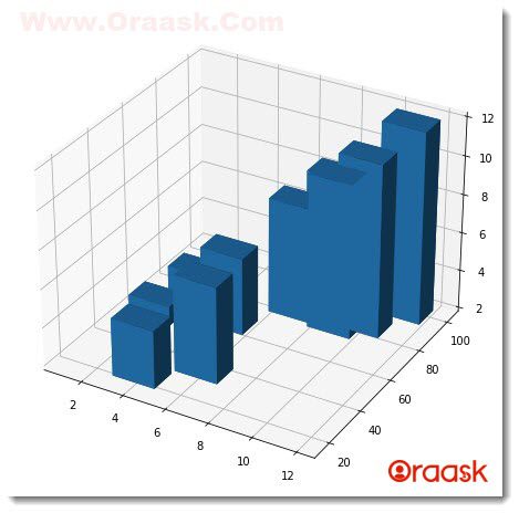
Explanation:
- We first need to import all the necessary libraries and modules in the program using the import statement of python. We used the alias names for convenience in writing the codes further in the program.
- Next we created a user-defined function called three_dimensional_bar().It takes six arguments namely x,y,z,dx,dy,dz. Under this function, we created the figure class using the plt.figure() function of matplotlib. Next, we created axes for the plot using the plt.axes() function and passed the attribute projection=”3d”.
- We then plotted the graph using the ax.bar3d() function. Notice that we passed a total of 6 parameters in the function.
- Next, we created the main () function, which is the driving code of the program. Under this function, we first created a list using list comprehension. We created three lists and named them x3, y3, and z3. For x3 and z3 we used the list comprehension technique to insert the elements in the list. We have iterated 10 times in the list comprehension and got a series of values from 1 to 10.
- We have created the data point of z3 manually in the code. Next, we also set the values of dx, dy, and dz in the program using the list comprehension. Finally, we called the three_dimensional_bar() function and passed all the necessary arguments in the program.
- At last, we declared the main () function as the driving code of the program using the following lines of code:
if __name__ == “__main__”:
main ()
If you look at the above code, it is pretty evident that the above code does not give us much information about the plot. For example, it does not tell us anything about the plot’s tile, legends, or labels. However, setting these parameters is extremely easy, and one can do it easily using the patterns and attributes available for the plt() function.
Example (3)
# import all the necessary libraries and modules
import numpy as np
import matplotlib.pyplot as plt
# create the main() function

def three_dimensional_bar(x,y,z,dx,dy,dz):
    # creating the figure class
    fig = plt.figure()
    # creating the three-dimensional axes
    ax = plt.axes(projection="3d")
    #plotting the chart
    ax.bar3d(x, y, z, dx, dy, dz,color="orange")
    #creating the label along the x-axis
    plt.xlabel("This is the label along the x-axis")
    #creating labels along the y axis
    plt.ylabel("This is the label along the y-axis")
    #creating title to the chart
    plt.title("Demonstrating the three dimensional bar chart")
    #displaying the graph
    plt.show()

def main():
    #passing value for the x-axis
    x3 = [int(x) for x in range(1,11)]
    #passing value for the y axis
    y3 = [51, 63, 17, 58, 29, 75, 86, 73, 78, 92]
    #passing value for the z-axis
    z3 = [(2) for x in range(1,11)]
    #setting the width along the x-axis
    dx = [(2) for x in range(1,11)]
    #setting the width along the y axis
    dy = [(10) for x in range(1,11)]
    #setting the width along the z-axis
    dz = [1, 2, 3, 4, 5, 6, 7, 8, 9, 10]
    three_dimensional_bar(x3,y3,z3,dx,dy,dz)

# calling the main() function
if __name__ == "__main__":
    main()
Output:
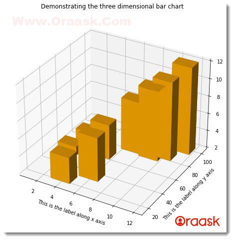
Explanation:
- First, we imported numpy and matplotlib.pyplot library in the code. We used np and plt as the alias names for numpy and matplotlib.pyplot respectively.
- Next, we created a user-defined function named three_dimensional_bar () function. This function takes 6 parameters: x, y, z, dx, dy, and dz. Under this function, we created a figure object using the plt.figure() function. After that, we created axes for the figure using the axes () function. Under the axes function, we passed an argument projection=”3d”.
- We plotted the three-dimensional bar charts using the bar3d () function. In this function, we passed all six arguments. We also set the color property to the function using the color attribute in this function.
- We set labels along the x-axis and y-axis using xlabel() and ylabel() attributes. After setting the plot’s title using plt.title(), we finally displayed the plot using the plt.show() function. However, the plt.show() function is optional in the jupyter notebook.
- Next, we created a main () function in the program. Under this function, we created 6 variables using the list object. We finally called the three_dimensional_bar() function with all the necessary arguments passed to the function.
- At last, we declared the main () function as the driving code of the program using the following lines of code:
if __name__ == “__main__”:
main ()
Plotting a 3D Line Graph
Plotting a three-dimensional line chart is a fundamental concept. Especially in the geography field, like measuring the earthquake on Richter scales, these graphs are used whenever there is a need to plot in three dimensions. The line chart can be plotted in three-dimensional space using the plot3D() function available in matplotlib. We must create a series of continuous data points and pass the variable to plot in the graph. Numpy-like arrays are used for this purpose.
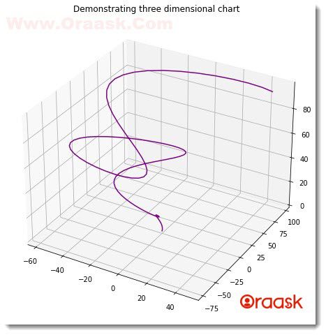
Check This: Article on How to Plot 3D Line Graph in Matplotlib if you want to know more about 3D line graph with practical examples.
Plotting 3D Scatter Graph
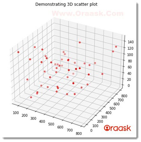
The three-dimensional scatter plot is used to plot discrete points in the plot. As the name suggests, the data points are scattered and are not continuous. We can use the plot3D () function of matplotlib again to plot the three-dimensional scatter plot here.
These are used for the discrete data when the dimensions are more than two, For example, plotting the space coordinate of a charged particle in space due to the effect of magnetic ad electric fields.
Check This: Article on How to Plot 3D Scatter Graph in Matplotlib if you want to know more about 3D scatter plot with practical examples.
Plotting 3D Surface Graph
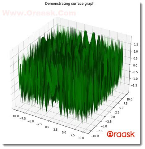
The surface graph is extensively used in the field of mathematics. It is a representation of two independent variables, which are dependent on a third variable. Hence the plot contains two functions and one independent data point.
Check This: Article on How to Plot 3D Surface Graph in Matplotlib if you want to know more about 3D Surface graph with practical examples.
Plotting 3D Wireframe Graph
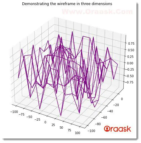
A wireframe model is a combination of multiple separate plots which are interdependent. However, instead of plotting, the primary purpose of this graph is to generate animations.
Earlier, this graph was used by the architecture and engineers to build a stakeholder’s model, and visual representation before the actual implementation took place. For example, dome buildings, monuments, etc., are first designed in a wireframe before the actual design or implementation. Almost all companies use it to make a wireframe of their products before actual product production.
Check This: Article on How to Plot 3D Wireframe Graph in Matplotlib if you want to know more about 3D Wireframe graph with practical examples.
Plotting 3D Contour Graph
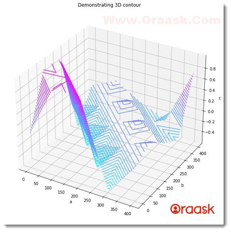
This kind of plot is used whenever we need to show three-dimensional plots with the help of two-dimensional surfaces. If there are two independent variables and another variable is a function of the other two variables, then such a plot is used. We first need to make the data points in the specified format and use the contour3() function to plot the contour graph.
Check This: Article on How to Plot 3D Contour Graph in Matplotlib if you want to know more about 3D contour graph with practical examples.
Final Thoughts
This article taught us how to plot matplotlib bar charts in three-dimensional space. We discussed many attributes and functions associated with the same. The bar3d () function of matplotlib is used for plotting the three-dimensional plot in the figure. We can also set titles and labels to the plot using functions associated with the matplotlib library. We also learned how to change the width of the bars in the figure.
Although we learned about all the essential attributes and functions to plot the bar chart in three-dimensional space, We highly recommended that the reader goes through the python matplotlib documentation page for more knowledge about the topics.


