How Can We Help?
A cumulative histogram is a visualization representing a dataset’s cumulative distribution. The plot represents the cumulative frequency of the distribution and hence the proportion of the data point in the graph. This graph gives us important insights into how the data got accumulated. These graphs are extensively helpful in finance, quality control, demographics, marketing, customer behavior analysis, etc. In this article, we will understand how to plot the cumulative histogram.
Using The hist Function to Plot Cumulative Histogram
The hist method in Matplotlib is versatile in Python to plot the histogram plot. It accepts the data input as a list or Numpy-like objects. The “bins” parameter controls the edges of the histogram. Apart from this, to get a cumulative histogram plot, we need to set the value of the parameter cumulative=True.
Example (1)
# Import the libraries and modules
import matplotlib.pyplot as plt
import numpy as np
# Generate random data
data = np.random.randn(1000)
# Create a cumulative histogram
plt.hist(data, bins=30, cumulative=True)
# Set plot labels
plt.xlabel('Value')
plt.ylabel('Cumulative Frequency')
# Set the tile
plt.title('Cumulative Histogram')
# Display the plot
plt.show()
Output:

Explanation:
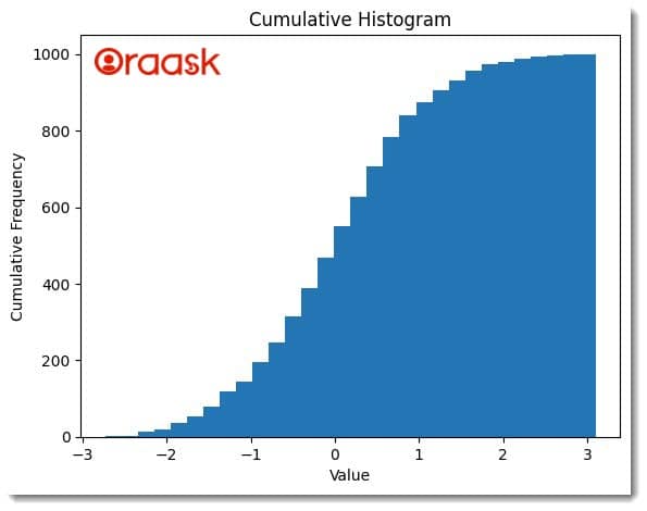
We first imported the plot module and the Numpy library in the above code. We used the aliasing technique of Python to import them. Next, we created a random data named “data” using the method-rand of the NumPy library. We used the hist method of Python to plot the histogram plot of Python. We passed the “data” argument and set the value of the parameter “cumulative” to be True. Next, we defined the plot labels using the xlabel and the ylabel methods. We also set the plot’s title using the title method of matplotlib.
Note: For more information about Histogram in the Matplotlib library, follow this tutorial: Python Matplotlib Histogram
Using The ax Object
The “ax” object in Matplotlib allows us to define individual axes or subplots within the figure. It provides a convenient way to plot multiple plots in the exact figure and manipulate them individually. First, we need to create an “ax” object next; we can use the built-in functions available in this object to define the labels, limits of the axes, etc.
Example (2)
import matplotlib.pyplot as plt
import numpy as np

# Generate random data
data = np.random.randn(10)

# Create a figure and axis object
fig, ax = plt.subplots()

# Plot the cumulative histogram
ax.hist(data, bins=30, cumulative=True)

# Set plot labels
ax.set_xlabel('Value')
ax.set_ylabel('Cumulative Frequency')
ax.set_title('Cumulative Histogram')

# Display the plot
plt.show()
Output:

Explanation:
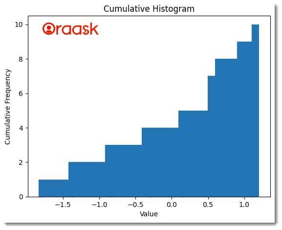
In the above code, we first imported the plot module and the Numpy library of Python. Next, we created a Numpy array using the rand method of Numpoy. We created a figure and an axis object using the subplots method of Matplotlib. We used the hist method of the “ax” object to plot the histogram. We set the value of the cumulative parameter to be True to ensure that we plot the cumulative graph. Next, we used the set_xlable and set_ylable methods to set labels along the x and y axes. Finally, we defined the plot’s title using the set_title method and displayed the graph using the show method.
Plotting Multiple Cumulative Histogram Graphs
Matplotlib also allows us to plot multiple plots in the exact figure using the subplot method. First, we need to create an object using the subplots method. Next, depending on our choice, we can use the indexing property to define the plots in rows and columns. The method allows complete control of all the subplots and is useful when comparing similar plots.
Example (3)
# Import the modules and libraries
import matplotlib.pyplot as plt
import numpy as np

# Generate sample data
data1 = np.random.randn(1000)
data2 = np.random.randn(2000)
data3 = np.random.randn(1500)
data4 = np.random.randn(2500)

# Create a figure and subplots
fig, axs = plt.subplots(2, 2, figsize=(10, 8))

# Plot cumulative histograms on each subplot
axs[0, 0].hist(data1, bins=30, cumulative=True, density=True, histtype='step', color='blue')
axs[0, 0].set_title('Cumulative Histogram 1')
axs[0, 0].set_xlabel('Values')
axs[0, 0].set_ylabel('Cumulative Probability')

axs[0, 1].hist(data2, bins=30, cumulative=True, density=True, histtype='step', color='red')
axs[0, 1].set_title('Cumulative Histogram 2')
axs[0, 1].set_xlabel('Values')
axs[0, 1].set_ylabel('Cumulative Probability')

axs[1, 0].hist(data3, bins=30, cumulative=True, density=True, histtype='step', color='green')
axs[1, 0].set_title('Cumulative Histogram 3')
axs[1, 0].set_xlabel('Values')
axs[1, 0].set_ylabel('Cumulative Probability')

axs[1, 1].hist(data4, bins=30, cumulative=True, density=True, histtype='step', color='orange')
axs[1, 1].set_title('Cumulative Histogram 4')
axs[1, 1].set_xlabel('Values')
axs[1, 1].set_ylabel('Cumulative Probability')

# Adjust subplot spacing
plt.tight_layout()

# Show the plot
plt.show()
Output:

Explanation:
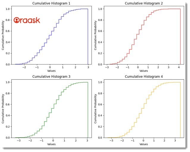
We first imported the Pyplot module and the Numpy library in the above code. Next, we created 4 Numpy arrays using the “randn” method of the Numpy library. We used the subplots method of the Matplotlib library to define a fig and ax object. We passed the argument “2,2” which means we want two rows and two columns containing the plots in our figure. Next, for each of the plots, we have defined the title and labels of the plot using the title, set_xlabel, and set_ylabel methods.
Conclusion
In this article, we have understood how to plot cumulative histogram plot in Matplotlib. Matplotlib offers us the hist function to plot the histogram plot. To get a cumulative histogram plot in Matplotlib, we can set the value of the parameter “cumulative” to be True. To plot multiple cumulative histogram plots in Python, we can also use the subplot method of Python. The method also allows us to customize the properties of the individual plots.


