How Can We Help?
The matplotlib is a potent tool in python for data visualization. It is used not only for plotting data but also for animations, graphics analysis, etc. The bar graph is a particular type of plot in matplotlib. It consists of rectangular bars. Each bar represents the relative values of the datasets.
What is Matplotlib Grouped Bar Chart used for? The grouped bar chart is exclusively used in business, economics, statistics, etc. These are extremely useful for comparing similar types of datasets over other parameters like time, etc. For example, the companies’ net profit over the past few decades.
In this article, we will learn about the grouped bar charts in matplotlib.
How to Plot the Grouped Bar Char in Matplotlib:
The plotting of the grouped bar chart in matplotlib is simple. The functions and the associated attributes are similar. Only we need to change our code in a few places.
This is as follows:
- We need to define the width of the full bars combined.
- We need to specify the length up to which the bars need to be placed.
Creating a Simple Grouped Bar Chart:
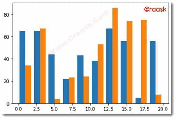
There is no separate function to make any grouped bar chart. Instead, the function used to plot the conventional bar chart is used to plot the grouped bar chart using only a little unique technique.
Example (1)
#import all the necessary packages and libraries
import matplotlib.pyplot as plt
import numpy as np
#creating the grouped_bar function to plot the graph
def grouped_bar(x,y1,y2,width):
    #plotting the first bar graph
    plt.bar(x-0.4,y1,width=width)
    #plotting the second bar graph
    plt.bar(x+0.4,y2,width=width)
#creating the main() function
def main():
    #creting data points for the x values
    x=np.arange(1,20,2)
    #creating data points for the first bar graph
    y1=[65,65,44,22,43,38,67,56,5,56]
    #creating data points for the second bar graph
    y2=[34,67,4,23,24,53,86,74,75,8]
    #specifying the width of the bars(combined)
    width=0.8
    #calling the function
    grouped_bar(x,y1,y2,width)
#calling the main() function
if __name__ == "__main__":
    main()
Output

Explanation
- We first imported all the necessary libraries and modules into the code. We used user-defined alias names to import them for convenience.
- Next we created a user-defined function named grouped_bar(). It takes four arguments: x,y1,y2, and width. Under the function, we plotted the first bar using the bar () function of the matplotlib.pyplot library. We passed the value of x and y1 to it. Notice that we have subtracted 0.4 from x. The user can change the value. We also passed the width argument, which describes the combined width of the bars. We repeated the same function and passed similar arguments to the function.
- After we are done with the grouped_bar() function, we create the main() function, which is the main part of the function. Under this function, we created a numpy array and assigned the value to a variable named x.
- We then created two lists, y1 and y2, for the data point of the two bars. The coder again defines these values. After that, we specified the width of the plot.
- We called the grouped_bar() function and passed the necessary arguments to the function.
- Finally, we called the main() function using the following command:
if __name__ == "__main__":
    main()
One thing that should be noted here is that the most important point in creating the grouped bar chart is that we need to specify the length up to which the bars should reside, i.e., the following lines of codes:
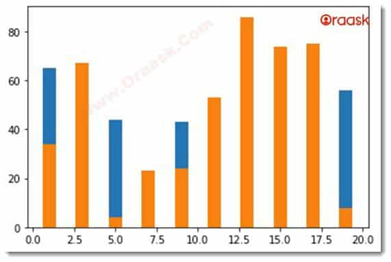
plt.bar(x-0.4,y1,width=width)If we pass the value of x and add or subtract any values, the graph formed will behave like a stacked bar graph.
Example (2)
#import all the necessary packages and libraries
import matplotlib.pyplot as plt
import numpy as np
#creating the grouped_bar function to plot the graph
def grouped_bar(x,y1,y2):
    #plotting the first bar graph
    plt.bar(x,y1)
    #plotting the second bar graph
    plt.bar(x,y2)
#creating the main() function
def main():
    #creting data points for the x values
    x=np.arange(1,20,2)
    #creating data points for the first bar graph
    y1=[65,65,44,22,43,38,67,56,5,56]
    #creating data points for the second bar graph
    y2=[34,67,4,23,24,53,86,74,75,8]
    #specifying the width of the bars(combined)
    #calling the function
    grouped_bar(x,y1,y2)
#calling the main() function
if __name__ == "__main__":
    main()
Output

Adding more Information to the Plot:
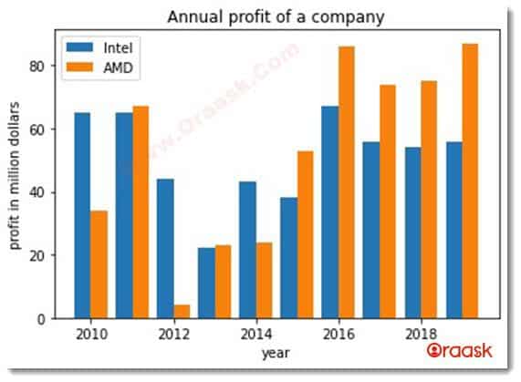
As we can see, the previous graph does not give us much in-depth information about the data and the graph itself. It is unclear what the x and y axes represent and the associated labels, legends, titles, etc. So let us make the graph more informative by adding more information. But how can we add that extra information?
In reality, the grouped bar is nothing but a simple bar graph with only multiple bars attached in the group; hence, we can apply any of the attributes associated with regular bar graphs.
Example (3)
#import all the necessary packages and libraries
import matplotlib.pyplot as plt
import numpy as np
#creating the grouped_bar function to plot the graph
def grouped_bar(x,y1,y2,width):
    #plotting the first bar graph
    plt.bar(x-0.2,y1,width=width)
    #plotting the second bar graph
    plt.bar(x+0.2,y2,width=width)
    #creating the title to the plot
    plt.title("Annual profit of a company")
    #creating the label along x axis
    plt.xlabel("year")
    #creating label along y axis
    plt.ylabel("profit in million dollars")
    #creating legends
    plt.legend(["Intel","AMD"])
#creating the main() function
def main():
    #creting data points for the x values
    x=np.arange(2010,2020,1)
    #creating data points for the first bar graph
    y1=[65,65,44,22,43,38,67,56,54,56]
    #creating data points for the second bar graph
    y2=[34,67,4,23,24,53,86,74,75,87]
    #specifying the width of the bars(combined)
    width=0.4
    #calling the function
    grouped_bar(x,y1,y2,width)
#calling the main() function
if __name__ == "__main__":
    main()
Output

In the above code, we have added some new functions:
- plt.title(): The function sets the title to the graph.
- plt.xlabel(): The function set label along the x-axis.
- plt.ylabel(): The function sets the label along the y axis.
- plt.legend():The function set legends.
Using Pandas Library to Plot the Group Bar
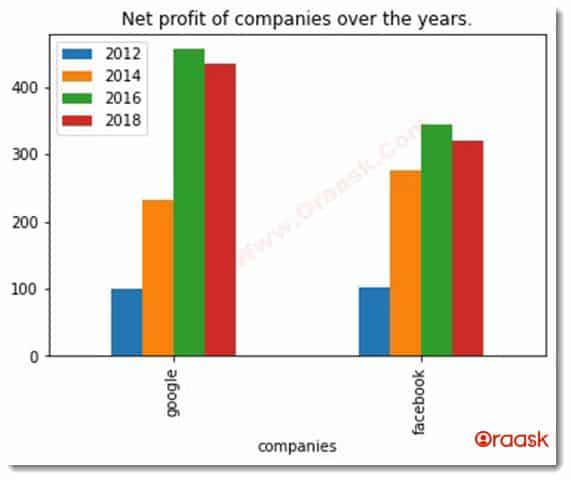
We can also use many other external libraries to plot the grouped bar char in python. The pandas library is a compelling library widely used for plotting the grouped bar graph.
Example (4)
#import all the necessary packages and libraries
import matplotlib.pyplot as plt
import pandas as pd
#creating the grouped_bar function to plot the graph
def grouped_bar():
    #creating data points
    df=pd.DataFrame([["google",100,233,456,434],["facebook",102,276,345,320]],columns=["companies","2012","2014","2016","2018"])
    #plotting the data frame in using pandas
    df.plot(x="companies",kind="bar",title="Net profit of companies over the years.")
#creating the main() function
def main():
    #calling the grouped_bar() function
    grouped_bar()
#creating the main() function
if __name__ == "__main__":
    main():
Output

Explanation
- We first imported all the necessary libraries and modules in the code using the import statement in python. We imported using the aliasing for convenience.
- We then created the grouped_bar() function. Under this function, we first created a data frame using pd.DateFrame() function. As per the syntax, we passed the values in the form of lists. We specified the column argument to the function to specify the column names to the data frame.
- We then used the df.plot() function to plot the data frame. We passed the value of x. We passed kind=” bar” to use bar graphs for plotting the graph. We also specified the title of the graph.
- Next, we created the main () function, where we called the grouped_bar() function, and we finally called the main() function using the following code:
if __name__ == "__main__":
    main()
Final Thoughts
In this article, we learned how to plot python grouped bars using both bar () function and the pandas library. We first learned it using matplotlib.pyplot() module where it is readily evident that plotting the grouped bar char is nothing but creating a simple bar chart with only a slight modification in the code.
Then we learned how to plot the grouped bar chart using the pandas library. Both of them are widely used in plotting the grouped bar chart. However, the matplotlib has an edge since it’s solely based on plotting the graphs, animations, etc., whereas the pandas is mainly a data processing and visualization library. The readers are recommended to look up the matplotlib library documentation to know about more attributes and the functions associated with it.


