How Can We Help?
Introduction
Matplotlib is the most popular data visualization library of Python. This is used to visualize different plots like histograms, bar graphs, pie charts, etc. Different types of colors help the readers to visualize the plot better. Hence it is recommended to use the histogram color properties. In this article, we shall learn how to specify customizable colors for the histogram.
Set Single Color For All The Bars
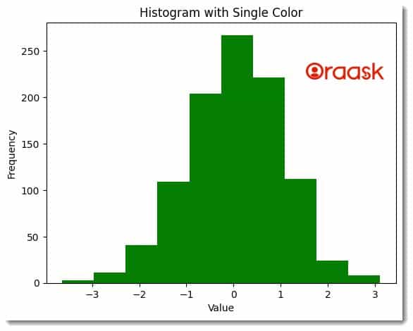
We may need to set a single color for all the bars in the graph. For this, we simply need to use the color property of the hist method. The property takes string data types. The value should be a valid color in the name, RGB, or HSV color format.
Example (1)
# Import the libraries in the code
import matplotlib.pyplot as plt
import numpy as np

# Generate some sample data
data = np.random.normal(0, 1, 1000)

# Set a single color for all bars
plt.hist(data, color='green')
# Define the title of the plot
plt.title('Histogram with Single Color')
# Define labels for the plot
plt.xlabel('Value')
plt.ylabel('Frequency')
plt.show()
Output:
Set Multiple Color For All The Bars
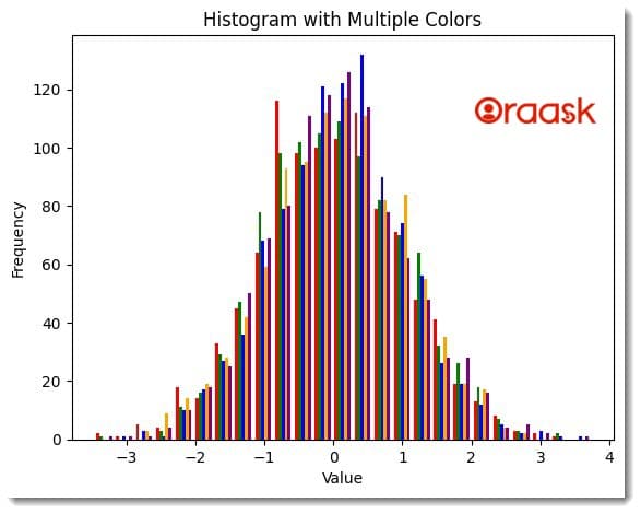
In the previous example, we learned how to set a single color to all the bars in the histogram. However, we may need to set multiple colors for all the bars when multiple graphs are in the same plot. In this situation, we must pass the colors as list data types. While the name of the colors should be in the form of a string, the sequence should be in the form of a list of array-like objects.
Example (2)
import matplotlib.pyplot as plt
import numpy as np

# Generate some sample data
data1 = np.random.normal(0, 1, 1000)
data2 = np.random.normal(0, 1, 1000)
data3 = np.random.normal(0, 1, 1000)
data4 = np.random.normal(0, 1, 1000)
data5 = np.random.normal(0, 1, 1000)
# Define the custom colors
colors = ['red', 'green', 'blue', 'orange', 'purple']
# Plot the data and pass the colors in the form of a list
plt.hist([data1,data2,data3,data4,data5], bins=25, color=colors)
# Define the title of the plot
plt.title('Histogram with Multiple Colors')
# Define the label of the plot
plt.xlabel('Value')
plt.ylabel('Frequency')
plt.show()
Output:
Note: For more information about Histogram in the Matplotlib library, follow this tutorial: Python Matplotlib Histogram
Set Colormap For The Bars
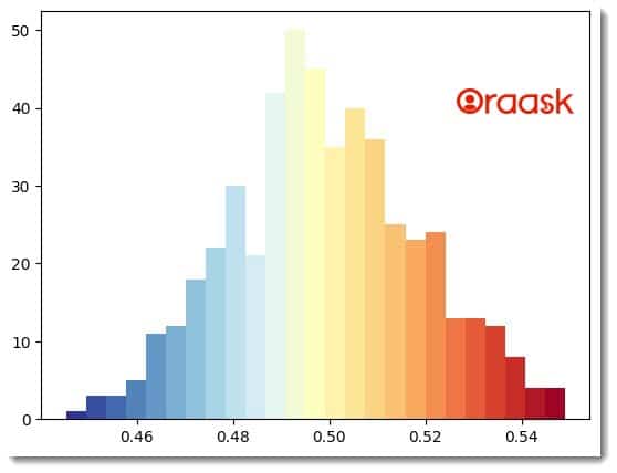
To set the colormap in the histogram, we can use the cmap argument of the hist method. This provides a convenient way to express the values relative to others.
Example (3)
import numpy as n
import matplotlib.pyplot as plt

# Define a random gaussian distribution
Ntotal = 500
data = 0.02 * n.random.randn(Ntotal) + 0.5

# Use a colormap depending upon your choice

cm=plt.colormaps.get_cmap('RdYlBu_r')

# Plot histogram.
n, bins, patches = plt.hist(data, 25, color='red')
bin_centers = 0.2 * (bins[:-1] + bins[1:])

# Normalize the value
col = bin_centers - min(bin_centers)
col /= max(col)
# Setup the colormap for each bar
for c, p in zip(col, patches):
    plt.setp(p, 'facecolor', cm(c))

plt.show()
Output:
Check This: There is a full guide on Matplotlib Colors if you want to know more about colors in matplotlib.
Set Edge Color For The Bars
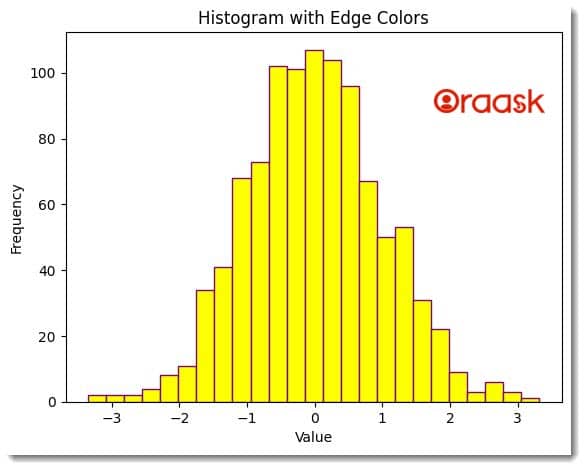
Maplotlib allows us to set the edge color of the bars using the edge color property of the hist method. The edge color is the color of the border of the bars. This proves handy when we need to contrast the plot’s different bars.
Example (4)
import matplotlib.pyplot as plt
import numpy as np
# Generate some sample data
data = np.random.normal(0, 1, 1000)
plt.hist(data, bins=25, color='yellow', edgecolor='purple')
plt.title('Histogram with Edge Colors')
plt.xlabel('Value')
plt.ylabel('Frequency')
plt.show()
Output:
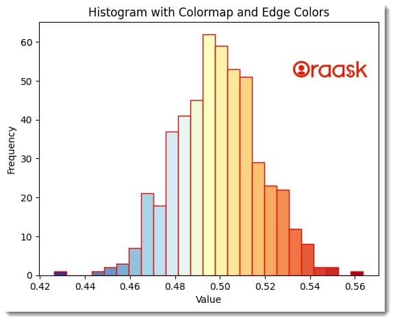
Combine Colormap And Edge Color Options
We can use the combination of any concepts we learned in this article. For example, we can use the colormap with edge color. We need to use multiple parameters within the same hist function to perform the same.
Example (5)
import numpy as n
import matplotlib.pyplot as plt

# Define a random Gaussian distribution
Ntotal = 500
data = 0.02 * n.random.randn(Ntotal) + 0.5

# Use a colormap depending upon your choice

cm=plt.colormaps.get_cmap('RdYlBu_r')

# Plot histogram.
n, bins, patches = plt.hist(data, 25, color='red',edgecolor='red')
bin_centers = 0.2 * (bins[:-1] + bins[1:])

# Normalize the value
col = bin_centers - min(bin_centers)
col /= max(col)
# Setup the colormap for each bar
for c, p in zip(col, patches):
    plt.setp(p, 'facecolor', cm(c))
plt.title('Histogram with Colormap and Edge Colors')
plt.xlabel('Value')
plt.ylabel('Frequency')
plt.show()
Output:
Conclusion
In this article, we understood how to set colors in the bars of the histogram plot. We first saw how to set a single color to all the bars in the histogram using the simple color property. Next, we used the exact property to define multiple colors using list data type instead. We also demonstrated the use of colormaps and edge color in the article. These concepts help improve the plot’s visualization to a great extent, and hence the programmers to use them whenever required.


