How Can We Help?
Python is one of the most popular programming languages in the world. It offers various libraries and packages that are extremely useful for many programming-related tasks. The matplotlib in python is a popular library for creating data visualization, plotting graphs, making animations, etc.
In this article, we will learn how to use the matplotlib labels.
What are Matplotlib Labels?
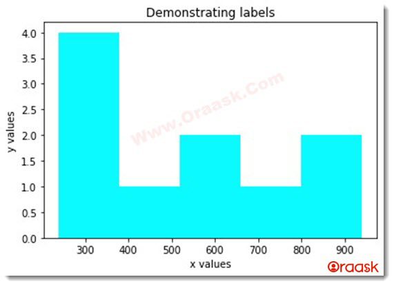
The labels are defined as the texts defining what the x and y axes are. It gives us information about the x and the y-axis. The labels are important because the reader must know about what quantity the axis represents and the units associated with it.
Example of labels:
import matplotlib.pyplot as plt
import numpy as np
import random
def histogram(x):
    plt.hist(x, bins=5,color="cyan")
    plt.title("Demonstrating labels")
    plt.xlabel("x values")
    plt.ylabel("y values")
    plt.show()
def main():
    x=[]
    for i in range(10):
        x.append(random.randint(200,1000))
    print(x)
    histogram(x)
if __name__ == "__main__":
    main()
Output:
[240, 649, 876, 371, 555, 359, 939, 516, 274, 759]

In the above example, look at the texts x and y values. Those are called the labels of the plot.
How to Make Labels in a Matplotlib Plot?
Making a label in matplotlib is a straightforward task. The only thing we need to do is we need to add the following statement:
plt.xlabel(<text information>)
plt.ylabel(<text information>)
Example (2):
import matplotlib.pyplot as plt
import random
def scatter(x,y):
    plt.scatter(x,y,color="green")
    plt.title("Demonstrating labels")
    plt.xlabel("This is the x label")
    plt.ylabel("This is the y label")
    plt.show()
def main():
    x=[]
    for i in range(25):
        x.append(random.randint(200,1000))
    print(x)
    y=[]
    for i in range(25):
        y.append(random.randint(200,1000))
    scatter(x,y)
if __name__ == "__main__":
    main()
Output:
[676, 718, 506, 752, 890, 818, 839, 405, 482, 896, 578, 233, 804, 553, 839, 357, 976, 708, 368, 677, 425, 289, 242, 851, 713]

Explanation:
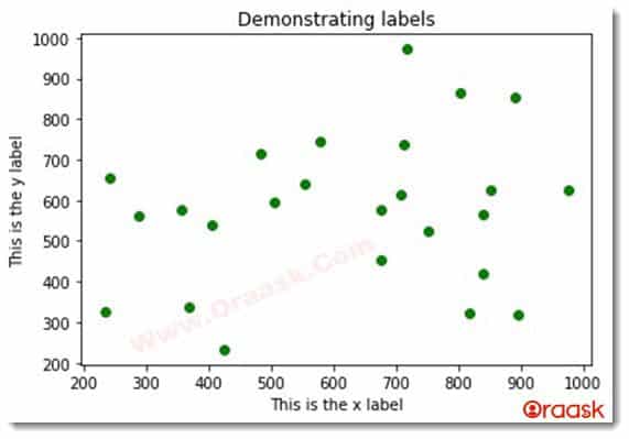
- First, we have imported all the necessary python libraries for the code. We have imported the matplotlib.pyplot and the random libraries using the import statement. We have created alias names for a convention.
- Then we created a user called scatter. It takes two positional arguments, x, and y. Under the function, we have written the codes to plot a scatter plot using the x and y as the values along the x and y axes.
- We used the plt.scatter() function to plot the scatter plot. We also passed the color argument to plot the color in green.
- Then we gave the title to the graph using the plt.title() function and labels using the xlabel and ylabel functions.
- Finally, we have shown the plot using the plt.show() function.
- We now created the main() function, which is the central part of the code. Here we defined the x and the y values. Both are list data types. We have used loops and the concept of random libraries to append 25 elements in the lists.
- We then called the scatter function to pass the parameters to the scatter() function.
- Finally, we called the main function to execute the main part of the program using the following code:
if __name__ == "__main__":
    main()
Setting Font Properties to the Labels
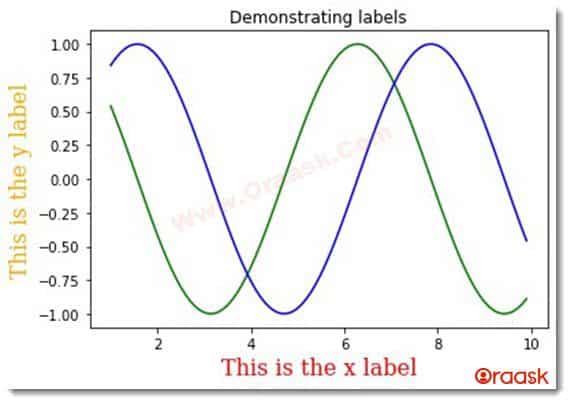
We can also set font properties to the labels in the plot. For that, we must pass an argument called fontdict to the xlabel() and the ylabel() function.
Example (3)
import matplotlib.pyplot as plt
import random
def plot_the_graph(x,y1,y2):
    plt.plot(x,y1,color="green")
    plt.plot(x,y2,color="blue")
    plt.title("Demonstrating labels")
    font1 = {'family': 'serif',
        'color':  'red',
        'weight': 'normal',
        'size': 16,
    }
    font2 = {'family': 'serif',
        'color':  'orange',
        'weight': 'normal',
        'size': 16,
    }
    plt.xlabel("This is the x label",fontdict = font1)
    plt.ylabel("This is the y label",fontdict=font2)
    plt.show()
def main():
    x=np.arange(1,10,0.1)
    y1=np.cos(x)
    y2=np.sin(x)
    plot_the_graph(x,y1,y2)
if __name__ == "__main__":
    main()
Output:

Explanation:
- First, we have imported all the necessary libraries into the code. We have imported the matplotlib.pyplot and random libraries.
- Now we made a user-defined function called plot_the_graph. It takes three parameters, namely x,y1, and y2.
- Under the function, we have used the codes to plot the values. We have used the plot() function to plot the values in the plot. We passed the color argument to specify the colors of the plots.
- We then gave the title to the plot using the title() function.
- Now we have created two variables called font1 and font2 and specified the font properties for the x and y labels.
- We then gave the labels to the plots. We passed the arguments called fontdict to pass the font parameters to the labels.
- Then we used the plt.show() function to show the graph.
- We then created the primary function. We created the values of x and y using the numpy library.
- Then finally, we called the primary function using the following code:
if __name__ == "__main__":
    main()
Conclusion:
In this article, we have learned how to use the matplotlib labels. We have used many attributes associated with the same. However, we highly recommend the readers look up the python matplotlib documentation to have more knowledge about the topics.


