How Can We Help?
Matplotlib is a convenient python library used for data visualization. The matplotlib pie chart is a special kind of chart in which the total share is represented through a circular portion, and the shares of individual parts are shown in the form of arcs. The pie chart is one of the most important charts in many fields. Especially in the field of business, economics, and government, this chart is extremely popular.
In this article, we will learn how to plot a pie chart in python and its many attributes.
Creating Pie Chart
Creating a pie chart in matplotlib is very simple. By default, the matplotlib offers the function to plot a pie chart, the pie () function.
Example (1)
#importing all the necessary libraries and modules in the code
import matplotlib.pyplot as plt
import numpy as np
#creating plot_pie() function
def plot_pie(x,y):
    #plotting the pie chart
    plt.pie(y,labels=x)
#creating the main() function
def main():
    #creating the labels for the plot
    employees=["John","simon","smith","johnson","micheal"]
    #creating data points
    salary=[53000,65455,58000,89000,78000]
    #calling the plot_pie() function
    plot_pie(employees,salary)
#declaring main() as the main driving code
if __name__ == "__main__":
    main ()
Output:
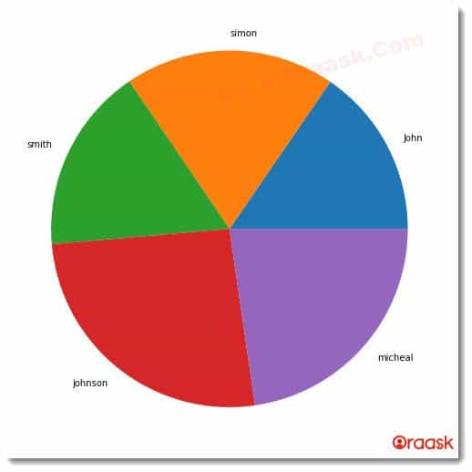
Explanation:
- First, we have created all the necessary libraries and modules in the code using the import statement of python. We used their alias names for convenience in writing the codes in the program.
- Next, we created a user-defined function named plot_pie() which takes two parameters, x, and y. Under this function, we have used the plt.pie() function to plot the pie chart. We passed y as the first argument and x as the argument for the labels.
- Now we created the main () function. This is the driving code of the program. Under this function, we created a list named employees. We created another list named salary, where we set the data points.
- We called the plot_pie() function with all the arguments passed. Finally, we called the main() function using the following lines of codes:
if __name__ == “__main__”:
main ()
Adding More Information to the Plot
However, the above code does not give us much information about the chart. It does not provide information about the chart’s title, labels, etc. We can, however, add them all using the functions associated with matplotlib.
Example (2)
#importing all the necessary libraries and modules in the code
import matplotlib.pyplot as plt
import numpy as np
#creating plot_pie() function
def plot_pie(x,y):
    #plotting the pie chart
    plt.pie(y,labels=x,colors=["green","red","blue","yellow","orange"])
    #passing title to the plot.
    plt.title("Distribution of salary of employees")
    #displaying the plot
    plt.show()
#creating the main() function
def main():
    #creating the labels for the plot
    employees=["John","simon","smith","johnson","micheal"]
    #creating data points
    salary=[53000,65455,58000,89000,78000]
    #calling the plot_pie() function
    plot_pie(employees,salary)
#declaring main() as the main driving code
if __name__ == "__main__":
    main()
Output:
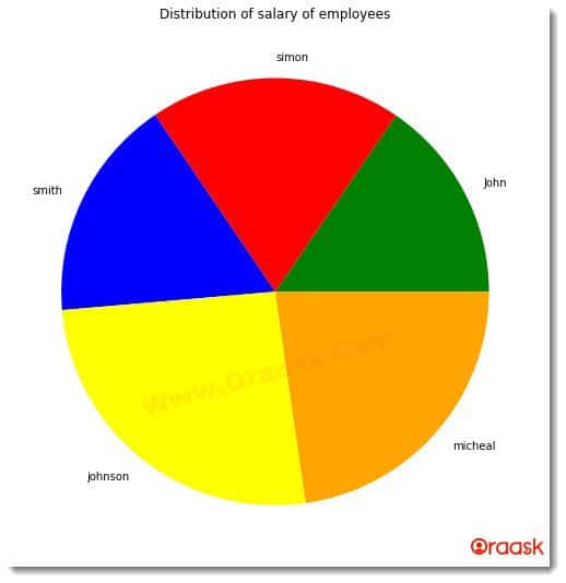
Creating Pie Chart with the Percentage inside the Wedge
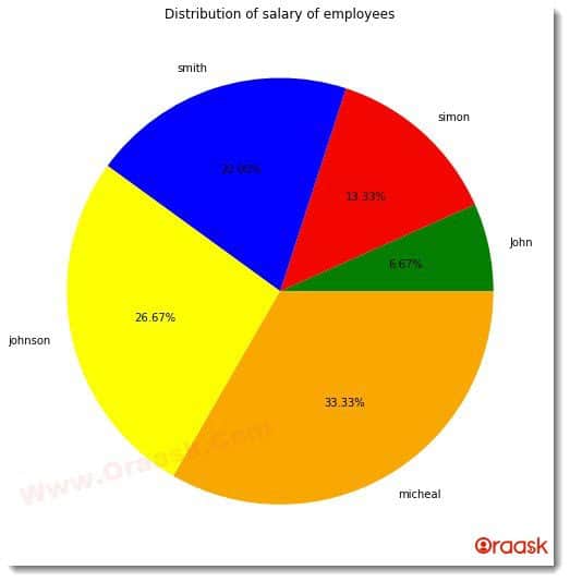
Adding percentage share to the pie chart is yet another easy task. Although we can also build our logic to make the percentage share array and show it in the pie chart, the good news is that matplotlib already offers us attributes to display each percentage share automatically.
This can be done by adding the following attributes to the pie () function:
autopct=’%1.2f%%’
Example (3)
#importing all the necessary libraries and modules in the code
import matplotlib.pyplot as plt
import numpy as np
#creating plot_pie() function
def plot_pie(x,y):
    #plotting the pie chart
    plt.pie(y,labels=x,colors=["green","red","blue","yellow","orange"],autopct='%1.2f%%')
    #passing title to the plot.
    plt.title("Distribution of salary of employees")
    #displaying the plot
    plt.show()
#creating the main() function
def main():
    #creating the labels for the plot
    employees=["John","simon","smith","johnson","micheal"]
    #creating data points
    salary=[int(x) for x in range(10000,60000,10000)]
    #calling the plot_pie() function
    plot_pie(employees,salary)
#declaring main() as the main driving code
if __name__ == "__main__":
    main()
Output:
Explanation:
- Using the import statement, we first imported all the necessary libraries and packages in the code. Next, we created the plot_pie () function. This function takes two parameters, namely x, and y.
- Under the plot_pie () functions, we used the pie () function of matplotlib.pyplot to plot the pie chart. We first passed the value of y. Under labels, we passed the value of x. We then passed the color attribute and set the color for the sectors. However, it is optional to add color attributes since, by default, matplotlib will automatically set different colors for each of the sectors.
- We used the attribute autopct=’%1.2f%%’ to show the percentage share of each sector in the plot. Next, we title the graph using the title () function.
- Next, we created the main() function. Under this main() function, we created the employee list for the pie chart labels. After that, we create a salary list for creating data points. We called the plot_pie () function with all the necessary arguments passed.
- Finally, we declare the main() function as the main driving code of the program using the following lines of code:
if __name__ == “__main__”:
main ()
Creating a Pie Chart Using Axes Object
We can also create a pie chart using the axes object in matplotlib. This is a more convenient method because it gives more control to the programmer to determine the size of the figure etc. We can use all the functions of matplotlib with it too.
Example (4)
#importing all the necessary libraries and modules in the code
import matplotlib.pyplot as plt
import numpy as np
#creating plot_pie() function
def plot_pie(x,y):
    #creating figure object
    fig=plt.figure()
    #creating the axis with 4 parameters passed
    ax=fig.add_axes([0,0,1,1])
    #making the axis of the plot equal
    ax.axis("equal")
    #plotting the chart
    ax.pie(y,labels=x)
#creating the main() function
def main():
    #creating the labels for the plot
    employees=["John","simon","smith","johnson","micheal"]
    #creating data points
    salary=[53000,65455,58000,89000,78000]
    #calling the plot_pie() function
    plot_pie(employees,salary)
#declaring main() as the main driving code
if __name__ == "__main__":
    main()
Output:
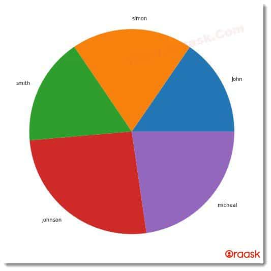
Explanation:
- We first imported all the necessary libraries and modules in the code using the import statement of python.
- Next, we created a user-defined function named plot_pie (), which takes two parameters, x, and y. Under the function, we first created the figure object using the plt.figure() function. Next, we created an axes object to define the axis of the plot. We did it using the add_axes() function. We passed four parameters here whose values are 0,0,1,1, respectively.
- Next, we made the axis equal through the ax.axis(“equal”)command. Finally, we plotted the pie chart sing ax.pie() function and passed y and x as the arguments in the program.
- Now we created the main () function, which is the driving code of the program. Under this function, we created a list like an object named employees to pass labels to the pie chart later in the code. Next, we also created a list named salary for the data points of the pie chart, which will represent a share of the arc from the circle available.
- We then called the plot_pie () function and passed the necessary arguments. Finally, we called the main () function using the following lines of commands:
if __name__ == “__main__”:
main ()
Still Curious? Click here to find out How to avoid pie chart labels overlap
Add a Legend to the Pie Chart
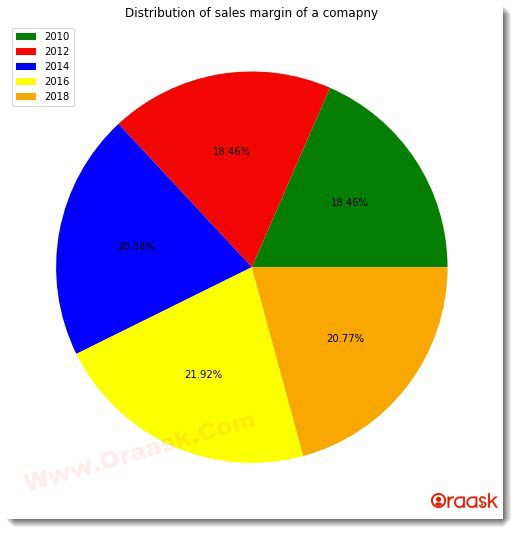
Adding legends to the plot is equally important to describe the code in the program entirely. Legends are essential to make the reader know which sector represents what information. We can add the same with the plot function of the matplotlib.pyplot module.
Example (5)
#importing all the necessary libraires and modules in the code
import matplotlib.pyplot as plt
import numpy as np
#creating plot_pie() function
def plot_pie(y):
    #plotting the pie chart
    plt.pie(y,colors=["green","red","blue","yellow","orange"],autopct='%1.2f%%')
    #passing title to the plot.
    plt.title("Distribution of sales margin of a comapny")
    #adding legends to the plot
    plt.legend(["2010","2012","2014","2016","2018"])
    #displaying the plot
    plt.show()
#creating the main() function
def main():
    #creating the labels for the plot
    #creating data points
    salary=[48,48,53,57,54]
    #calling the plot_pie() function
    plot_pie(salary)
#declaring main() as the main driving code
if __name__ == "__main__":
    main()
Output:
Still Curious? Click here to find out more useful information about Matplotlib Pie Chart Legend
Exploding Pie Chart
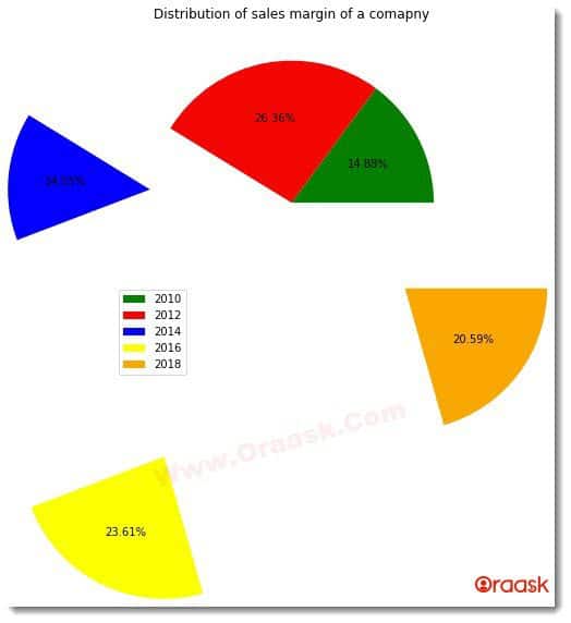
Sometimes data become so important that we want to show them separately. One way of doing this is to use the explode function, which will take the sector out of the circle to the desired position as set by the programmer. The explode attribute will take the values in the form of tuples, and the values can be in the form of integers or floats. It cannot be any string.
Example (6)
#importing all the necessary libraries and modules in the code
import matplotlib.pyplot as plt
import numpy as np
#creating plot_pie() function
def plot_pie(y):
    #plotting the pie chart
    plt.pie(y,colors=["green","red","blue","yellow","orange"],autopct='%1.2f%%',explode=(0,0,1,2,1))
    #passing title to the plot.
    plt.title("Distribution of sales margin of a comapny")
    #adding legends to the plot
    plt.legend(["2010","2012","2014","2016","2018"])
    #displaying the plot
    plt.show()
#creating the main() function
def main():
    #creating the labels for the plot
    #creating data points
    salary=[54200,96000,53000,86000,75000]
    #calling the plot_pie() function
    plot_pie(salary)
#declaring main() as the main driving code
if __name__ == "__main__":
    main()
Output:
Nested Pie Chart
Sometimes we also may want to create a nested pie chart. A nested pie chart is a pie chart in which multiple other pie charts are embedded. This can be quickly done with the help of the pie () function of matplotlib. We also need to pass another parameter named size, in which we need to set different sizes for all the pie charts; otherwise, the pie charts will overlap, and only one pie chart will be visible.
Example (7)
#import all the necessary libraries and modules
import matplotlib.pyplot as plt
import numpy as np
#creating a user defined function named nested_pie()
def nested_pie(x,y,z,size):
    #creating figure object
    fig=plt.figure(figsize=(5,10))
    #creating the axis with 4 parameters passed
    ax=fig.add_axes([0,0,1,1])
    #creating the outermost pie chart
    ax.pie(x,radius=size)
    #creating the middle pie chart
    ax.pie(y,radius=size-0.3)
    #creating the smallesst pie chart
    ax.pie(z,radius=size-0.6)
def main():
    #creating dat point for the outermost pie chart
    salary1=[5,17,48,32,4]
    #creating dat point for the middle pie chart
    salary2=[12,23,23,23,23]
    #creating dat point for the pie chart with least radius
    salary3=[7,8,6,5,6]
    #defining the size or the pie chart
    size=1
    #calling the nested_pie() function
    nested_pie(salary1,salary2,salary3,size)
#declaring main() function as the main driving code of the program.
if __name__ == "__main__":
    main ()
Output:
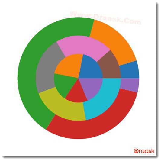
We can use all the attributes and functions with the individual pie charts as we did in the previous codes. Only multiple pie charts with some size difference are added to a single chart.
Still Curious? Click here to find out How to Plot Nested Pie Chart in Matplotlib
Customize Colors of Matplotlib Pie Chart
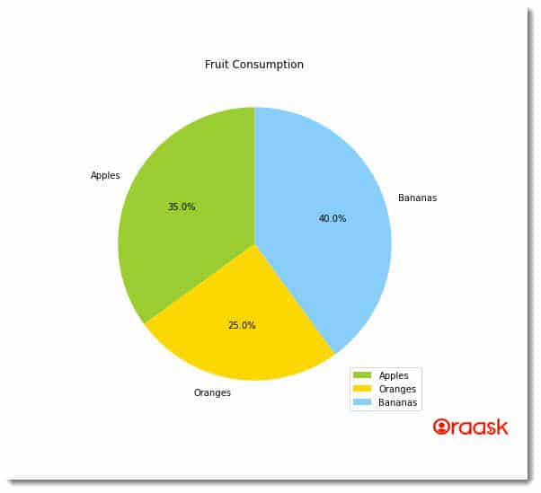
While pie charts are effective for displaying data, they can be made even more informative and visually appealing by customizing the colors. By changing the default colors, users can highlight specific categories or make their charts more visually interesting. In this way, customizing pie chart colors in Matplotlib is a useful tool for creating impactful and memorable data visualizations.
Example (8):
import matplotlib.pyplot as plt

# data to plot
labels = ['Apples', 'Oranges', 'Bananas']
sizes = [35, 25, 40]
# custom colors
colors = ['yellowgreen', 'gold', 'lightskyblue']

fig = plt.figure(figsize=(7, 7))

# plot
plt.pie(sizes, labels=labels, colors=colors, autopct='%1.1f%%', startangle=90)

# add a legend
plt.legend(labels, loc="best")

# add a title
plt.title("Fruit Consumption")

# show the plot
plt.show()
Output:
Still Curious? Click here to find out more useful informations about How to Customize Matplotlib Pie Chart Colors
Matpltolib Pie Chart Quiz
Conclusion
This article taught us how to create a pie chart in the python matplotlib library. We learned about the pie () function available in matplotlib, mainly used for plotting the pie chart in python. We also learned about many attributes associated with the function, like color, labels, etc. We also learned how to add title labels to the pie chart.
Although we learned about all the essential attributes and functions associated with the pie chart, it is recommended for the user to look up the python matplotlib documentation to have more knowledge of the topics. Also, keeping updated with the latest functions will be helpful.


