How Can We Help?
There are quite a large number of coordinates available in mathematics—for example, the rectangular coordinate system, cylindrical coordinate system, spherical coordinate system, etc.
We mostly talk about the rectangular coordinate system, which consists of two x and y axes in two dimensions and three-axis, namely x,y, and z in the three dimensions. However, apart from these, other popular coordinate systems are critical. One such popular co-coordinate system is the polar coordinate system, widely used in scientific computing, physics, etc. These coordinate systems are extensively used in the gaming industry too.
[adinserter block=”1″]
This article will explain how to plot the polar curves in matplotlib in python.
Table of Contents:
- What is Matplotlib Polar Plot
- What is the use of Matplotlib Polar Plot
- Creating Simple Popular Figures on the Polar Axis
- Creating arcs Using Matplotlib Polar
- Plotting Ellipse in the Polar Coordinate
- Creating Spiral Graph
- Creating Line Plots on the Polar Axis
- Scatter Plot in Polar Coordinates
- Plotting Bar Graph in Polar Coordinates
- Final-Thoughts
What is Matplotlib Polar Plot?
The polar plot is the locus of the graphical representation with real and imaginary parts. The polar coordinates are not rectangular in shape. Instead, they are circular. The points on the circle have two projections on the x and y-axis. The value along the x-axis represents the natural part, and the projection on the y-axis represents the imaginary part.
What is the use of Matplotlib Polar Plot?
Polar plots are extensively used in the field of mathematics and electrical engineering. These plots help visualize the systems’ frequency characteristics over the entire frequency range. Such visualization plays a crucial role in determining the characteristics of wave signals. Polar is used to design and implement digital signal processing, communications, etc.
[adinserter block=”2″]
Parameters Required for the Polar Coordinates
Just like the rectangular coordinates required x,y, and z as the parameters for the description of the figures in the polar coordinate system, we need to pass theta(or the angle) and r(distance of the points from the origin)
Prerequisite:
We need to install a few libraries for the programs to run. They are matplotlib and numpy
We can install it through the PowerShell of Windows, the bash shell of Linux, or the mac operating system.
Just type the following commands :
pip install matplotlib
pip install numpy
Creating Simple Popular Figures on the Polar Axis
Before going to the actual implementation of bar plot, pie plot, etc., in the polar plot, it is recommended to know how to plot the figures in the polar form using different figures. Let us discuss plotting some of the most famous plots in matplotlib using the polar coordinates.
Example (1)
#import all the necessary modules and libraries in the code
import numpy as np
import matplotlib.pyplot as plt
#creatinf a user-defined function called polar
def polar(r,radians):
    plt.figure(figsize=(9,9))
    #creating the polar object
    plt.axes(projection = 'polar')
    #plotting the polar coordinates
    for rad in radians:
        plt.polar(rad, r,'red')
    #displaying the graph
    plt.show()
#creating the main() function
def main():
    #creating data points for the angles of each point
    radians = np.arange(0, (2 * np.pi), 0.01)
    #definig the radius of the data points
    r = 2
    #calling the polar function
    polar(r,radians)
#calling the main() function
if __name__ == '__main__':
    main()
[adinserter block=”3″]
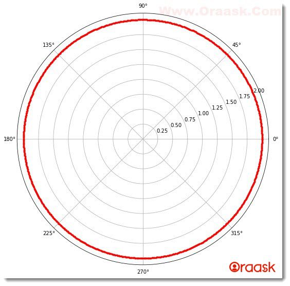
Output:
[adinserter block=”4″]
Explanation:
- First, we imported all the necessary libraries and packages in our code using the import statement of python. We imported numpy and matplotlib.pyplot using their alias names to make it much more convenient to code later.
- Next, we created a user-defined function named polar(), which takes two parameters, r, and radians, for plotting the polar axis. Under this function, we first created the figure object to define the size of the figure using the figsize attribute of the plot. Next, we created the axes class using the axes() function. We passed the attribute projection= “polar” to specify that the coordinate should be polar coordinate.
- Next, we used a for loop to loop through all the data points. We then plotted each data point by looping the radians variable, a numpy array containing the angle for each plot in the radians unit.
- We used the polar () function to plot the figure’s points. Note that it is a built-in function of matplotlib.pyplot.We then displayed the figure using the plt.show() function.
- Next, we created the main() function, which is the main driving code of the program. Under this function, we first created the data points for each point’s angles. We used the numpy library for the same. We used 0 as the first parameter indicating the date points should start with the angle at 0 degree/radian. Next, we used 2*np.pi, which means approximately 2*3.141. We choose this number because the total length of the perimeter in the circle is approximately 2*3.141. We have used 0.01 as the third parameter, which defines the iterating step for each data point.
- Next, we defined the radius of the data points using the variable r and defined it as 2. We could choose any value depending on the radius of the circle needed.
- We then called the polar() function and passed the necessary parameters in the code.
- Finally, we called the main() function using the following lines of codes:
if __name__ == ‘__main__’:
main()
Creating arcs Using Matplotlib Polar
We can also create arcs instead of complete cycles in polar coordinates. This can be done by choosing the appropriate starting angle of the data points and the appropriate last angle of the data points in the plot.
Example (2)
#import all the necessary modules and libraries in the code
import numpy as np
import matplotlib.pyplot as plt
#creatinf a user-defined function called polar
def polar(r,radians):
    plt.figure(figsize=(9,9))
    #creating a polar object
    plt.axes(projection = 'polar')
    #plotting the polar coordinates
    for rad in radians:
        plt.polar(rad, r, 'b.')
    #displaying the graph
    plt.show()
#creating the main() function
def main():
    #creating data points for the angles of each point
    radians = np.arange(1/2*np.pi,  np.pi, 0.01)
    #definig the radius of the data points
    r = 2.5
    #calling the polar function
    polar(r,radians)
#calling the main() function
if __name__ == '__main__':
    main()
Output:

[adinserter block=”5″]
In the above code, we plotted one-quarter of a circle in the second quadrant by specifying the starting index as 1/2*np.pi and the end index as np.pi. We have also changed the radius of the plot to 3 units.
Check This: Article on How to Draw a Polar Contour Plot in Matplotlib if you want to know more about how to draw a mix of polar and contour plot in Matplotlib with practical examples.
Plotting Ellipse in the Polar Coordinate
Another famous graph in the polar co coordinates is the ellipse. The ellipse has two major components, namely the major axis and the minor axis. They are usually represented by a and b, respectively.
The radius of the points is defined as the distance of the points from the origin of the ellipse. The formula gives it:
r=(a*b)/√(asinθ)2+(bcosθ)2.
We can therefore implement this formula in python code to get the figure.
Example (3)
#import all the necessary modules and libraries in the code
import numpy as np
import matplotlib.pyplot as plt
import math
#creating a user-defined function called polar
def polar(a,b,radians):
    plt.figure(figsize=(9,9))
    #creating a polar object
    plt.axes(projection = 'polar')
    #iterating each angle in radians
    for rad in radians:
        #defining the distance of each point through each iteration
        distance = (a*b)/math.sqrt((a*np.sin(rad))**2 + (b*np.cos(rad))**2)
        #plotting the graph
        plt.polar(rad, distance, 'r.')
    #displaying the graph
    plt.show()
#creating the main() function
def main():
    #defining the length of the major axis
    a=6
    #defining the length of the minor axis
    b=5
    #creating data points for the angles of each point
    radians = np.arange(0, 2* np.pi, 0.01)
    #calling the polar function
    polar(a,b,radians)
#calling the main() function
if __name__ == '__main__':
    main()
[adinserter block=”6″]
Output:
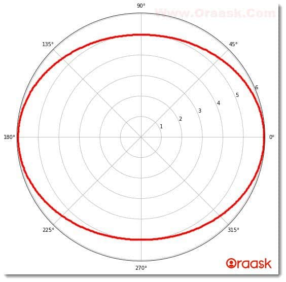
Explanation:
- First, we imported all the necessary libraries and packages in the code using the import statement of python. We used the alias names for convenience.
- Next, we created a user-defined function called the polar() function, which takes three arguments: a,b and radians. Under this function, we created the figure object to specify the size of the figure. Next, we created the axes object and set the projection to polar to plot a polar coordinate.
- Then we iterated the radians, which is a numpy array. Under each iteration, we created a distance variable and applied the formulae for finding the distance of the data points from the figure’s origin. Next, we plotted the graph using the plot.polar() function.Under this built-in function, we have passed three arguments. The first is the rad, the second is the distance of the points, and the third one is the data point’s color.
- We then displayed the graph using the plt.show() function.
- Next, we created the main() function, which is the main driving code of the program. Under this function, we first defined the values of a and b, which are the length of the ellipse’s major and minor axis of the ellipse.
- We used the numpy array to generate data points which is the angle subtended by the data points on the origin. Next, we called the polar() function by passing the appropriate arguments.
- Finally, we declared the main() function as the main driving code of the program using the following lines of codes:
if __name__ == ‘__main__’:
main()
[adinserter block=”7″]
Creating Spiral Graph
Another graph in polar coordinates is the spiral graph. This graph is defined as the locus of a graph in which a point is moving uniformly in a path such that the distance of the path from the origin changes uniformly. In the mathematical description, it has the following property:
radius=angle subtended by the point on the center.
Example (4)
#import all the necessary modules and libraries in the code
import numpy as np
import matplotlib.pyplot as plt
import math
#creating a user-defined function called polar
def polar(radians):
    plt.figure(figsize=(9,9))
    #creating the polar object
    plt.axes(projection = 'polar')
    #iterating each angle in radians
    for rad in radians:
        #plotting the graph
        plt.polar(rad, rad, 'r.')
    #creating title for the graph
    plt.title("Demonstrating polar co-ordinate through spiral graph")
    #creating a legend for the graph
    plt.legend(["Spiral graph"])
    #displaying the graph
    plt.show()
#creating the main() function
def main():
    #creating data points for the angles of each point
    radians = np.arange(0, 2* np.pi, 0.01)
    #calling the polar function
    polar(radians)
#calling the main() function
if __name__ == '__main__':
    main()
Output:
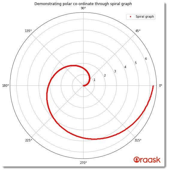
Explanation:
- We first imported all the necessary libraries and packages on the code as customary.
- Next, we created a user-defined function called polar() which takes only one argument, namely radians and radius. Under this function, we created a figure object and passed the projection=” polar” attribute. This we did to make a polar plot. Next, we plotted the graph by calling the plt.plot() function and passing radians and radius as its parameters. Next, we passed the title to the plot using the plt.title() function and the legend using the plt.legend() function.
- After the polar() function, we created the main() function, which is the main driving code of the program. Under this function, we first created data points for the radius variable, which specifies the distance of the data points from the origin. Then we created the radians variable and called the polar() function.
- Finally, we called the main() function using the following lines of codes:
if __name__ == ‘__main__’:
main()
[adinserter block=”8″]
Creating Line Plots on the Polar Axis
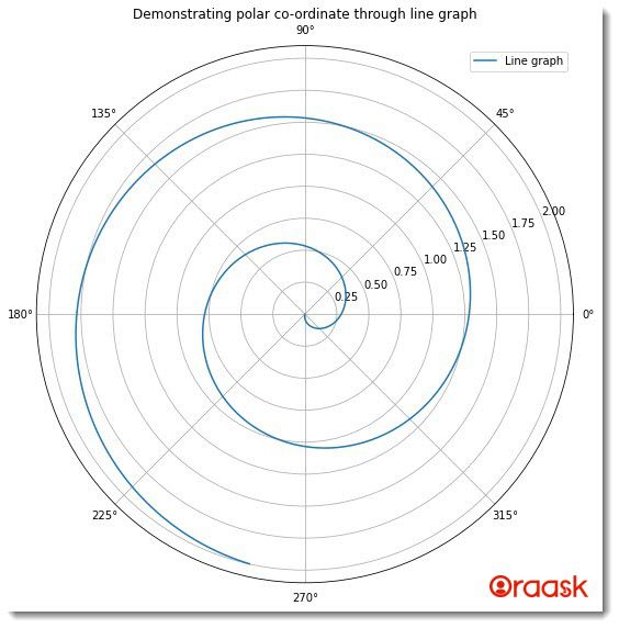
Polar coordinates also allow us to plot line plots in the graph. We can plot the line curves using the plt.plot() function. But before that, we need to set the projection of the axis to a polar function.
Example (5)
#import all the necessary modules and libraries in the code
import numpy as np
import matplotlib.pyplot as plt
import math
#creating a user-defined function called polar
def polar(radius,radians):
    plt.figure(figsize=(9,9))
    #creating a polar object
    plt.axes(projection = 'polar')
    #iterating each angle in radians
    plt.plot(radians, radius)
    #creating title for the graph
    plt.title("Demonstrating polar co-ordinate through line graph")
    #creating a legend for the graph
    plt.legend(["Line graph"])
    #displaying the graph
    plt.show()
#creating the main() function
def main():
    radius=np.arange(0, 2, 0.001)
    #creating data points for the angles of each point
    radians =  2 * np.pi * radius+4.5
    #calling the polar function
    polar(radius,radians)
#calling the main() function
if __name__ == '__main__':
    main()
Output:
Scatter Plot in Polar Coordinates
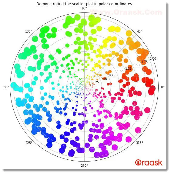
Polar coordinates also allow us to plot the scatter graphs. Here we need to specify the projection of the plot to polar first. Then we need to use the scatter() function to plot the data points in the figure. We can also specify the color, opacity, distance of the points from the origin, etc.
[adinserter block=”9″]
Example (6)
#import all the necessary libraries and packages in the code
import numpy as np
import matplotlib.pyplot as plt
#creating a user-defined function named scatter
def scatter(distance,theta,colors,area):
    #creating the figure object
    fig = plt.figure(figsize=(9,9))
    #creating the axis object and setting the projection to be polar
    ax = fig.add_subplot(projection='polar')
    #plotting the graph
    c = ax.scatter(theta, distance, c=colors, s=area, cmap='hsv', alpha=0.95)
    plt.title("Demonstrating the scatter plot in polar co-ordinates")
#creating the main() function
def main():
    #defining random seed to that the numbers are not changed each time we refresh the code
    np.random.seed(42)
    #using a random function to set the distance
    distance = 2 * np.random.rand(600)
    #creating 600 data points for the angle subtended by the points
    theta = 2 * np.pi * np.random.rand(600)
    #defining the area of the points to be displayed
    area = 100 * distance**2
    #defining color values to be used for cmap
    colors = theta
    #calling the scatter() function
    scatter(distance,theta,colors,area)
#calling the main() function
if __name__=='__main__':
    main()
Output:
Plotting Bar Graph in Polar Coordinates
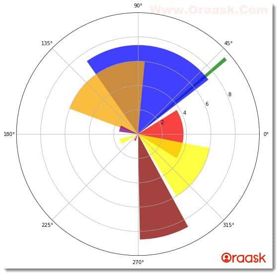
Bar graphs in the polar coordinates are not precisely rectangular bars. Instead, they are in the form of sectors of a circle. Both the area and the bar plots’ size define the bars’ relative values. If the area of one bar is twice the other, that means the corresponding value of the former is twice that of the latter.
Example (7)
#import all the necessary libraries and packages in the code
import numpy as np
import matplotlib.pyplot as plt

#defining a user-defined function
def bar(theta,radii,width,colors):
    #defining figure object to the plot
    fig=plt.figure(figsize=(9,9))
    #creating the axes object
    ax = plt.axes(projection='polar')
    #plotting the polar bar plot
    ax.bar(theta, radii, width=width, bottom=0.0, color=colors, alpha=0.75)
    #displaying the plot in the figure
    plt.show()
#defining the main() function
def main():
    #defining random seed to set the fixed value of the generated random numbers
    np.random.seed(42)
    #definng the angles of the data points with the center
    theta = np.arange(0., 2 * np.pi, 0.71)
    #defining the radius
    radii = 10 * np.random.rand(9)
    #defining the width of the axis
    width = np.pi / 2* np.random.rand(9)
    print(theta)
    #defining the colors of the plots
    colors = ["red","green",'blue',"orange","purple","yellow","red","darkred","yellow"]
    #calling the bar() function
    bar(theta,radii,width,colors)
#calling the main() function
if __name__=='__main__':
    main()
Output:
[adinserter block=”10″]
Final Thoughts
In this article, we have learned how to plot polar graphs in Matplotlib Python. We have also learned about many functions and attributes associated with the Numpy and math libraries in python. We plotted many standard graphs like circles and ellipses in the polar coordinate and then learned how to plot other graphs like line graphs, bar graphs, etc.
Although we have covered the essential functions and attributes associated with the topic, we encourage the readers to look up the python documentation for more information about the associated functions and libraries.


