How Can We Help?
Introduction
The violin plots are actually the combination of the box plot and the histogram plot. This is a very popular graph when dealing with the measures of central tendency like mode, median, mean, etc. The central tendency portion is contributed through the box plot, and the histogram plot contributes to the distribution part.
Below are examples of the violin plots:
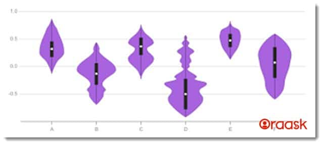
The different portions of the violin plots are as follows:
- The white dots refer to the median of the distribution.
- The thin black colored line’s endpoints represent the maximum and minimum of the distribution.
- The endpoints of the solid black lines represent the iqr1 and iqr3.
- All the distributions which lie above the 1.5x interquartile represent the outliers. These values have a very high variance compared to the other values.
Using the violinplot function
Mtplotlib offers inbuilt functions to plot the violin plot. The function which we can use is the violinplot function. The function takes a list or array-like data as arguments and plots accordingly. The array should be one-dimensional only. We can also pass multiple arrays or lists to this function. In doing so, matplotlib will plot multiple violin plots in the same graph.
Example (1)
# Importing all the necessary libraries and packages in the code
import numpy as np
import matplotlib.pyplot as plt
def violin_plot(uniform):
    # creating figure
    fig=plt.figure(figsize=(9,9))
    # Creating the axes
    ax=plt.axes()
    # plotting violin plot for uniform distribution
    ax.set_title('Uniform Distribution in violin plot')
    # Plotting the uniform distribution
    ax.violinplot(uniform)
    # Defining the label along the x-axis
    plt.xlabel("X axis")
    # Defining the label along the y axis
    plt.ylabel("Y axis")
    # Function to show the plot
    plt.show()
def main():
    uniform = [int(x**3) for x in range(1,10,1)]
    # Calling the viloin_plot function to plot the violin plot
    violin_plot(uniform)
# Calling the main function
if __name__ == "__main__":
    main()
Output:
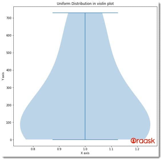
Explanation:
- First, we imported the numpy library and the pyplot module using the import statement of Python.
- Next, we have created a user-defined function using the violin_plot function. Under this function, we first created the figure axes using the figure function. We specified the plot’s size using the function’s figsize attribute. Next, we created the axes object using the axes function of the pyplot module.
- We used the set_title function to define the title of the plot. Now we used the violinplot function to plot the figure.
- We also used the xlabel and the ylabel functions to define the plot labels. Next, we used the show function to display the plot. Note that this is entirely optional to use the show function.
- After the viloin_plot function, we have defined the main function. This is the driving code of the program. Under this function, we first created the data point for the plot. Next, we called the violin_plot function to plot the graph.
- We called the main function using the following lines of codes: if __name__ == “main“: main()
Plotting Multiple Violin plots
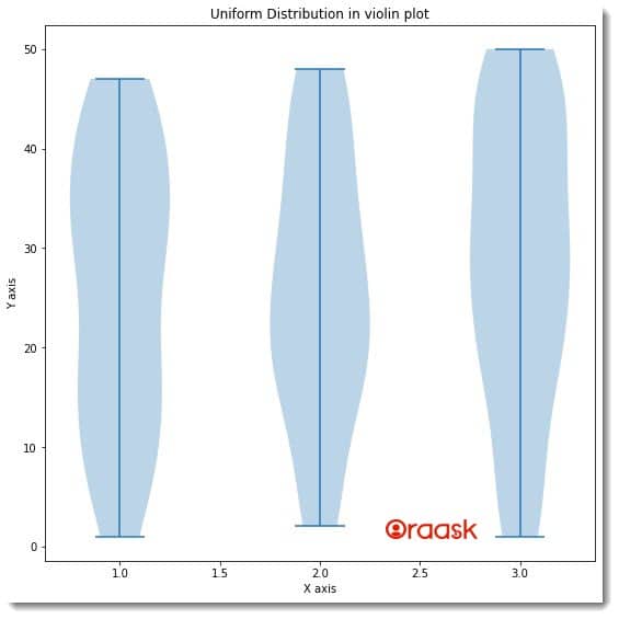
This concept is useful whenever we have several datasets and need to compare them in a single plot. We do not need to create subplots for the same. Instead, matplotlib allows us to plot them in a single figure. This helps to compare the data distribution of two different data types more easily. We first need to access the data set. Next, we need to create a dataset collection and use the same violinplot function to plot the data. We only need to pass the dataset arrays in the form of lists or another array into the function.
Example (2)
# Importing all the necessary libraries and packages in the code
import numpy as np
import matplotlib.pyplot as plt
import numpy as np
import matplotlib.pyplot as plt
from random import randint


def violin_plot(l1, l2, l3):
    # creating figure
    fig = plt.figure(figsize=(9, 9))
    # Creating the axes
    ax = plt.axes()
    # plotting violin plot for uniform distribution
    ax.set_title('Uniform Distribution in violin plot')
    # Creating a random collection
    random_collection = [l1, l2, l3]
    # Plotting the uniform distribution
    violinplot = ax.violinplot(random_collection)
    # Defining the label along the x-axis
    plt.xlabel("X-axis")
    # Defining the label along the y axis
    plt.ylabel("Y-axis")
    # Function to show the plot
    plt.show()


def main():
    # Creating 3 empty lists
    l1 = []
    l2 = []
    l3 = []
    # Filling the lists with random value
    for i in range(50):
        n = randint(1, 50)
        l1.append(n)
    for i in range(50):
        n = randint(1, 50)
        l2.append(n)
    for i in range(50):
        n = randint(1, 50)
        l3.append(n)

    # Calling the viloin_plot function to plot the violin plot
    violin_plot(l1, l2, l3)


# Calling the main function
if __name__ == "__main__":
    main()
Output:
Plotting Horizontal Violin Plot
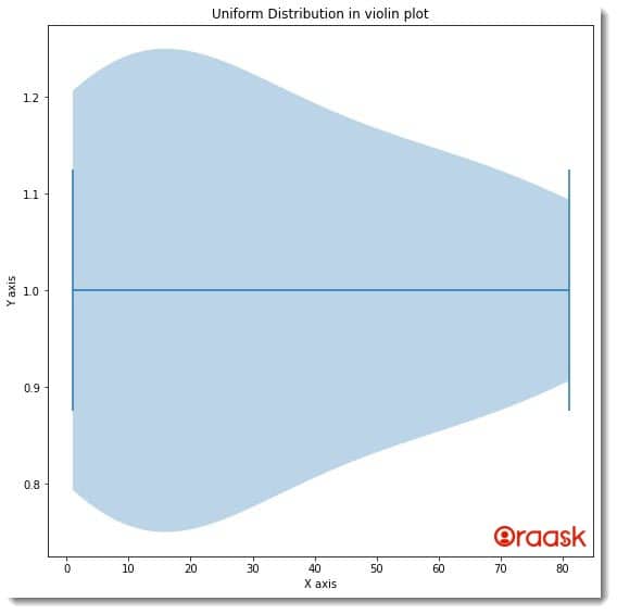
We can also place the violin plot horizontally(i.e., along the x-axis). For this, we only need to tweak one attribute of the violinplot function. We need to set vert=False.
This will ensure that the plot is held horizontally.
Example (3)
# Importing all the necessary libraries and packages in the code
import numpy as np
import matplotlib.pyplot as plt
def violin_plot(uniform):
    # creating figure
    fig=plt.figure(figsize=(9,9))
    # Creating the axes
    ax=plt.axes()
    # plotting violin plot for uniform distribution
    ax.set_title('Uniform Distribution in violin plot')
    # Plotting the uniform distribution
    ax.violinplot(uniform,vert=False)
    # Defining the label along the x-axis
    plt.xlabel("X axis")
    # Defining the label along the y axis
    plt.ylabel("Y axis")
    # Function to show the plot
    plt.show()
def main():
    uniform = [int(x**2) for x in range(1,10,1)]
    # Calling the viloin_plot function to plot the violin plot
    violin_plot(uniform)
# Calling the main function
if __name__ == "__main__":
    main()
Output:
Specifying the median, outliers, etc. In The Violin Plot
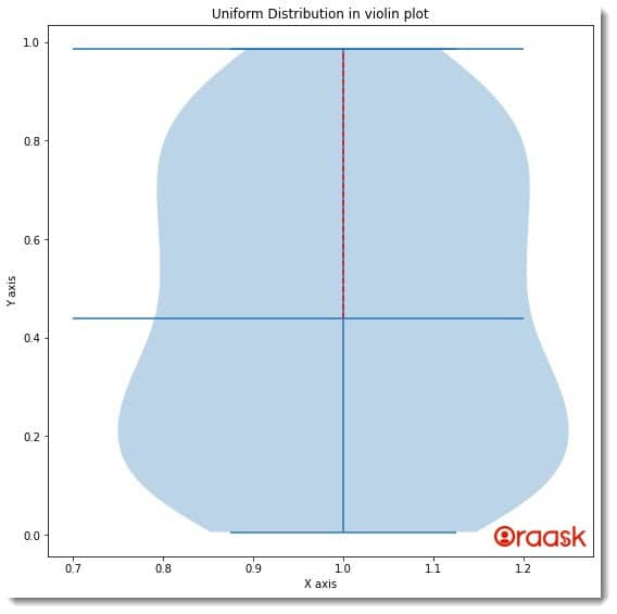
In the violin plot, we can also specify the median, outliers, etc. For this, we can adopt the following steps:
- First, define the quartile, median, and mean of the data from the data sets. You can either use the NumPy array functions, or you can calculate them with several other techniques available.
- Next, you need to use the violinplot function to plot the figure. In the figure itself, we need to use the vlines and hlines functions of the matplotlib to mark the median, outliers, etc., in the plot.
Example (4)
# Importing all the necessary libraries and packages in the code
import numpy as np
import matplotlib.pyplot as plt
def violin_plot(data,quartile1, median, quartile3):
    # creating figure
    fig = plt.figure(figsize=(9, 9))
    # Creating the axes
    ax = plt.axes()
    # Creating the plot
    plt.violinplot(data)
    # Defining a vertical line
    plt.vlines(1, quartile1,quartile3,color='r',linestyle='--')
    # Defining horizontal lines
    plt.hlines(quartile1,.7,1.2)
    plt.hlines(quartile3,.7,1.2)
    # plotting violin plot for uniform distribution
    ax.set_title('Uniform Distribution in violin plot')
    # Defining the label along the x-axis
    plt.xlabel("X axis")
    # Defining the label along the y axis
    plt.ylabel("Y axis")
    # Function to show the plot
    plt.show()
def main():
    np.random.seed(42)
    data = np.random.random(111)
    quartile1, median, quartile3 = np.percentile(data,[ 50, 75,100],axis=0)
    # Calling the viloin_plot function to plot the violin plot
    violin_plot(data,quartile1, median, quartile3)
# Calling the main function
if __name__ == "__main__":
    main()
Output:
Explanation:
- We first imported all the necessary libraries and packages in our code using the import statement of Python. Next, we defined a user-defined function, namely violin_plot. This is a void function, and it takes four arguments, namely data,quartile1, median, and quartile3.
- Under this function, we first created the figure object using the figure function of the pypot. Next, we created the axes object using the axes function of the pyplot.
- We used the violin function to plot the figure. To plot the outliers, we have used the vlines and the hlines. These functions created vertical and horizontal lines, respectively.
- Next, we defined the title for the plot using the set_title function. We also defined the labels along the axes with the help of the xlabel and the ylabel functions.
- After the violin_plot function, we created the main function. Under this function, we have created all the data points. We first used the function random.seed. This function fixes only one random value even on running the program multiple times. Next, we used the random function of the numpy to get a random array. Next, we used the percentile function. The function computes the nth percentile of the data set. This is a shortcut method to get the measures of the central tendency of any data, say the median.
- We called the violin_plot function to plot the graph. Next, we called the main function with the help of the following lines of codes: if __name__ == “main“:
main()
Using The Violin Plot With CSV Files
Until now, we have understood how to create violin plots using matplotlib. However, we may not always deal with custom data sets in real life. Instead, we will work with data sets that shall be available to us. These data can be in Excel, CSV file formats, etc. In such cases, first, we need to use some data preprocessing libraries, like the pandas, etc., to first read the data, make columns or data frames from it and make the plot.
Before proceeding with the code, first, follow the below steps:
- Download the data set in the same directory where you will keep your.py file.
- Click on the below link https://www.kaggle.com/datasets/ashydv/housing-datasetk
- Next, click on the Download option to download the zip file.
- Next, go to the directory where you downloaded the zip file and extract it to the same directory where you have kept the .py file.
Example (5)
# Importing all the necessary libraries and packages in the code
import numpy as np
import matplotlib.pyplot as plt
import pandas as pd
def violin_plot(bedrooms,bathrooms):
    # creating figure
    fig = plt.figure(figsize=(9, 9))
    # Creating the axes
    ax = plt.axes()
    # Create a plot
    ax.violinplot([bedrooms,bathrooms])
    # Add title
    ax.set_title('Uniform Distribution in violin plot')
    # Defining the label along the x-axis
    plt.xlabel("X axis")
    # Defining the label along the y axis
    plt.ylabel("Y axis")
    # Function to show the plot
    plt.show()
def main():
    # Reading the CSV file
    data = pd.read_csv("Housing.csv")
    # Creating a data frame
    df=pd.DataFrame(data)
    # Selecting the bedrooms column
    bedrooms = df['bedrooms']
    # Selecting the bathrooms column
    bathrooms = df['bathrooms']
    # Calling the viloin_plot function to plot the violin plot
    violin_plot(bedrooms,bathrooms)
# Calling the main function
if __name__ == "__main__":
    main()
Output:
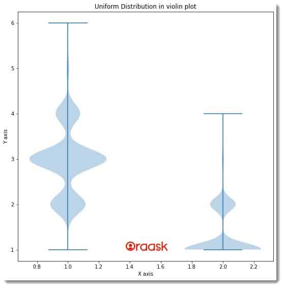
Explanation:
- First, we imported the libraries and packages in the code. Note that we can import the libraries anywhere in our code.
- Next, we have created a user-defined function, namely violin_plot. This function takes two parameters, namely bedrooms and bathrooms. This is a void function.
- Under this function, we first defined the size of the figure using the figure function.
- Next, we used the axes function to define the plot’s axes. Now we have used the violinplot function to plot the violin plot. We passed two parameters to the function, namely bedrooms, and bathrooms.
- We defined the title of the plot using the set_title function. We also used the xlabel and the ylabel functions to define labels along the axes.
- Next, we defined the main function. This is the driving code of the program. Under this function, we first read the data using the read_csv function. Ensure that you entered the correct file path in the function.
- Next, we created a data frame from the data using the DataFrame function of pandas. We have used two columns of the data, namely the bedrooms, and bathrooms. We called the violin_plot function with the appropriate arguments to plot the violin plot.
- Finally, we called the main function with the help of the following lines of codes: if __name__ == “main“: main()
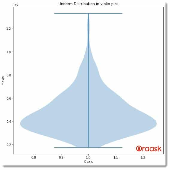
Below is another illustration of the same dataset but with the price column.
Example (6)
# Importing all the necessary libraries and packages in the code
import numpy as np
import matplotlib.pyplot as plt
import pandas as pd
def violin_plot(price):
    # creating figure
    fig = plt.figure(figsize=(9, 9))
    # Creating the axes
    ax = plt.axes()
    # Create a plot
    ax.violinplot([price])
    # Add title
    ax.set_title('Uniform Distribution in violin plot')
    # Defining the label along the x-axis
    plt.xlabel("X axis")
    # Defining the label along the y axis
    plt.ylabel("Y axis")
    # Function to show the plot
    plt.show()
def main():
    # Reading the CSV file
    data = pd.read_csv("Housing.csv")
    # Creating a data frame
    df=pd.DataFrame(data)
    # Selecting the price column
    price = df['price']
    # Calling the viloin_plot function to plot the violin plot
    violin_plot(price)
# Calling the main function
if __name__ == "__main__":
    main()
Output:
Conclusion:
In this article, we have learned how to plot the violin plot in matplotlib using the violinplot function of matplotlib. We also learned about the associated parameters and attributes with this function.
We strongly recommend that readers look up the Python matplotlib documentation to understand the topic more.


