How Can We Help?
Introduction
Matplotlib is a powerful and flexible data visualization library in Python that can create various charts, including waterfall charts. This article will show how to create a waterfall chart in Matplotlib and customize its appearance and behavior.
What is Matplotlib Waterfall Chart?
Waterfall charts, also known as bridge charts or cascade charts, are a type of data visualization used to show how a value changes from one state to another through a series of intermediate changes. Waterfall charts are handy for showing the cumulative effect of multiple positive and negative values on a total value over time.
To create a waterfall chart in Matplotlib, we can use the bar function from the pyplot module. The bar function allows us to draw horizontal or vertical bars on a chart, and we can use it to create a waterfall chart by setting the bottom parameter to the cumulative sum of the values we want to plot.
Why Should We Use A Waterfall Chart?
Waterfall charts, also known as bridge charts or cascade charts, are a type of data visualization used to show how a value changes from one state to another through a series of intermediate changes. Waterfall charts are handy for showing the cumulative effect of multiple positive and negative values on a total value over time.
Some common use cases for waterfall charts include:
- To show the contribution of individual values to a total value, such as the contribution of different product categories to a company’s revenue.
- Comparing the performance of different variables over time, such as the performance of different departments in a company.
- To identify the causes of changes in a value, such as the factors contributing to changes in a company’s profit margin.
- To present the data in a visually appealing and easy-to-understand way, such as presenting data to stakeholders or investors.
- Waterfall charts are handy for showing the cumulative effect of multiple values on a total value. They allow the viewer to see the intermediate steps and understand how each value contributes to the final result. They are also helpful for highlighting the positive and negative values and showing how they impact the total value.

Here is an example of how to create a simple waterfall chart in Matplotlib:
Example (1)
import matplotlib.pyplot as plt

# Set the values to be plotted
values = [10, -5, 7, -3, 4, -6, 3]

# Calculate the cumulative sum of the values
cumulative_sum = [sum(values[:i+1]) for i in range(len(values))]

# Set the labels for the bars
labels =  [str(val) for val in values]

# Set the colors for the bars
colors = ["#ADD8E6"] + ["#FFE4B5" if val > 0 else "#87CEEB" for val in values] + ["#ADD8E6"]

# Create the figure and axis
fig, ax = plt.subplots(figsize=(9,9))

# Set the axis limits
ax.set_ylim(min(cumulative_sum)-5, max(cumulative_sum)+5)

# Set the axis labels
ax.set_xlabel("values")
ax.set_ylabel("Cumulative Value")

# Create the bars
ax.bar(labels, values, color=colors, edgecolor="#000000")

# Set the title
ax.set_title("Illustrating waterfall chart")

# Show the plot
plt.show()
Output:
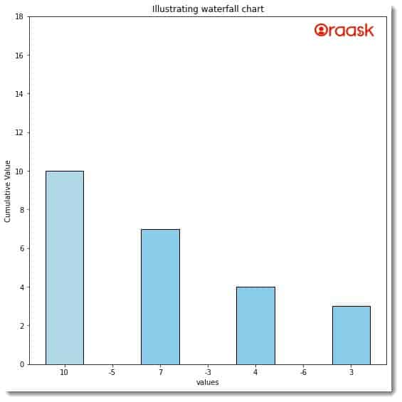
Explanation:
In this example, we first set the values we want to plot on the chart. Then, we calculate the cumulative sum of the values using a list comprehension. We set the labels for the bars to include the start and end values, and we set the colors for the bars using a list comprehension based on the value of each bar. Finally, we create the figure and axis using the subplots function, set the axis limits and labels, and create the bars using the bar function.
We can customize the appearance and behavior of the waterfall chart in various ways. For example, we can set the title and legend of the chart using the title and legend functions, respectively. We can customize the tick marks and labels using the set_xticks and set_xticklabels functions.
In addition, we can use the annotate function to add annotations to the chart, such as the values of the bars or the cumulative sum at each step. We can also use the text function to add text labels to the chart, such as the total value at the end of the chart.
How to customize the appearance and behavior of the waterfall chart
To further customize the appearance and behavior of the waterfall chart, we can use various parameters of the bar function. For example, we can use the width parameter to set the width of the bars, the align parameter to set the alignment of the bars, and the hatch parameter to add hatch patterns to the bars.
We can also use the fill_between function to add a shaded region between two lines or curves on the chart. This can be useful for highlighting the difference between two values or showing individual values’ contribution to a total.
Here is an example of how to use the fill_between function to add a shaded region to the waterfall chart:
Example (2)
import matplotlib.pyplot as plt

# Set the values to be plotted
values = [10, -5, 7, -3, 4, -6, 3]

# Calculate the cumulative sum of the values
cumulative_sum = [sum(values[:i+1]) for i in range(len(values))]

# Set the labels for the bars
labels = [str(val) for val in values]

# Set the colors for the bars
colors = ["#ADD8E6"] + ["#FFE4B5" if val > 0 else "#87CEEB" for val in values] + ["#ADD8E6"]

# Create the figure and axis
fig, ax = plt.subplots(figsize=(9,9))

# Set the axis limits
ax.set_ylim(min(cumulative_sum)-5, max(cumulative_sum)+5)

# Set the axis labels
ax.set_xlabel("values")
ax.set_ylabel("Cumulative Value")

# Create the bars
ax.bar(labels, values,cumulative_sum, color=colors, edgecolor="#000000")

# Add a shaded region between the start and end values
ax.fill_between(labels,values,cumulative_sum, color="#ADD8E6", alpha=0.5)

# Set the title
ax.set_title("Illustrating waterfall chart")

# Show the plot
plt.show()
Output:
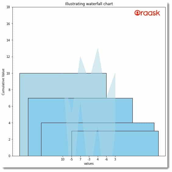
Explanation:
In this example, we use the fill_between function to add a shaded region between the start and end values of the chart. We set the region’s color to the same color as the start and end bars and the alpha value to 0.5 to make the region semi-transparent.
We can also customize the appearance of the shaded region by setting other parameters of the fill_between function, such as the hatch parameter to add a hatch pattern to the region or the edgecolor parameter to set the color of the edges of the region.
Another helpful feature of Matplotlib is the ability to save the chart as an image file. To save the chart as an image file, we can use the savefig function and specify the file name and format of the image.
Here is an example of how to save the waterfall chart as a PNG image file:
Example (3)
import matplotlib.pyplot as plt

# Set the values to be plotted
values = [10, -5, 7, -3, 4, -6, 3]

# Calculate the cumulative sum of the values
cumulative_sum = [sum(values[:i+1]) for i in range(len(values))]

# Set the labels for the bars
labels =  [str(val) for val in values]

# Set the colors for the bars
colors = ["#ADD8E6"] + ["#FFE4B5" if val > 0 else "#87CEEB" for val in values] + ["#ADD8E6"]

# Create the figure and axis
fig, ax = plt.subplots(figsize=(9,9))

# Set the axis limits
ax.set_ylim(min(cumulative_sum)-5, max(cumulative_sum)+5)

# Set the axis labels
ax.set_ylabel("Cumulative Value")
ax.set_xlabel("Values")

# Create the bars
ax.bar(labels, values, bottom=cumulative_sum, color=colors, edgecolor="#000000")

# Add a shaded region between the start and end values
ax.fill_between(labels, cumulative_sum, color="#ADD8E6", alpha=0.5)


# Set the title
ax.set_title("Illustrating waterfall chart")

# Show the plot
plt.show()
Output:
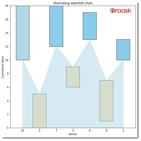
In this example, we use the annotate function to add annotations to the chart showing the values of the bars. We also use the text function to add a text label showing the total value at the end of the chart. We set the title and legend of the chart using the set_title and legend functions, respectively. Finally, we save the chart as a PNG image file using the savefig function and show the plot using the show function.
How to create a waterfall chart in Matplotlib using data from a CSV file
We have learned how to make waterfall charts from custom data points. However, while dealing with real-life problems, we will deal with CSV or Excel files instead of custom data points. In this section, we will learn how to create a waterfall chart in matplotlib using data from CSV files.
Example (4)
import matplotlib.pyplot as plt
import pandas as pd

# Load the data from the CSV file
df = pd.read_csv("train.csv")

# Extract the values and labels from the data frame
values = df["trip_distance"].tolist()
labels = df["rate_code"].tolist()

# Calculate the cumulative sum of the values
cumulative_sum = [sum(values[:i+1]) for i in range(len(values))]

# Set the colors for the bars
colors = ["#ADD8E6"] + ["#FFE4B5" if val > 0 else "#87CEEB" for val in values] + ["#ADD8E6"]

# Create the figure and axis
fig, ax = plt.subplots(figsize=(9,9))

# Set the axis limits
ax.set_ylim(min(cumulative_sum)-5, max(cumulative_sum)+5)

# Set the axis labels
ax.set_ylabel("Cumulative Value")
ax.set_xlabel("Values")

# Create the bars
ax.bar(labels, values, bottom=cumulative_sum, color=colors, edgecolor="#000000")

# Add a shaded region between the start and end values
ax.fill_between(labels, cumulative_sum, color="#ADD8E6", alpha=0.5)

# Add annotations to the chart
for i, val in enumerate(values):
    ax.annotate(str(val), (labels[i], cumulative_sum[i]), ha="center", va="center", color="#000000")

# Add a text label for the total value
# ax.text(labels, cumulative_sum, str(cumulative_sum), ha="center", va="center", color="#000000")

# Set the title and legend of the chart
ax.set_title("Waterfall Chart")
ax.legend(["Value"])

# Show the plot
plt.show()
Output:
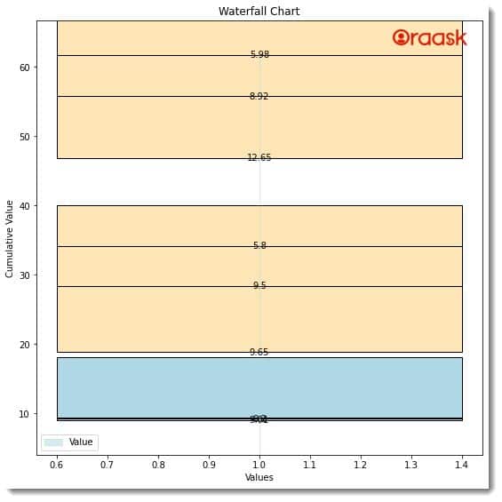
In this example, we use the read_csv function from the pandas library to load the data from the CSV file into a dataframe. We extract the values and labels from the data frame using the tolist method and calculate the cumulative sum of the values using a list comprehension. We then create the figure, axis, and bars like in the previous example.
Conclusion
Matplotlib is a powerful and flexible data visualization library in Python that can create various charts, including waterfall charts. By using the bar and fill_between functions, we can customize the appearance and behavior of the waterfall chart and add annotations and text labels to the chart. We can also save the chart as an image file using the savefig function.
We strongly recommend that the readers look up the Python matplotlib documentation to understand the topic more.


