How Can We Help?
Histograms are bar-like graphs that appear to be similar to bar graphs. They seem to be very handy when dealing with cumulative data—for example, the sales of any particular product for a company over a region, etc. In this article, we shall learn how to deal with the overlapping histogram with Matplotlib in Python.
Use The Alpha Parameters
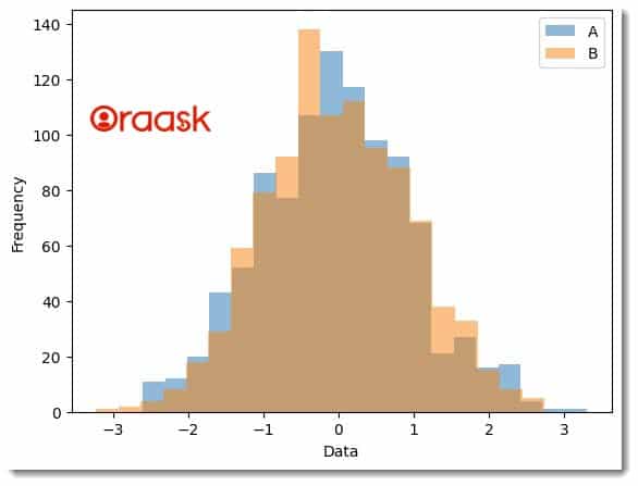
The difficulty of overlapping the histogram plot is due to the non visibility of all the bars in one go. Due to overlapping, we can see only one of the plots at a time. Hence to overcome the problem, we can use the alpha property of the hist function. The parameter sets the transparency of the plots. Therefore we can see all the plots in the same graph.
Example (1)
# Import the numpy and the matplotlib library
import numpy as np
import matplotlib.pyplot as plt
# Generate two sets of random data
data_A = np.random.randn(1000)
data_B = np.random.randn(1000)
# Create overlapping histograms
plt.hist(data_A, bins=20, alpha=0.5, label='A')
plt.hist(data_B, bins=20, alpha=0.5, label='B')
# Add legend and labels
plt.legend(loc='upper right')
# Add a label along the x-axis
plt.xlabel('Data')
# Add a label along the y axis
plt.ylabel('Frequency')
# Display plot
plt.show()
Output:

Use Density parameter
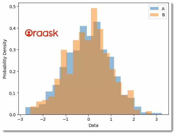
The density parameter normalizes the histograms to show the probability density of each dataset instead of the raw frequency. This is useful when the datasets have different sample sizes, as it allows us to compare their distributions on a standard scale.
Example (2)
import numpy as np
import matplotlib.pyplot as plt
# Generate two sets of random data
data_A = np.random.randn(1000)
data_B = np.random.randn(500)
# Create overlapping histograms
plt.hist(data_A, bins=20, alpha=0.5, label='A', density=True)
plt.hist(data_B, bins=20, alpha=0.5, label='B', density=True)
# Add legend and labels
plt.legend(loc='upper right')
plt.xlabel('Data')
plt.ylabel('Probability Density')
# Display plot
plt.show()
Output:

Use Cumulative Parameter
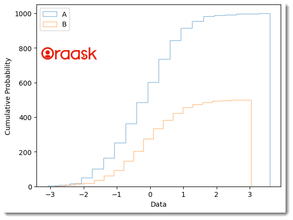
Another option for creating overlapping histograms is to use the cumulative parameter, which plots each dataset’s cumulative distribution function (CDF) instead of the raw frequency or density. The CDF shows the probability that a random variable takes on a value less than or equal to a specific value. This is particularly useful for comparing the overall distribution of two datasets and helps the readers to check multiple plots in the same graph.
Example (3)
import numpy as np
import matplotlib.pyplot as plt
# Generate two sets of random data
data_A = np.random.randn(1000)
data_B = np.random.randn(500)
# Create overlapping histograms
plt.hist(data_A, bins=20, alpha=0.5, label='A', cumulative=True, histtype='step')
plt.hist(data_B, bins=20, alpha=0.5, label='B', cumulative=True, histtype='step')
# Add legend and labels
plt.legend(loc='upper left')
plt.xlabel('Data')
plt.ylabel('Cumulative Probability')
# Display plot
plt.show()
Output:

Explanation
- We have imported the Numpy and the matplotlib using the Python import statement. Next, we created two data sets, namely data_A, and data_B. We used the rand function of NumPy to get random integers. We used these random data points to plot our histogram.
- Next, we used the hist function to plot the histogram plot. We passed the alpha parameter to control the transparency of the plot and set cumulative=True to obtain the cumulative frequency distribution instead of the original plot.
- We defined the legend using the legend function and the labels along the axes using the xlabel and the ylabel functions.
- Finally, we have used the show function to get the plot.
Conclusion
This article taught us how to deal with overlapping histogram plots in matplotlib in Python. We understood the usage of the alpha property, which we can utilize the overlap the plots.


