How Can We Help?
Introduction
Matplotlib is a modern library of Python for data visualization using different types of graphs. Histogram is a graph that displays the data as cumulative bars. Such visualization is essential for forecasting, business growth analysis, etc.
In this article, we shall understand how to plot matplotlib histogram from dictionary.
Use a Dictionary to Plot.
While learning to use Matplotlib, we often start with the list of data types to plot the matplotlib plots. However, there are several other data formats; one should know how to deal with them. One such data type is the dictionary. The dictionary is a data type consisting of key-value pairs. However, we cannot directly pass the dictionary to plot the data using Matplotlib since the methods of Matplotlib to plot the data only accept list or array-like objects. Hence indirectly, we first need to convert them into a list or array-like objects using the list or other similar functions.
Example (1)
import matplotlib.pyplot as plt
import numpy as np

# Create a dictionary with test scores
scores_dict = {'John': 80, 'Alice': 90, 'Bob': 75, 'Lisa': 85, 'Mike': 60}

# Extract the scores from the dictionary
scores = list(scores_dict.values())

# Calculate the range of the data
data_range = max(scores) - min(scores)

# Calculate the number of bins
num_bins = int(round(data_range / 5))

# Create an array of evenly spaced bins
bins = np.arange(min(scores), max(scores) + 5, 5)

# Create the histogram
plt.hist(scores, bins=bins, color='steelblue', edgecolor='black', linewidth=1.2)

# Add a title and labels to the axes
plt.title('Distribution of Test Scores')
# Define the x label
plt.xlabel('Score')
# Define the y label
plt.ylabel('Frequency')

# Add a grid to the plot
plt.grid(axis='y', alpha=0.75)

# Add a legend to the plot
plt.legend(['Test Scores'], loc='upper left')

# Display the histogram
plt.show()
Output:
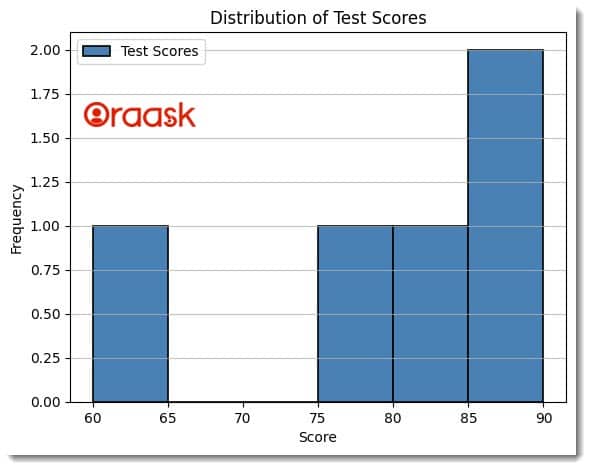
Explanation:
- The code uses the dictionary data type to plot a histogram plot. First, we imported the matplotlib and the numpy library in our code using the Python import statement. Next, we have defined a dummy dictionary named score_dict. Here we have defined a key-value pair of students and their names.
- We used the values method of the dictionary to get all the values and converted them into a list using the list method of Python. Next, we defined a data range using the max and min functions.
- We created an array of evenly spaced bins using the arrange method of the NumPy library.
- We used the hist method of matplotlib to plot the histogram. We passed the necessary parameters to it, like the scores, bins, etc.
- Next, using the title function, we defined the plot’s title, xlabel, and ylabel functions to define the labels along the x and y axis.
- We used the legend method to add a legend to the plot and the show method to display the plot.
Create a Dictionary From JSON Data and Plot the Histogram
In the above example, we have seen how we can use the dictionary to plot histogram plot in Python using the matplotlib library. However, we would not be dealing with dummy data in real life. Our data would be in Excel, CSV, or JSON format. In this section, we shall learn how to create a dictionary from JSON data format and use this to plot histogram plots using Maplotlib. First, we need to have the JSON file. In our example, we shall be using the following JSON file:
{
    "data": [
      {"quantity": 10, "price": 2.99},
      {"quantity": 20, "price": 3.49},
      {"quantity": 15, "price": 2.99},
      {"quantity": 5, "price": 1.99},
      {"quantity": 12, "price": 4.99},
      {"quantity": 7, "price": 2.49},
      {"quantity": 8, "price": 1.99},
      {"quantity": 9, "price": 3.99},
      {"quantity": 3, "price": 0.99},
      {"quantity": 14, "price": 4.49}
    ]
  }
Create a JSON file named index.json and copy and paste the above JSON data.
Next, create a Python file in the same directory and run the following command:
Example (2)
import json
import matplotlib.pyplot as plt

class DataPlotter:
    def __init__(self, filename):
        self.filename = filename
        self.load_data()

    def load_data(self):
        with open(self.filename, 'r') as f:
            self.data = json.load(f)['data']

    def plot_bar_chart(self):
        # Extract the quantities and prices from the data
        quantities = [d['quantity'] for d in self.data]
        prices = [d['price'] for d in self.data]

        # Create a bar chart of the data
        plt.bar(['Quantity', 'Price'], [sum(quantities), sum(prices)], color='steelblue', edgecolor='black', linewidth=1.2)

        # Add a title and labels to the axes
        plt.title('Fruit Data')
        plt.xlabel('Attribute')
        plt.ylabel('Value')

        # Display the bar chart
        plt.show()


def main():
    # Create the object named DataPlotter
    data_plotter = DataPlotter('index.json')
    # Call the function to plot the data
    data_plotter.plot_bar_chart()

# Call the main function, which is the driver code
if __name__=='__main__':
    main()
Output:
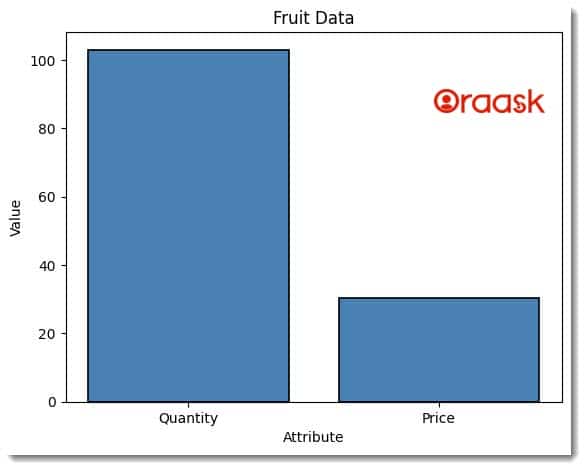
Explanation:
- This code plots a bar chart using the JSON file format and the matplotlib library. First, we import the necessary libraries using the import statement.
- Next, we define a class called DataPlotter. This class has an __init__ method that takes a filename as its parameter. The __init__ method sets the filename to the attribute self.filename and then calls the load_data method.
- The load_data method opens the specified file using the open function and then uses the json.load function to load the JSON data from the file. The JSON data is then stored in the self.data attribute.
- Using list comprehension, the plot_bar_chart method extracts the quantities and prices from the JSON data. Then, the bar function is called with the Quantities and Prices strings as the x-axis labels and the sum of quantities and prices as the y-axis data. The bars’ color, edge color, and line width are also specified. The title, xlabel, and ylabel functions add a title and labels to the x and y axes of the chart, respectively. Finally, the show function displays the bar chart.
- The main function creates an instance of the DataPlotter class, passing the filename of the JSON file as an argument. Then, the plot_bar_chart method is called to plot the bar chart.
- The last part of the code is a conditional statement that checks if the script is being run as the main program or if it is being imported as a module. If the script runs as the main program, the main function is called to execute the code.
Note: For more information about Histogram in the Matplotlib library, follow this tutorial: Python Matplotlib Histogram
Create a Dictionary From CSV Data and Plot the Histogram
In the above section, we understand how to deal with JSON data. In this section, we shall understand how to deal with CSV files. CSV is the short form of ‘Comma Separated Values.’ This data type is useful when importing vast amounts of data over different platforms.
We first need to have a CSV file. In our case, we would be dealing with the following CSV file:
fruit,quantity,price
Apple,10,2.5
Banana,5,1.5
Orange,7,3.0
Mango,4,4.0
Pineapple,2,5.0
Kiwi,6,2.0
Grapes,8,8.8
Peach,3,3.5
Pear,5,2.0
Watermelon,1,9.0
Create a CSV file and name it index.csv. Then copy and paste the above data into it.
Next, create a Python file in the same directory and run the following codes:
Example (3)
import csv
import matplotlib.pyplot as plt

class DataPlotter:
    def __init__(self, filename):
        self.filename = filename
        self.load_data()

    def load_data(self):
        with open(self.filename, 'r') as f:
            reader = csv.DictReader(f)
            self.data = []
            for row in reader:
                try:
                    row['quantity'] = float(row['quantity'])
                    row['price'] = float(row['price'])
                    self.data.append(row)
                except ValueError:
                    pass

    def plot_bar_chart(self):
        # Extract the quantities and prices from the data
        quantities = [d['quantity'] for d in self.data]
        prices = [d['price'] for d in self.data]

        # Create a bar chart of the data
        plt.bar(['Quantity', 'Price'], [sum(quantities), sum(prices)], color='yellow', edgecolor='black', linewidth=1.2)

        # Add a title and labels to the axes
        plt.title('Fruit Data')
        plt.xlabel('Attribute')
        plt.ylabel('Value')

        # Display the bar chart
        plt.show()


def main():
    data_plotter = DataPlotter('index.csv')
    data_plotter.plot_bar_chart()


if __name__ == '__main__':
    main()
Output:
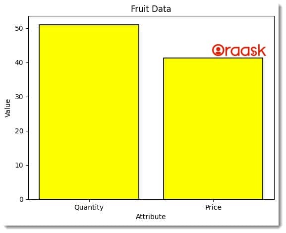
Explanation:
- The code imports two libraries – csv and matplotlib.pyplot. The CSV library reads and writes CSV files, while the matplotlib.pyplot library creates visualizations like bar charts, scatterplots, line charts, and more.
- The code defines a class named DataPlotter with two methods – init and load_data. The init method is the constructor method that initializes an instance of the DataPlotter class. It takes a filename as a parameter, which is the name of the CSV file to load. It then calls the load_data method to load the data from the CSV file.
- The load_data method reads the CSV file using the csv.DictReader function, which returns an iterator that returns dictionaries instead of lists. Each dictionary represents a row in the CSV file, with the keys being the column headers and the values being the cell values. The method then converts the ‘quantity’ and ‘price’ values to float and appends the row to a list named data. If the conversion fails, the row is skipped.
- The plot_bar_chart method extracts the quantities and prices from the data and creates a bar chart of the data using the bar function from the pyplot library. The function takes two parameters – the x-axis and y-axis values. The x-axis values are the labels ‘Quantity’ and ‘Price’, while the y-axis values are the sum of the quantities and prices. The function also sets the bars’ color, edge color, and line width.
- The method adds titles and labels to the axes using the title, xlabel, and ylabel functions. Finally, the method displays the bar chart using the show function.
- The main function creates an instance of the DataPlotter class with the filename ‘index.csv’ and calls the plot_bar_chart method. The if name == ‘main’ statement ensures that the main function is only called if the script is run directly and not if it is imported as a module.
Final Thoughts:
In this article, we learned how to deal with the dictionary data types to plot histogram plots. We first went through the basic ideas using dummy dictionary data. Next, we discussed converting the JSON and CSV file formats into the corresponding dictionary data for the histogram plot. The basic idea we understood is that we need to convert the data type in the required format, and ultimately we need to convert the data in list format to plot it.
