How Can We Help?
Matplotlib is a Python-language library. It is an extension of the NumPy library and is also known as the plotting library. We use it to visualize the graphs more efficiently. To improve the communication of matplotlib visuals, we annotate.
An annotation is a remark or comment added to a chart. It provides some additional information about the visualization summary. Suppose we plot a speed-time graph using matplotlib. We must label the x-axis as t (time), the y-axis as u (speed), and the area beneath the curve as d (distance). Annotate method enables us to interpret focused points with no effort.
Annotate Method:
matplotlib.pyplot.annotate(text, xy, *args, **kwargs)The xy point is annotated with the text “text”.
[adinserter block=”1″]
Syntax:
matplotlib.pyplot.annotate(text, xy, XYText, XYCoords,TextCoords , ArrowProps)We will discuss each of the arguments of annotate method later. Let’s start with an example to understand the general syntax better.
Maxima and Minima of Sinusoidal Waveform
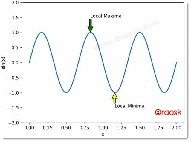
The sine or sinusoidal wave is a smooth repetitive curve of wavelength ‘2π’. The sine function takes input in degrees or radians. Here we will use radians as input. This function can achieve maximum and minimum values of 1 and -1, respectively. Consider the below example to mark these points.
[adinserter block=”2″]
Example
# Implementation of matplotlib.pyplot.annotate() function
import matplotlib.pyplot as plt
import numpy as np

fig, sine = plt.subplots()

t = np.arange(0.0, 2.0, 0.0001)
s = np.sin(3 * np.pi * t)
line = sine.plot(t, s, lw=2)

# Annotation
sine.annotate('Local Maxima', xy=(0.83, 1.01), xytext=(0.83, 1.5), arrowprops=dict(facecolor='green', shrink=0.005))
sine.annotate('Local Minima', xy=(1.16, -1.01), xytext=(1.16, -1.5), arrowprops=dict(facecolor='yellow', shrink=0.005))

# Setting limit of Y-axis
sine.set_ylim(-2, 2)

# Add label to both axis
plt.xlabel("x")
plt.ylabel("sin(x)")

# Plot the Annotation in the graph
plt.show()
Output

[adinserter block=”3″]
Explanation
Here, we plot a sinusoidal wave with NumPy and the matplotlib library to understand the basic syntax of annotate function. Now, to mark the Local Maxima and Local Minima on the graph, we used annotate method. ‘Local Maxima’ is the text inserted for the Maxima occurring at the point (0.83, 1.01), while the position of the text is (0.83,1.5). ArrowProps parameter enables us to draw an arrow. From the annotation, the arrow points to the desired point. The shape, size, and color of the arrow can be adjusted depending on the need.
Parameters of Annotate Method
The various arguments that annotate function takes are described below.
- text: This parameter represents the text that needs to be annotated.
- xy: This parameter represents the X and Y coordinates of the point.
- XYText: This parameter represents the position where the text along X and Y needs to be placed.
- XYCoords: This parameter contains the string value. It represents the coordinate system in which xy is given.
- TextCoords: This is the system of coordinates where XYText is present.
- ArrowProps: This parameter includes the “dict” type. By default, it is none. This is used to trace an arrow between xy and XYText.
- facecolor: assigns a color to the arrow.
- shrink: It is the Fractional length to be shrunk from both ends of the arrow to maintain visible distance.
- width: the width of an arrow can be modified using this keyword.
- headwidth: this keyword is used to change the width of the arrow’s base.
- headlength: It is used to allocate the length to the arrowhead.
[adinserter block=”4″]
The first two arguments of the annotate function are mandatory. The others are optional and may be used on-demand. All parameter values are fractional.
Bar Graph Annotation
A bar graph presents explicit data with rectangular bars, either vertical or horizontal. The height/length of the bar is relative to the values it represents.
Example
# Implementation of Annotate function in a bar graph
import numpy as np
import matplotlib.pyplot as plt

# set width of bar
barWidth = 0.25
fig = plt.subplots(figsize =(12, 8))

# set height of bar
Y2017 = [10000, 3000, 9000, 8000, 5000]
Y2018 = [9500, 6000, 7500, 8500, 5600]


# Set position of bar on X axis
br1 = np.arange(len(Y2017))
br2 = [x + barWidth for x in br1]

# Make the plot
plt.bar(br1, Y2017, color ='r', width = barWidth,
     edgecolor ='grey', label ='Y2017')
plt.bar(br2, Y2018, color ='b', width = barWidth,
     edgecolor ='grey', label ='Y2018')

# Adding Xticks
plt.xlabel('Cars', fontweight ='bold', fontsize = 15)
plt.ylabel('No. of Units Sold', fontweight ='bold', fontsize = 15)
plt.xticks(br1 + barWidth/2, ('A', 'B', 'C', 'D', 'E'))

plt.title('Sale Comparison of Cars for 2 years')
# Adding Annotations

for i in range(len(Y2017)):
  PercentIncrease = ((Y2018[i]- Y2017[i])*100)/Y2017[i]     # Percent increase in sales
  str1 = "{:.2f}".format(PercentIncrease)
  print(i+barWidth/2)
  plt.annotate(str1+'%', xy=(i+0.125 , 10000), xytext=(i+0.125, Y2018[i]+125))

plt.legend()
plt.show()
[adinserter block=”5″]
Output

Explanation
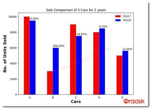
A company XYZ manufactures 5 different types of cars. Its sales executive recorded the number of units sold for each type of car. We plot a graph to visualize the percentage increase or decrease in sales of a particular type of car. This data will help them forecast the production of each car in the coming years. Now we annotate the “percentage increase in sales” of every type of car in 2018 compared to 2017. This helps make the data pictorially more understandable. In this case, the negative sign indicates a decline in sales.
Manipulating ArrowProp Parameter
This parameter allows us to add different types of arrows in our graphs to establish a relation between annotated points and annotation. It is one of the most critical parameters. Graphs may look vague with just texts written everywhere on them. They may seem chaotic to the viewers and hence becomes difficult to interpret. The ArrowProp appears to be a key argument to increase visual ability.
[adinserter block=”6″]
Example
import matplotlib.pyplot as plt
import numpy as np

plt.rcParams["figure.figsize"] = [7.50, 3.50]
plt.rcParams["figure.autolayout"] = True

np.random.seed(0)
dt = 0.01 # sampling interval
Fs = 1 / dt # sampling frequency
t = np.arange(0, 10, dt)

# generate noise:
nse = np.random.randn(len(t))
r = np.exp(-t / 0.05)
cnse = np.convolve(nse, r) * dt
cnse = cnse[:len(t)]
s = 0.1 * np.sin(4 * np.pi * t) + cnse

fig, axs = plt.subplots()
axs.set_title("Phase Spectrum of Sound")
axs.phase_spectrum(s, Fs=Fs, color='C2')

# Annotating graph:
plt.annotate('Highest Pitch', xy=(37.7, 40), xytext=(42, 30), arrowprops=dict(facecolor='pink', shrink=0.0005, width=2))

plt.annotate('Lowest Pitch', xy=(11.26, -27.6), xytext=(19, -23), arrowprops=dict(facecolor='pink',shrink=0.0005))

plt.annotate('',xy=(4.47, 26.5), xytext=(4.47, 0), arrowprops=dict(facecolor='pink', arrowstyle='<-'))

plt.annotate('(Amplitude)',xy=(4.47, 26.5), xytext=(0, -1.5))

plt.show()
[adinserter block=”7″]
Output

Explanation
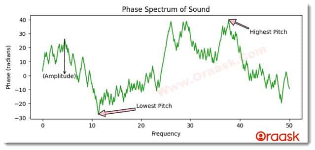
In this example, a Phase Spectrum of Sound is annotated. Different pitch points along with the amplitude are marked. Many manipulations to the arrow are done, such as changing its shape, size, color, and width.
- Amplitude: The distance of a point to the X-axis.
- Lowest Pitch: The point on the graph with the lowest amplitude has the lowest pitch.
- Highest Pitch: The point on the graph with the highest amplitude has the highest pitch.
[adinserter block=”8″]
Conclusion
In conclusion, we have seen that the Horizontal Bar Chart is a handy tool for visualizing data. It allows us to compare quantities and percentages of a series of categories. Each bar represents one category and is plotted along the horizontal axis, with its length representing the percentage of the total value for that category. Matplotlib is a powerful tool for creating and manipulating plots with Python. It is designed to be an open-source alternative to MATLAB, and it can be used in a wide variety of applications. The next time you need to visualize your data, don’t forget about matplotlib!


