How Can We Help?
Python is one of the most popular languages. One of its libraries is matplotlib which is exclusively used for plotting and analyzing graphs, animations, etc. The library has a color attribute and is used to provide colors to the graphs. Whether for the labels, the whole graph area, or the legends. Matplotlib offers color change for almost all the sections of the graph.
In this article, we will discuss the colors available in matplotlib.
[adinserter block=”1″]
List of Matplotlib Colors
Matpllotlib offers us to choose a variety of colors. They are divided into three color groups, namely Base colors, Tableau palette, and CSS colors. Users can use any color code; among them, they will give the corresponding color. Users can also use different color codes within the same code.
a)Base Colors:
The base color is the most commonly used, primarily consisting of the seven colors we are all familiar with. They need not be represented with their full names. Instead, users can also define them using their first letter. For example, the blue color is represented by b, and red is represented by r, etc.
The followings are the lists of base colors in Matplotlib:
- Blue-b
- Green-g
- Red-r
- Cyan-c
- Meta-m
- Black-k
- White-w
[adinserter block=”2″]
However one can also write “black” instead of “k“, “blue” instead of “b“, “red” instead of “r“, etc. This is not compulsory to use shorthand notation. Users can use the full name of the color too.
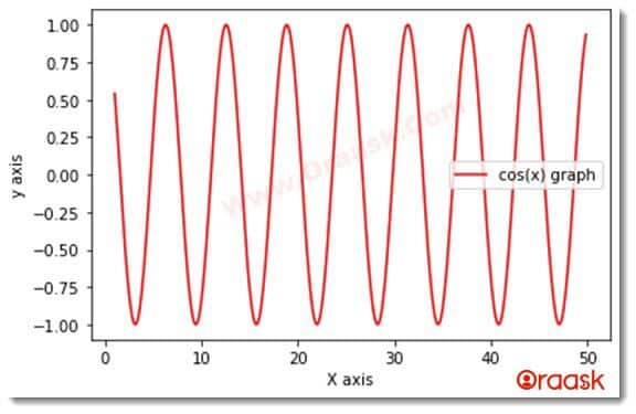
Example 1:
import matplotlib.pyplot as plt
import numpy as np
x=np.arange(1,50,0.1)
y=np.cos(x)
plt.plot(x,y,color="r")
plt.xlabel("X axis")
plt.ylabel("y axis")
plt.legend(["cos(x) graph"])
plt.show()
Output
[adinserter block=”2″]
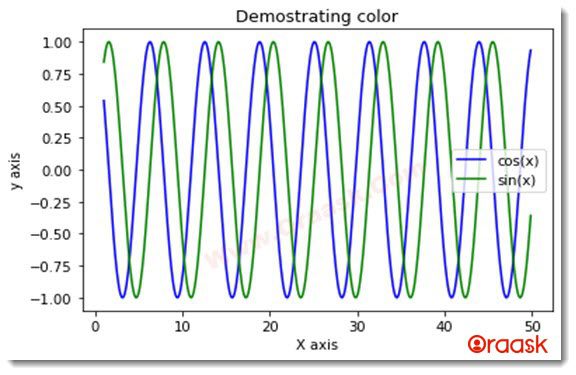
Example 2:
import matplotlib.pyplot as plt
import numpy as np
x=np.arange(1,50,0.1)
y=np.cos(x)
z=np.sin(x)
plt.plot(x,y,color="b")  #using basic color codes
plt.plot(x,z,color="g")
plt.xlabel("X axis")
plt.ylabel("y axis")
plt.legend(["cos(x)", "sin(x)"])
plt.title("Demostrating color")
plt.show()
Output
[adinserter block=”3″]
b)Tableau Palette:
In matplotlib, there are ten tableau colors. Here you pass the color argument in the form of a tad:
The colors are, respectively:
- tab:blue
- tab:orange
- tab:green
- tab:red
- tab:purple
- tab:brown
- tab:pink
- tab:gray
- tab:olive
- tab:cyan
This color code covers more colors than the base colors, and these need to be entered in the specified format only.
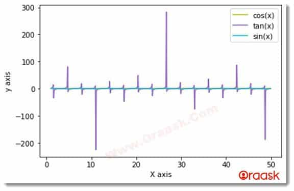
Example 3:
import matplotlib.pyplot as plt
import numpy as np
x=np.arange(1,50,0.1)
y=np.cos(x)
z=np.tan(x)
w=np.sin(x)
plt.plot(x,y,color="tab:olive")    #using the tableau palette color codes.
plt.plot(x,z,color="tab:purple")
plt.plot(x,w,color="tab:cyan")
plt.xlabel("X axis")
plt.ylabel("y axis")
colors=["cos(x)","tan(x)","sin(x)"]
plt.legend(colors)
plt.show()
[adinserter block=”4″]
Output
c)CSS Colors:
In matplotlib, there is another group of colors called CSS colors. This broad spectrum of colors covers hundreds of colors.
Some of them are as follows:
black dimgray gray grey darkgrey silver lighgrey lightgrey gainsboro whitesmoke white snow rosybrown lighcolral indianred brown firebrick maroon darkred red mistyrose salmon tomato darksalmon coral orangered lightsalmon sienna seashell chocolate saddlebrown peachpuff peru linen
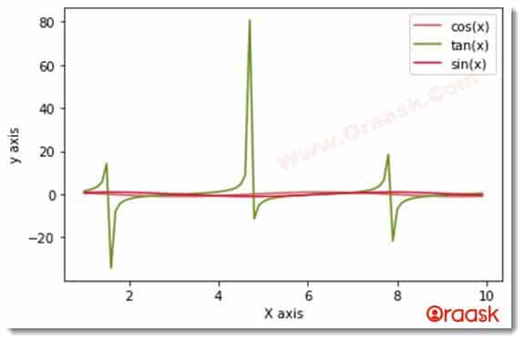
Example 4:
import matplotlib.pyplot as plt
import numpy as np
x=np.arange(1,10,0.1)
y=np.cos(x)
z=np.tan(x)
w=np.sin(x)
plt.plot(x,y,color="indianred")   #using the css color codes
plt.plot(x,z,color="olivedrab")
plt.plot(x,w,color="crimson")
plt.xlabel("X axis")
plt.ylabel("y axis")
colors=["cos(x)","tan(x)","sin(x)"]
plt.legend(colors)
plt.show()
Output
[adinserter block=”4″]
Matplotlib Hex Colors
Another popular color code is the hex color code. Here programmer needs to use a hash(#) sign followed by a hexadecimal number. The hexadecimal number corresponds to some color.
Example :
| Syntax | Description |
|---|---|
| aliceblue | #F0F8FF |
| cadetblue2 | #8EE5EE |
| cobalt | #3D59AB |
| chocolate2 | #EE7621 |
| cyan4 | #008B8B |
| darkolivegreen | #556B2F |
| yellow4 | #8B8B00 |
| violetred1 | #FF3E96 |
Example 5:
import matplotlib.pyplot as plt
import numpy as np
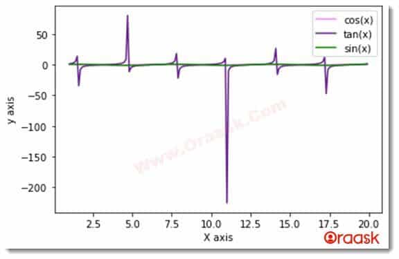
x=np.arange(1,20,0.1)
y=np.cos(x)
z=np.tan(x)
w=np.sin(x)
plt.plot(x,y,color="#F888FF")
plt.plot(x,z,color="#68228B")
plt.plot(x,w,color="#088B00")
plt.xlabel("X axis")
plt.ylabel("y axis")
colors=["cos(x)","tan(x)","sin(x)"]
plt.legend(colors)
plt.show()
Output
Matplotlib Color Intensity
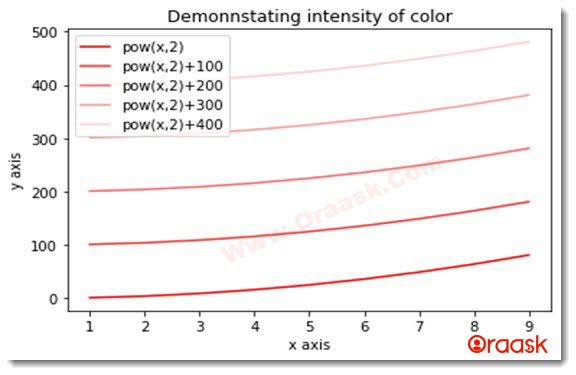
Matplotlib also offers the option to change the color intensity. We can achieve the same by using the alpha attribute available in matplotlib. It takes values between 0 and 1 with both included. The scale is relative. 0 means no intensity, and 1 means the highest available intensity.
Example 6
import matplotlib.pyplot as plt
import numpy as np
x=np.arange(1,10,1)
y1=pow(x,2)
y2=pow(x,2)+100
y3=pow(x,2)+200
y4=pow(x,2)+300
y5=pow(x,2)+400    #using the built in power function
plt.plot(x,y1,color="red",alpha=1)
plt.plot(x,y2,color="red",alpha=0.8) #specifying the intensity of the color
plt.plot(x,y3,color="red",alpha=0.6)
plt.plot(x,y4,color="red",alpha=0.4)
plt.plot(x,y5,color="red",alpha=0.2)
plt.xlabel("x axis")
plt.ylabel("y axis")
plt.title("Demonnstating intensity of color")
colors=["pow(x,2)","pow(x,2)+100","pow(x,2)+200","pow(x,2)+300","pow(x,2)+400"]
plt.legend(colors)
plt.show()
Output
Matplotlib Bar Chart Colors
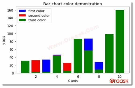
The bar chart in python matplotlib is the graph represented by rectangles. These graphs are best used for comparison purposes. We can pass arguments to give different colors to the graphs’ bars. The color codes are the same. We can pass the color arguments in the form of the primary color, tab color, etc.
[adinserter block=”5″]
Example 7
import matplotlib.pyplot as plt
import numpy as np
x=[1,2,3,4,5,6,7,8,9,10]
y=[11,32,34,46,5,6,87,28,9,10]
z=[14,32,3,45,25,36,7,8,93,10]
w=[31,2,3,44,5,86,57,8,99,160]
plt.bar(x,y,color="b")
plt.bar(x,z,color="r")
plt.bar(x,w,color="g")
plt.xlabel("X axis")
plt.ylabel("y axis")
plt.legend(["first color","second color","third color"])
plt.title("Bar chart color demostration")
plt.show()
Output
Example 8 Using Different Transparency
import matplotlib.pyplot as plt
import numpy as np
x=[1,2,3,4,5,6,7,8,9,10]
y=[11,32,34,46,5,6,87,28,9,10]
z=[14,32,3,45,25,36,7,8,93,10]
w=[31,2,3,44,5,86,57,8,99,160]
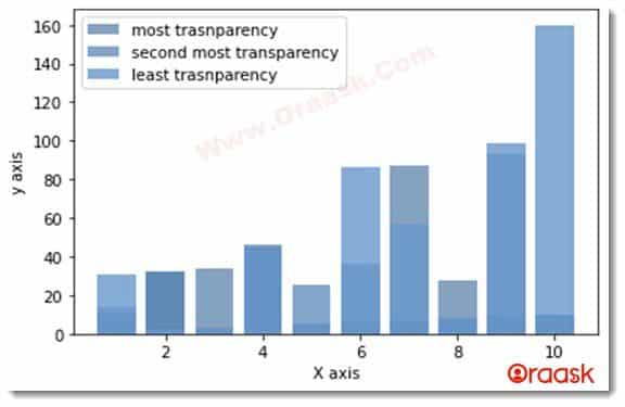
plt.bar(x,y,color=(0.2, 0.4, 0.6, 0.6))
plt.bar(x,z,color=(0.3, 0.5, 0.7, 0.7))
plt.bar(x,w,color=(0.4, 0.6, 0.8, 0.8))
plt.xlabel("X axis")
plt.ylabel("y axis")
plt.legend(["most trasnparency","second most transparency","least trasnparency"])
plt.show()
Output
Matplotlib Scatter Colors
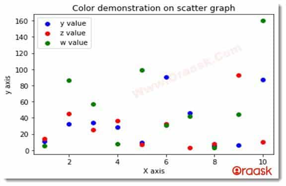
In python matplotlib, the scatter graph represents the values in the form of small dots over the plot area. This graph is mainly used to demonstrate the density of the values over the whole data set.
We can use the above-discussed color codes in the scatter plots to give color to the points.
[adinserter block=”6″]
Example 9:
import matplotlib.pyplot as plt
import numpy as np
x=[1,2,3,4,5,6,7,8,9,10]
y=[11,32,34,28,9,90,46,5,6,87]
z=[14,45,25,36,7,32,3,8,93,10]
w=[5,86,57,8,99,31,42,3,44,160]
plt.scatter(x,y,color="b")
plt.scatter(x,z,color="r")
plt.scatter(x,w,color="g")
plt.xlabel("X axis")
plt.ylabel("y axis")
plt.legend(["y value","z value","w value"])
plt.title("Color demonstration on scatter graph")
plt.show()
Output
Matplotlib Pie Chart Colors
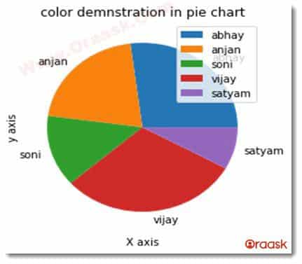
In python, the pie chart is the chart in the form of some circle, and each slice represents the percentage share of the value. We can also assign different colors to the slices. For that, we can use the color codes discussed in the article.
Example 10:
import matplotlib.pyplot as plt
import numpy as np
name=['abhay','anjan','soni','vijay','satyam']
marks=[87,67,44,98,26]
plt.pie(marks,labels=name)
plt.xlabel("X axis")
plt.ylabel("y axis")
plt.legend(name)
plt.title("color demnstration in pie chart")
plt.show()
Output
Matplotlib Horizontal Bar Graph Colors
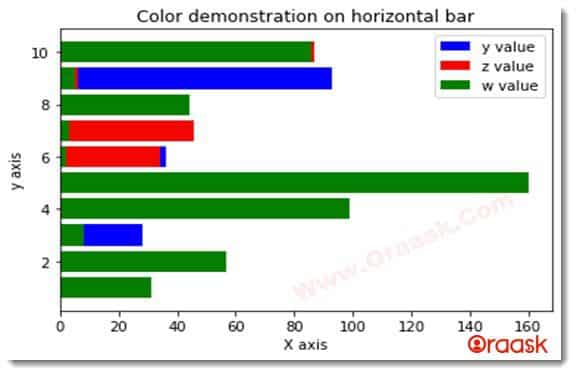
In python, horizontal bar graphs are graphs represented by horizontal bars. These can be assumed to be bar graphs placed horizontally. These are used for alternative visualization over the bar chart.
[adinserter block=”7″]
Example 11:
import matplotlib.pyplot as plt
import numpy as np
x=[1,2,3,4,5,6,7,8,9,10]
y=[11,32,28,9,10,36,7,8,93,10]
z=[14,32,3,45,25,34,46,5,6,87]
w=[31,57,8,99,160,2,3,44,5,86,]
plt.barh(x,y,color="b")
plt.barh(x,z,color="r")
plt.barh(x,w,color="g")
plt.xlabel("X axis")
plt.ylabel("y axis")
plt.legend(["y value","z value","w value"])
plt.title("Color demonstration on horizontal bar")
plt.show()
Output
Matplotlib Histogram Color
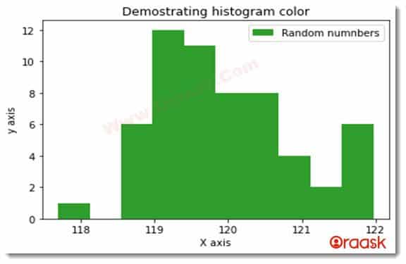
The histogram is a graph representing some organized group of continuous data points. These can be visualized as bar graphs but with no distance between the successive bars.
[adinserter block=”8″]
Example 12:
import matplotlib.pyplot as plt
import numpy as np
x=[1,2,3,4,5,6,7,8,9,10]
y=[11,32,28,9,10,36,7,8,93,10]
z=[14,32,3,45,25,34,46,5,6,87]
w=[31,57,8,99,160,2,3,44,5,86,]
plt.barh(x,y,color="b")
plt.barh(x,z,color="r")
plt.barh(x,w,color="g")
plt.xlabel("X axis")
plt.ylabel("y axis")
plt.legend(["y value","z value","w value"])
plt.title("Color demonstration on horizontal bar")
plt.show()
Output
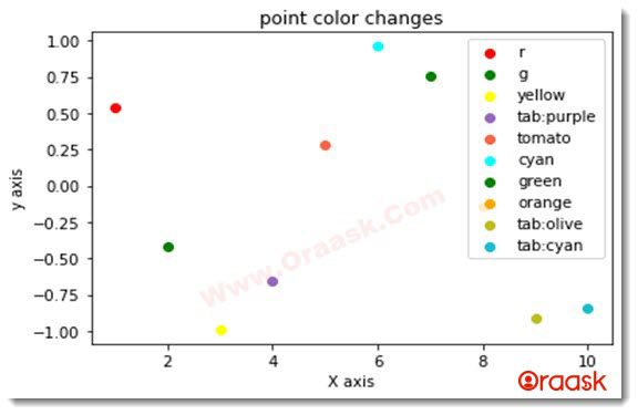
Matplotlib Different Colors for each Point
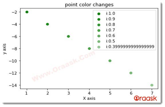
As discussed earlier, we can specify different colors for these points using the scatter plot. However, that can only change the color of a specific group of points. We can manually adopt many techniques if we want to change the colors of the points by applying certain conditions.
Example 13:
import  numpy as np
import matplotlib.pyplot as plt
x = np.linspace(1,10,10)
y = np.cos(x)
colors =['r','g','yellow','tab:purple','tomato','cyan','green','orange','tab:olive','tab:cyan']
j=0
for i in range(len(x)):
    plt.scatter(x[i], y[i],color=colors[j])
    j=j+1
plt.xlabel("X axis")
plt.ylabel("y axis")
plt.legend(colors,loc="upper right")
plt.title("point color changes")
plt.show()
Output
Example 14 (Changing the color intensity):
import  numpy as np
import matplotlib.pyplot as plt
x = np.arange(1,8,1)
y = -1*x*2
k=1
intense=[]
for i in range(len(x)):
    plt.scatter(x[i], y[i],color='green',alpha=k-i*0.1)
    j=j+1
    intense.append(f"i:{k-i*0.1}")
plt.xlabel("X axis")
plt.ylabel("y axis")
plt.legend(intense,loc="upper right")
plt.title("point color changes")
plt.show()
[adinserter block=”9″]
Output
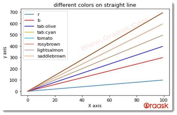
Matplotlib Plots Multiple Lines with Different Colors
Example 15:
import matplotlib.pyplot as plt
import numpy as np
x = np.arange(100)
plt.plot(x, x)
plt.plot(x, 3 * x,color="r")     #using basic color
plt.plot(x, 4 * x,color="b")
plt.plot(x, 5 * x,color="tab:olive")    #using tableau color code
plt.plot(x, 6 * x,color="tab:cyan")
plt.plot(x, 7 * x,color="tomato")
plt.plot(x, 5 * x,color="rosybrown")
plt.plot(x, 6 * x,color="lightsalmon")
plt.plot(x, 7 * x,color="saddlebrown")   #using css color code
plt.xlabel("X axis")
plt.ylabel("y axis")
colors=["r","b","tab:olive","tab:cyan","tomato","rosybrown","lightsalmon","saddlebrown"]
plt.legend(colors)
plt.title("different colors on straight line")
plt.show()
Output
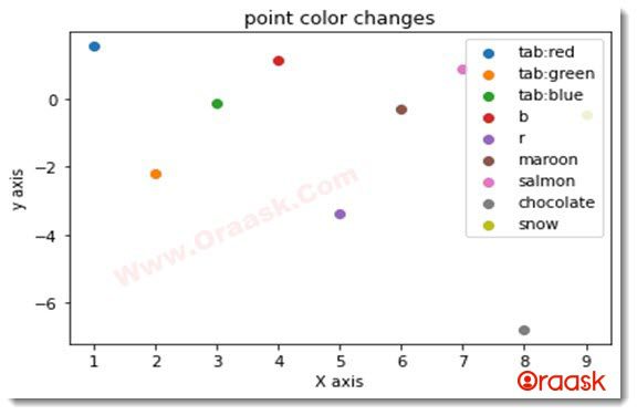
Matplotlib Changes Point Colors
[adinserter block=”10″]
Example 16:
import matplotlib.pyplot as plt
import numpy as np
x = np.arange(1,10,1)
y = np.tan(x)
my_colors = {1:'tab:red',2:'tab:green',3:'tab:blue',4:'b',5:'r',6:'maroon',7:'salmon',8:'chocolate',9:'snow',10:'peru'}    #storing numbers and corrosponding color names in the dictionary
for i,j in enumerate(x):
    plt.scatter(x[i] , y[i])
plt.xlabel("X axis")
plt.ylabel("y axis")
colors=['tab:red','tab:green','tab:blue','b','r','maroon','salmon','chocolate','snow','peru']
plt.legend(colors,loc="upper right")  #specifying the location of the legend
plt.title("point color changes")
plt.show()
Output
Conclusion
In this article, we have learned about different types of ways to specify the colors of the matplotlib plots. There are three classes of colors, namely primary, Tableau palette, and CSS colors. We can also use the hex color codes or the RGB color codes to specify the color attribute in matplotlib.On the other hand, we can also change the intensity of the color using the alpha attribute. The value between 0 and 1.0 means no intensity, 1 means the full intensity of the color, and all the scales are intermediate between them.


