How Can We Help?
Data visualization is crucial before giving the data to a model because the data itself is not cleaned. The machine learning or deep learning model will also provide a poor result. So, to visualize the data, we can use different types of libraries in python, such as matplotlib, seaborn, ggplot, etc. And sometimes, we need to plot and visualize complex data.
[adinserter block=”1″]
In those scenarios, we can use 3D visualization. Initially, matplotlib was used to plot and visualize only 2D graphs, but we should thank the mplot3d toolkit available in the matplotlib library. We can visualize 3D plots such as 3D scatter plots, 3D line plots, Surface plots, Rotated plot angles, etc.
In this article, we will see how to do 3D visualization and rotate 3D plot in matplotlib so that we can get an idea around 360degrees.
Table of Contents:
3D Scatter Plot using Matplotlib’s Toolkit mplot3d
Before going into too much technical, let’s recall the basic understanding of 3D. 3D or 3 Dimensional, if an object has 3 dimensions (or parameters) to measure its position (or location), it is called a 3D object. If an object has width, height, and depth, it is a 3D object in much simpler words.
Scatter Plot is also similar to all other plots. Here, the data points are plotted along the x-axis, y-axis, and z-axis (in the case of 3 dimensions), and by default, these data points are denoted using points.
[adinserter block=”2″]
A 3-dimension scatter plot is used to visualize complex data points in a much simpler form with the help of cartesian coordinates.
A simple approach to plotting a 3D scatter plot is:
- Import the required libraries such as NumPy, pandas, matplotlib, mplot3d
- Read the pre-defined data or create random data for 3D space.
- Plot a 3D scatter plot using the scatter3d() method.
- Use the show() method to visualize the plot.
Let’s see the above steps with an example.
Example
from mpl_toolkits import mplot3d
import numpy as np
import matplotlib.pyplot as plt

x = np.arange(0, 20, 0.2)
y = np.sin(x)
z = np.cos(x)

fig = plt.figure(figsize = (10, 7))
ax = plt.axes(projection ="3d")

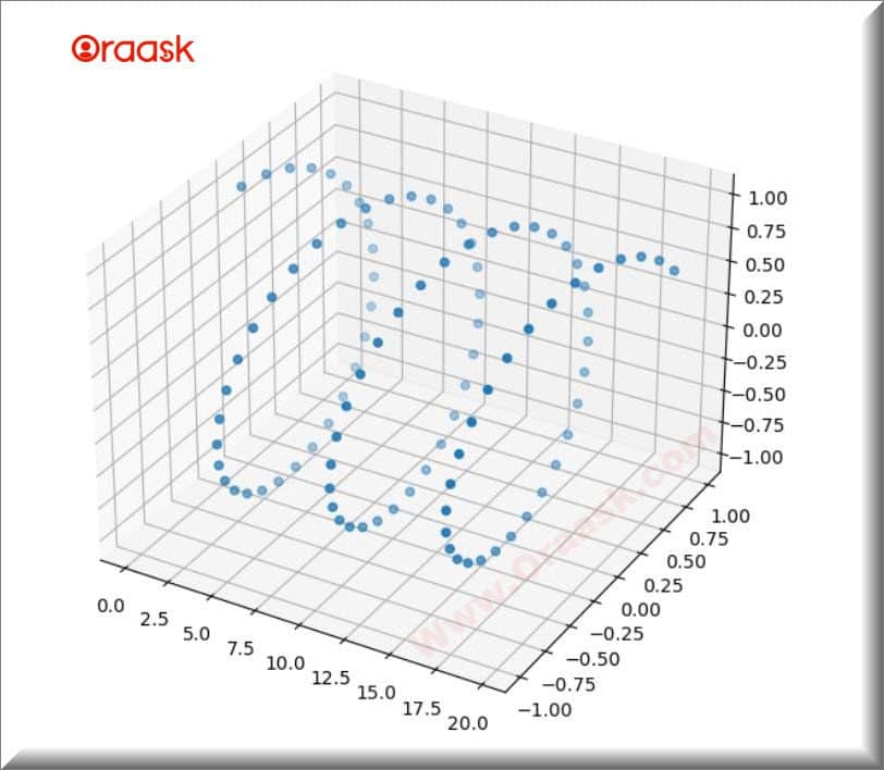
ax.scatter3D(x, y, z)
plt.show()
Output

[adinserter block=”3″]
Explanation
First of all, we have imported the required libraries like NumPy, matplotlib, and mplot3d, and then we generated data using arange(), sin(), and cos() method with the help of NumPy. These data points will represent the 3-dimensions of a scatter plot.
Next, we called the figure() method and gave an argument figsize. It will create a blank figure of the size figsize.
After that, the axes() method is called, and given an argument, projection is equal to 3d. It will set the axis for 3-dimensional space.
Now, we used scatter3D() method and gave the generated data as an argument. At last, we called the show() method to visualize the plot.
3D Scatter Plot with Color-bar using Matplotlib’s Toolkit mplot3d
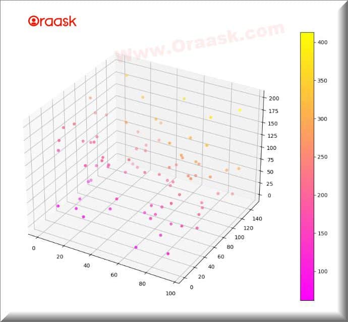
If we want to map the scaler values with colors, we can use the color bar. The color bar is generally displayed with a dedicated axis. Let’s see this with an example.
[adinserter block=”4″]
Example
from mpl_toolkits import mplot3d
import numpy as np
import matplotlib.pyplot as plt

x = np.random.randint(100, size=(80))
y = np.random.randint(150, size=(80))
z = np.random.randint(200, size=(80))

fig = plt.figure(figsize = (16, 9))
ax = plt.axes(projection ="3d")

color_map = plt.get_cmap('spring')
scatter_plot = ax.scatter3D(x, y, z, c = (x+y+z), cmap = color_map)

plt.colorbar(scatter_plot)
plt.show()
[adinserter block=”5″]
Output

Explanation
First of all, we have imported the required libraries like NumPy, Matplotlib, and mplot3d, and then we generated data using arange(), sin(), and cos() method with the help of NumPy. These data points will represent the 3-dimensions of a scatter plot.
Next, we called the figure() method and gave an argument figsize. It will create a blank figure of the size figsize.
After that, the axes() method is called, and given an argument, projection is equal to 3d. It will set the axis for 3-dimensional space.
We used the scatter3D() method and gave the generated data as an argument. At last, we called the show() method to visualize the plot.
[adinserter block=”6″]
Rotate 3D Scatter Plot using Matplotlib’s Toolkit mplot3d
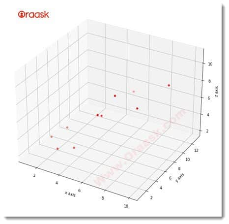
Sometimes, we need to visualize the 3D plot from a different point of view, and in that can, a rotating 3D plot would be much better. Let us see with the below example how we can rotate a 3D plot using matplotlib in python.
Example
%matplotlib notebook
from mpl_toolkits.mplot3d import Axes3D
import matplotlib.pyplot as plt
fig = plt.figure()
ax = fig.add_subplot(111, projection='3d')
X = [1,2,3,4,5,6,7,8,9,10]
Y = [5,6,2,3,13,4,1,2,4,8]
Z = [2,3,3,3,5,7,9,11,9,10]
ax.scatter(X,Y,Z, c='r', marker='o')
ax.set_xlabel('x axis')
ax.set_ylabel('y axis')
ax.set_zlabel('z axis')d
plt.show()
Output

[adinserter block=”7″]
Explanation
- In the above example, we have used a %matplotlib notebook. It enables the interactive mode, and now we can interact with the object and rotate it easily. We have imported essential libraries in the subsequent lines and created or initialized the figure.
- We have imported the name of the libraries with different names so that it becomes convenient for us to write the code. Hence we have imported matplotlib.pyplot as plt,numpy as np, and mpl_toolkits as mplot3d.
- We then created a figure object. Basically, this tells the program about creating the figure specifying its dimension, etc. We have identified the dimension of the figure as (8,8).
- We created another object named ax. Here we passed the parameter projection=’3d’.This makes the program understand that the required plot is a three-dimensional plot.
- We then choose values of z as discrete values using the linspace() function of NumPy.
- Following the same, we have chosen the value of x to be the sine and the value of y to be the cosine function of z.
- Now we plot the graph. We also passed the color argument in the plot3D() function to specify the color to be red.
- And then scatter() method is used to plot a 3D graph. In the last, we called the set-label() method and added the labels across all the 3 labels.
- And at last, to visualize the plot or graph, we used the show() method.
Change the View Angle of the 3D Scatter Plot
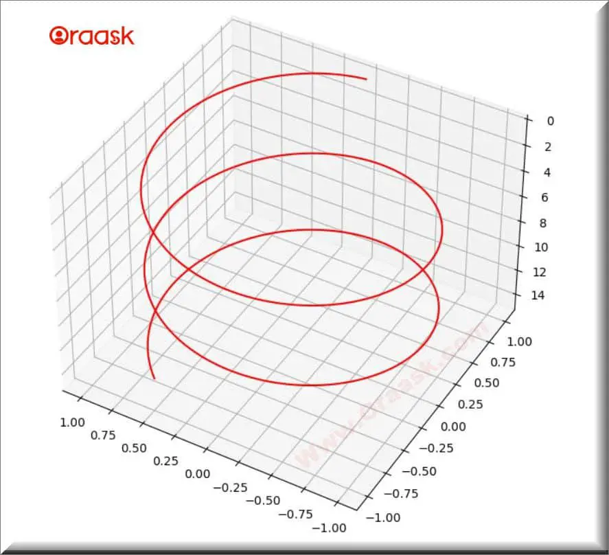
If we want to view the 3D plot from different angles, we can take the help of matplotlib’s mplot3d library.
Example
[adinserter block=”8″]
from mpl_toolkits import mplot3d
import numpy as np
import matplotlib.pyplot as plt

fig = plt.figure(figsize = (8,8))
ax = plt.axes(projection = '3d')

z = np.linspace(0, 15, 1000)
x = np.sin(z)
y = np.cos(z)
ax.plot3D(x, y, z, 'red')

ax.view_init(-140, 60)
plt.show()
Output

[adinserter block=”10″]
Explanation
- Initially, we imported the required libraries, namely the mplot3d numpy and the matplotlib; we used the figure() method and axes() method to plot the 3d axis. In these methods, we passed figsize and projection values as the parameter.
- We created our small dataset and plotted a scatter3D plot using the scatter3D() method. At the last view_init() method is used to change the view angle of the 3D plot. The view_init() method takes two parameters: the elevation angle in the z-plane and the azimuth angle in the x & y plane. And finally, called the show() method to display the 3D plot.
Conclusion
In the above article, we have discussed data visualization, 3D plots, scatter plots, and plot rotation, and with these, we have covered some good examples as well. The 3d plot is used in science, medicine, economics, and industry to visualize data having more than two parameters. While the two-dimensional graphs represent the relationship between the x and y-axis, the three-dimensional graph represents the relationship between the x,y, and z axis.


