How Can We Help?
There are multiple visualization techniques in Python to visualize the data points, and matplotlib is one of the libraries we will be discussing today.
Matplotlib is a vast library used to plot different types of charts and plots, such as pie charts, bar charts, line plots, scatter plots, histograms, etc. To create interactive, animated, and attractive visualization of different charts and plots in Python, we use the matplotlib library.
Today’s article will cover one of the matplotlib library’s data-visualization method scatter plots.
[adinserter block=”1″]
What is Scatter Plot?
A Scatter plot is one of the visualization plots in the matplotlib library, which display the values as collections of points in a 2-dimensional space. It is used to observe the relationship between different variables present in the dataset. Scatter plots check how one variable varies from another variable in a visualization format. We can use the scatter() function from the matplotlib library to draw a scatter plot.
[adinserter block=”2″]
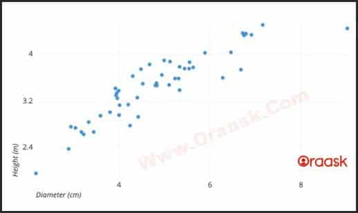
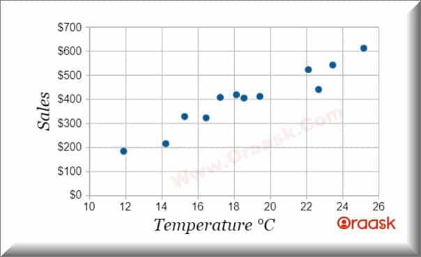
The above figure shows an example of a scatter plot. It displays the data points of some sample trees. We can see on the x-axis; that the diameter of trees is in cm, that is, the diameter (cm) is plotted, and on the y-axis, the height of trees is in a meter, that is, the height (m) are plotted.
If we observe closely, we can see a linear relationship between the height and diameter of the trees. As the diameter of trees increases, their height also increases linearly. In other words, we can say there is a strong positive correlation.
Now, let us see how to plot these graphs. Here is the syntax of a scatter plot that is in the matplotlib library:
matplotlib.pyplot.scatter(x_axis, y_axis, s=None, c=None, marker=None, cmap=None, vmin=None, vmax=None, alpha=None, linewidths=None, *, edgecolors=None, plotnonfinite=False, data=None, **kwargs)Simple Scatter Plot
Let’s take the example of a few sample tree datasets. In a city, there are multiple trees and the city administration wants to visualize these data.
Example (1)
import matplotlib.pyplot as plt

height = [66, 64, 30, 67, 32, 3.9, 3.1, 8.9, 7.7]
diameter = [10.2, 11, 6.9, 12, 2.8, 3.9, 3.1, 8.9, 7.7]
plt.scatter(height, diameter)
plt.show()
[adinserter block=”3″]
Explanation
Firstly, we have imported the matplotlib library because, in matplotlib, only the scatter-plot method is present and given an alias as plt. Alias, plt, is nothing but a short-form of matplotlib. pyplot
After that, we gave sample data on the height and diameter of the tree in a list format and then used the scatter method to create a scatter plot. The Scatter method takes at least two parameters, nothing but data on the x-axis and y-axis.
Now, let us deep dive into the Scatter Plot method of customizing Scatter Plots or Advance Scatter Plot.
We can customize the marker argument in a scatter-plot method in different ways. We can find three main features:
- Color
- Size
- Shape
Color Parameter in Scatter Plot Method
If we want to show the data points in colors, we can use the color parameter that is ‘c’ in the scatter-plot method. Let’s see how to use it with the help of an example.
[adinserter block=”4″]
Example (2)
import matplotlib.pyplot as plt

height = [66, 64, 30, 67, 32, 3.9, 3.1, 8.9, 7.7]
diameter = [10.2, 11, 6.9, 12, 2.8, 3.9, 3.1, 8.9, 7.7]
small = (0, 1, 0)
medium = (1, 1, 0)
large = (1, 0, 0)
tree_height = [small, large, medium, medium, large, small, large, medium, large]

plt.scatter(height, diameter, c = tree_height)
plt.show()
Output
Explanation
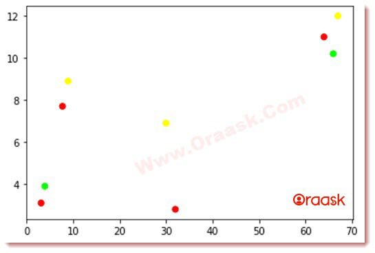
- Here, we have defined the variables small, medium, and large as a tuple. Each tuple contains three values representing the red, green, and blue color components. The tuples have high, medium, and low mean red, yellow, and green colors.
- After that, we have defined tree_height as a list, and this list contains those tuple values, which are nothing but the colors green, yellow, and red.
- In the scatter-plot method, we have introduced an optional parameter, ‘c’, which denotes the color of the data points.
Check This: Article on How to Label Each Point in Scatter Plot Matplotlib if you want to know more about labeling points in a scatter plot with practical examples.
Size Parameter in Scatter Plot Method
If we want to increase the height of the data points, we can use the size parameter ‘s’ in the scatter-plot method. Let’s see how to use it with the help of an example.
[adinserter block=”5″]
Example (3)
import matplotlib.pyplot as plt
import NumPy as np

height = np.asarray([66, 64, 30, 67, 32, 3.9, 3.1, 8.9, 7.7])
diameter = np.asarray([10.2, 11, 6.9, 12, 2.8, 3.9, 3.1, 8.9, 7.7])
actual_height = np.asarray([66, 64, 30, 67, 32, 3.9, 3.1, 8.9, 7.7])
small = (0, 1, 0)
medium = (1, 1, 0)
large = (1, 0, 0)
tree_height = [small, large, medium, medium, large, small, large, medium, large]

plt.scatter(x = height, y = diameter, c = tree_height, s = actual_height * 10)
plt.show()
Output
Explanation
- First, we have imported a new library, NumPy, and given an alias ‘np’. If we want to do the complex operation fast, we can use NumPy.
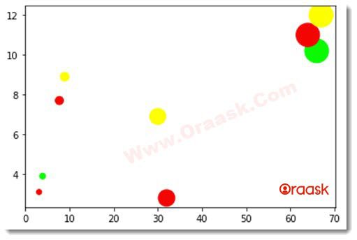
- After that, we added a new list of values that are the actual height of trees, and then in the scatter-plot method, we used the parameter ‘s‘ and assigned the ten times of exact height to ‘s’ that is s = (actual_height * 10).
- So this will increase the size of our data points in the visualization. We can see it in the above-shown visualization.
[adinserter block=”6″]
Shape Parameter in Scatter Plot Method
We can change the shape of our data points, and it will be easy to differentiate while visualizing multiple types of data points in a single graph. We can use the ‘marker’ parameter in the scatter-plot method. Let’s see how to use it with the help of an example.
Example (4)
import matplotlib.pyplot as plt
import NumPy as np

small = (0, 1, 0)
medium = (1, 1, 0)
large = (1, 0, 0)

height_area_1 = np.asarray([66, 64, 30, 67, 32, 3.9, 3.1, 8.9, 7.7])
diameter_area_1 = np.asarray([10.2, 11, 6.9, 12, 2.8, 3.9, 3.1, 8.9, 7.7])
actual_height_area_1 = np.asarray([66, 64, 30, 67, 32, 3.9, 3.1, 8.9, 7.7])
tree_height_area_1 = [small, large, medium, medium, large, small, large, medium, large]

height_area_2 = np.asarray([50, 54, 40, 47, 42, 10, 20])
diameter_area_2 = np.asarray([12, 11, 7, 10, 4, 6, 3])
actual_height_area_2 = np.asarray([50, 54, 40, 47, 42, 10, 20])
tree_height_area_2 = [large, small, medium, small, large, small, large]

plt.scatter(x = height_area_1, y = diameter_area_1, c = tree_height_area_1, s = actual_height_area_1 * 10)
plt.scatter(x = height_area_2, y = diameter_area_2, c = tree_height_area_2, s = actual_height_area_2 * 10, marker = ‘d’)
plt.show()
Output
[adinserter block=”7″]
Explanation
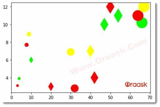
- To differentiate between the trees which are in different areas, we have added new values like height_area_2, diameter_area_2, actual_height_area_2, tree_height_area_2.
- After that, we used two scatter-plot methods; in the first one, we plot data points of one area without any marker parameter, which is nothing but the shape of the data points.
- While in the second scatter-plot method, we plot data points of the second area with marker parameter and assign a value’ d’.
- Here, ‘d’ represents a diamond shape. In the above figure, we see the heights of the trees in area 1 are in circle shape while the height of the trees in area 2 is a diamond shape.
[adinserter block=”8″]
Conclusion
In this article, we have learned the basics of scatter plots using the matplotlib library in Python. Now, you can do some hands-on on your own with any dataset you want. The scatters plot helps you visualize the data points in a better way.


